Showing posts with label Scotland. Show all posts
November 1, 2016
Makeagain Monday: Popping the Bubbles of the Scottish Index of Multiple Deprivation
cluster
,
gantt
,
makeagain
,
Makeover Monday
,
Pablo Gomez
,
packed bubbles
,
Scotland
,
SIMD
4 comments

The purpose isn't to pick on anyone. I use this as a teaching method. How can I take an existing visualisation and show I would improve and simplify it step-by-step. I only detail what I think doesn't work about the visualisation.
This week we looked at the Scottish Index of Multiple Deprivation and Pablo Gomez create this visualisation (click on it for the interactive version):

What doesn't work?
- Packed bubbles are basically impossible to compare
- What does the size and color of the bubbles mean?
- Do the colors coordinate with the scatter plots? (The answer is no, but I didn't know that until I downloaded the workbook.)
- What do the scatterplots add? They all basically look the same.
- The massive image on the right takes up like 25% of the space. What does the flag mean?
With that, here's my step-by-step makeover as a gif. Click on the gif for my version on Tableau Public.

October 31, 2016
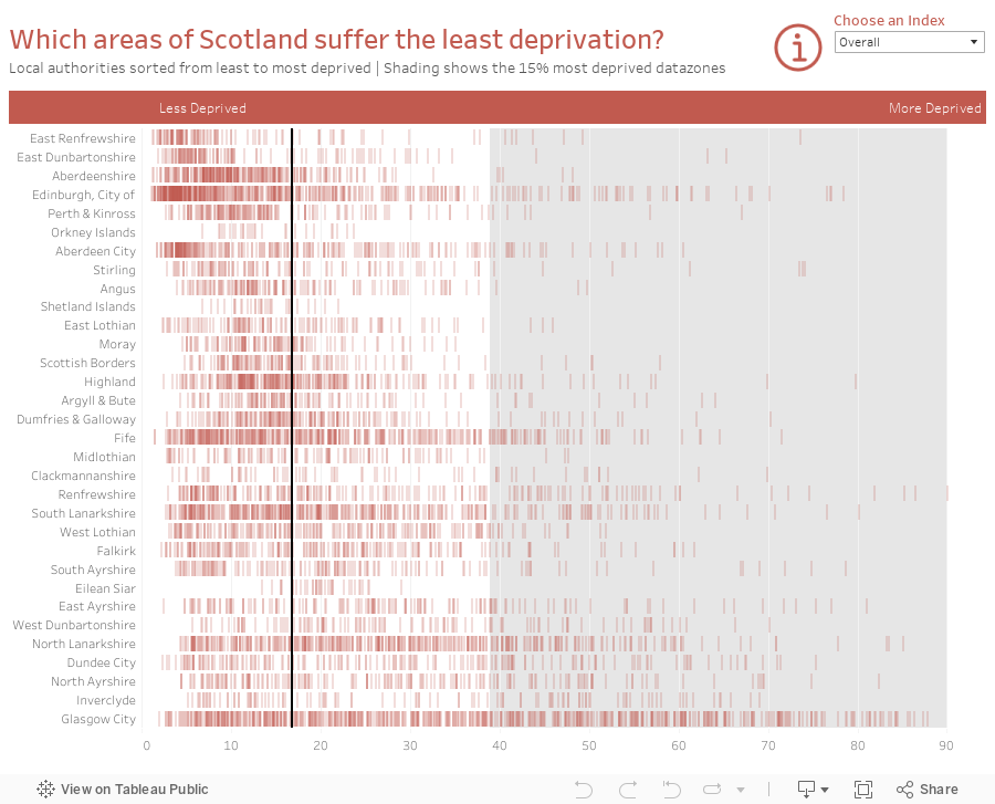
Makeover Monday: Which areas of Scotland suffer the least deprivation?
barcode
,
deprivation
,
dot plot
,
Makeover Monday
,
Scotland
,
SIMD
No comments


What works well?
- Nice headers to help you know what is good and what is bad
- Alphabetical sort makes it easy to find a specific local authority
- Shading of the lowest 15% provides nice context
- Bar code representation makes spotting concentrations really easy
What could be improved?
- Unless you read the accompanying website, you can't really make sense of the chart on its own as there is now scale and no explanation of how to read it.
- There's no way to rank the local authorities from best to worst (or vice versa).
- Interactivity would help with know which datazones are which
- None of the other ranking metrics are included; this only covers the overall rank
I really like the bar code chart, so I set out to recreate it with a better color scheme. I also include a more meaningful title, explanations via the information icon, and an option to choose different metrics. In addition, I used the score instead of the rank. For me, using the score makes more sense because you're looking at how each datazone is doing instead of how they rank against each other.
Here are two example of the bar code chart I created, one for the overall score and one for education.


What I did notice, though, was that two of the scores are percentages: Employment and Income. So for those metrics, I switch the viz to a dot plot. The more dots that are on top of each other, the dark they are represented, thus showing the concentration. Here's an example of Employment scores.

Here is the full interactive version. Overall, a fun visualisation to re-create.
April 12, 2015
English Football Stadium Tracker
england
,
English Premier League
,
football
,
London
,
map
,
running
,
Scotland
,
soccer
,
UK
,
united kingdom
No comments
Today is Sunday, which means it’s Sunday Long Run. Those of you that are runners know what I mean. I moved to London last Saturday and my goal for my runs is to use them as a way to explore new places. Yesterday, I went to see Leeds United play with a friend from Atlanta who grew up a Leeds fan.

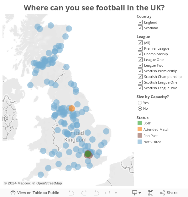
Today, I set out to see some football stadiums. I mapped a route that took me from Wimbledon, past three iconic football stadiums.
Today, I set out to see some football stadiums. I mapped a route that took me from Wimbledon, past three iconic football stadiums.
 |
| Craven Cottage - home of Fulham FC |
 |
| Loftus Road - home of QPR FC |
 |
| Stamford Bridge - home of Chelsea FC |
And yes, I know I titled this post "English" and Scotland is not part of England, but UK football stadium tracker doesn't resonate as well with me.
Subscribe to:
Posts
(
Atom
)


