November 1, 2022
#MakeoverMonday Week 44 - Fundraising vs. Spending by Members of the 117th Congress

The midterm elections in the US are next week. If you're able to vote, please do. Democracy is at stake.
This week's data was about fundraising, spending and debt by people currently in Congress. If you missed #WatchMeViz, I showed 16 different ways to visualize this data set. Hopefully they give you a bit of inspiration for creating your own.
Catch up with the show below. In the end, I went with a bar chart that compares funds raised vs. spent by State. I also have a gantt bar to show the difference between the two. I have a tutorial of that chart here.
Below this video is an image of the dashboard I created. Click on it to see the interactive version on Tableau Public.
March 2, 2021
How to Create a Circle Timeline

November 1, 2016
Makeagain Monday: Popping the Bubbles of the Scottish Index of Multiple Deprivation

The purpose isn't to pick on anyone. I use this as a teaching method. How can I take an existing visualisation and show I would improve and simplify it step-by-step. I only detail what I think doesn't work about the visualisation.
This week we looked at the Scottish Index of Multiple Deprivation and Pablo Gomez create this visualisation (click on it for the interactive version):

What doesn't work?
- Packed bubbles are basically impossible to compare
- What does the size and color of the bubbles mean?
- Do the colors coordinate with the scatter plots? (The answer is no, but I didn't know that until I downloaded the workbook.)
- What do the scatterplots add? They all basically look the same.
- The massive image on the right takes up like 25% of the space. What does the flag mean?

September 12, 2016
Makeover Monday: Which shipping company really makes the most money?
This week’s Makeover Monday looks at the largest shipping container companies of 2016. The article includes this packed bubble chart:

What works well?
- It’s eye-catching and draws you in.
- The method for labelling ensures you only see the largest (as they names won’t fit otherwise).
- The color helps identify the largest companies.
What doesn’t work?
- Ranking is nearly impossible
- Are the depth of color and the size of the bubble for the same metric? The viz doesn’t tell us, so we’re left to guess.
- Is big good or bad?
- There’s no focus or context.
I started by changing it to a bar chart, but found that to be too boring, though effective. Then I saw an example by Shawn Levin which shows looks at the TEU per ship. That adds much more context to the visualisation. Shawn compared Total TEU to TEU per ship.
For me, I thought it was more meaningful to look at TEU per ship for both the total shipments and for the ships each company owns. This led me to the slope graph you see below which tells a much more meaningful story.
March 3, 2016
Dear Data Two | Week 44: Distractions

For week 44, I tracked all of the things that distracted me. The data I collected included:
- When did I get distracted?
- What was I doing at the time?
- What distracted me?
- How long was I distracted?
When doing the analysis in Tableau, I started doing what I always do by building lots of different views. I started with how many, but there weren’t any days that were massive outliers. When looking at how long I was distracted, there was a big outlier on Wednesday. That was because we had Caroline Beavon teaching in amazing data visualisation class at the Data School and she introduced us to an infographics design tool called Piktochart. This is when I distracted myself. It was fun to play with and got me thinking more about design.
I built several more views looking at the different dimensions against the different measures. Nothing particularly exciting…until I built a bubble chart in which I colored the bubbles by whether or not social media was the distraction.

I generally have a disdain for bubble charts, but this particular view helped me easily see how often social media is a distraction. Does this mean I’m on my phone too much? Probably!
The view above simply looks at how often, meanwhile looking at the bubble chart by how long the distractions lasted makes social media distractions look not so awful.

Lastly, I needed to find a view that would allow me to incorporate all of the dimensions along with the length of each distraction into a single view. I came up with this viz:

Here are some of the design decisions I made:
- Show the day of the week left to right
- Inside each day, show the distractions in order from first to last going left to right
- To show what I was doing and what distracted me, I wanted to go with the idea of going from something to something else. I ended up with filled circles inside open circles. The open circle is what I was doing; the filled circle is what distracted me.
- Create groups of activities and distractions so that there aren’t too many colors
Lastly, I liked what Stefani did for her week 44 with the lines, so I tried to do something similar with my postcard version while maintaining the view I created in Tableau.
August 24, 2015
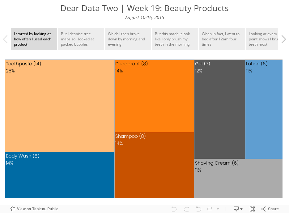
Dear Data Two | Week 19: Beauty Products

Enjoy!
October 20, 2014
Monday Makeover: Causes of Death in the USA

One of my frustrations with Viz of the Day, as I've noted on both of my appearances on the Tableau Wannabe Podcast, is that I suspect people look at these as examples of visualizations done well, even though that's not the true intent. Yes, I'm saying that anecdotally, but I base this off of a few conversations I've had with people about it.
In today's viz, there are an abundance of issues. Here are a few:
- The filled map makes it impossible to see the smaller states. In fact, it's nearly impossible to trigger the action when hovering over Rhode Island. Filled maps can easily skew the data towards the larger states, so a bubble map is preferred.
- The temperature diverging color palette for the map is not color-blind friendly.
- The colors on the map and on the packaged bubbles are too similar. Green on the map means a low rate, while green on the bubbles means cancer.
- The stacked bar chart in the middle adds no value. When you hover over a state, the packed bubbles changes, so what value is the stacked bar chart adding.
- Packed bubbles are a very poor way to communicate ranking. A sorted bar chart is better.
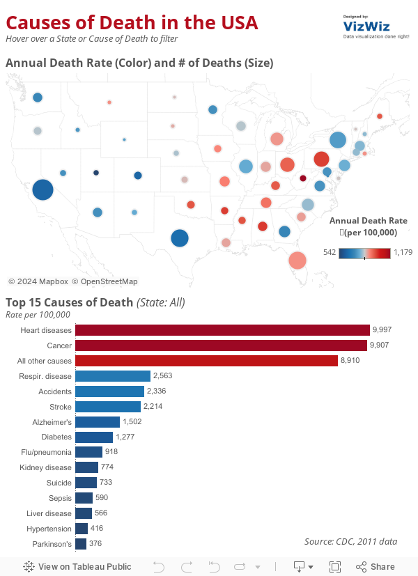
- I changed the map to a bubble map. Now it's easier to see all states because I've also sized the states by the number of deaths for additional context.
- I'm using a blue-red color palette consistently throughout to represent the death rate.
- I removed the individual colors for the diseases and colored them by the death rate instead.
- I killed the stacked bar chart. I also included an action from the bar chart to the map (in addition to the existing map to bar chart action).
- I changed the packed bubbles to a ranked bar chart.






