March 8, 2024
Visualizing Time Series Data in Tableau
Last night I was invited to speak at the Chicago Tableau User Group about visualizing time series data. Other than spatial data, time series data is my favorite to visualize.
There seem to be endless methods for making time series data useful for analysis. Check out this video for 60ish ways to visualize time.
I had a 20 minute slot to present and, of course, I ran over time. I seem to do this with every session I run lately. Be it training for Next-Level Tableau, presenting at events, or running a livestream, I get into a groove and don't want to stop.
I was able to create 14 vizzes in 20+ minutes. I added an extra in this workbook to make the dashboard format nicely.
Click on the image below to download the workbook and dissect it. Get the data here to follow along.
Have fun!

August 15, 2023
An 8-Chart Guide to Dashed Lines in Tableau

In this tip learn when to use of dashed lines. Through this video, I'll walk you through 8 distinct examples, demonstrating the effectiveness and clarity that dashed lines can bring to your data representation:
- Line Chart with Dashed Elements: Understand the basics of creating dashed lines.
- Multiple Lines Differentiation: Explore how to distinguish multiple measures using varied dashed patterns.
- Line/Area Chart Combination: Integrate dashed lines with filled areas.
- Comparison to a Moving Average: Learn how dashed lines can contrast raw data against its moving average, helping in trend analysis.
- Current Year vs. Prior Year: Used dashed lines to make year-on-year comparisons.
- Combination Chart: Combine several chart types, using dashes to maintain clarity.
- Barbell Chart Analysis: Learn how dashes can link data points in a barbell chart, highlighting change and consistency.
- Forecast vs. Actuals: Create a forecast with dashed lines.
June 26, 2023
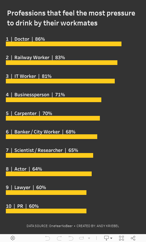
#MakeoverMonday 2023 Week 26: The UK's Drinking Culture

November 1, 2022
#MakeoverMonday Week 44 - Fundraising vs. Spending by Members of the 117th Congress

The midterm elections in the US are next week. If you're able to vote, please do. Democracy is at stake.
This week's data was about fundraising, spending and debt by people currently in Congress. If you missed #WatchMeViz, I showed 16 different ways to visualize this data set. Hopefully they give you a bit of inspiration for creating your own.
Catch up with the show below. In the end, I went with a bar chart that compares funds raised vs. spent by State. I also have a gantt bar to show the difference between the two. I have a tutorial of that chart here.
Below this video is an image of the dashboard I created. Click on it to see the interactive version on Tableau Public.
May 25, 2022
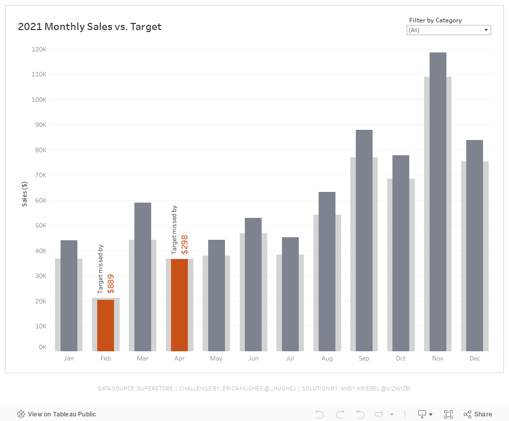
#WOW2022 Week 20 - Monthly Sales vs. Target
Resources
- Week 20 Challenge
- My Solution (image below)

March 8, 2021
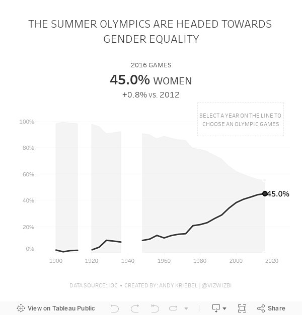
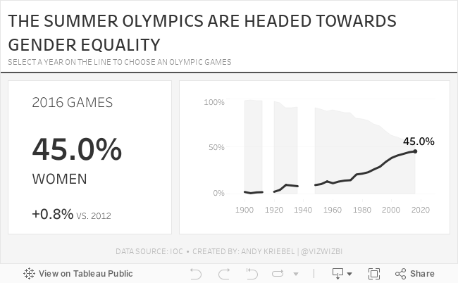
#MakeoverMonday Week 10: Female Participation in the Summer Olympics

First, thank you to Tommaso Ferri for moderating Watch Me Viz. I enjoyed working with this data set and was able to build nine vizzes in about 40 minutes, then took another 40-50 working through formatting and some pesky table calcs. I got there in the end!
After the live stream ended, I created one more version that uses containers. I think I like this one best. Below you'll find the live stream recording as well as the two final visualizations.
Thanks for watching!
November 24, 2020
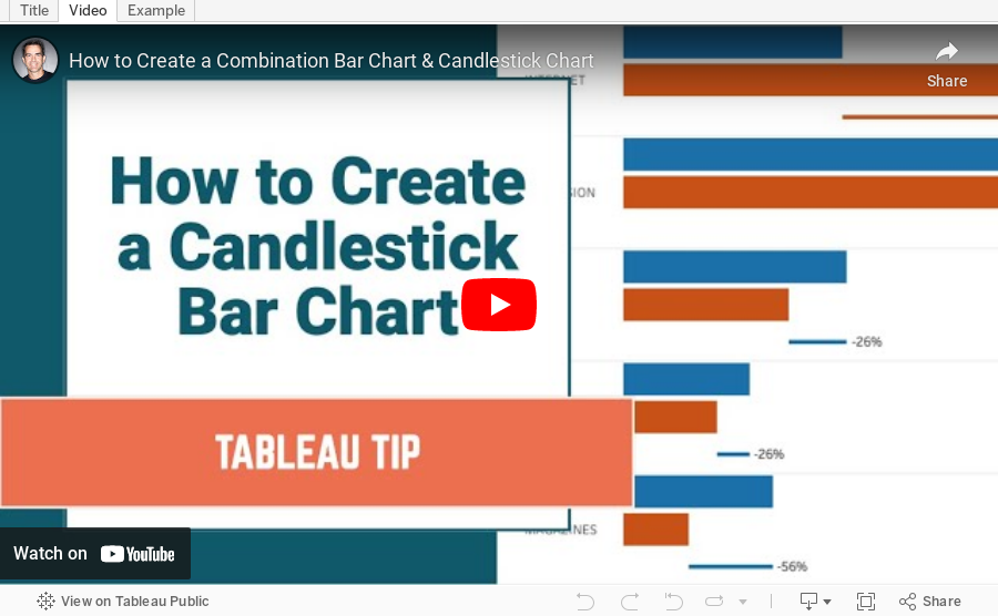
How to Create a Combination Bar Chart & Candlestick Chart

In a recent Makeover Monday #WatchMeViz, I showed how to create a bar chart to compare two measures and then add a candlestick chart as well to show the difference between the two measures. It's actually quite simple; it requires some knowledge of:
- How Measure Names and Measure Values work together
- How to create a combined axis chart
- How to create a dual axis chart
- How to create a Gantt chart
September 13, 2016
Tableau Tip Tuesday: How to Create a Combination Chart with Overlapping Bars & a Line

In this week’s tip, I look back at one of my most popular posts - 7 easy steps to create a combination chart with overlapping bars & a line. The tip hasn’t changed much, however, this time there’s a video.
January 31, 2016
Makeover Monday: Travel Agents Are a Relic of the Past and Hotels Could Be Next

The chart that we're reviewing this week for Makeover Monday is from Tech Chart of the Day. The title of the article "Travel Agents Are a Relic of the Past and Hotels Could Be Next" is quite catching, but the accompanying chart leaves a lot to be desired.

What can be improved?
- The title is boring and doesn't capture my attention.
- I'm not exactly sure which axis goes with which colour because neither axis is labeled.
- The colours of the lines are too similar for me.
- For some reason, my eyes want to match the darker blue line with online hotel revenue and the lighter blue line with # of travel agents, but they're actually the opposite.
- A dual-axis chart is often used to show a correlation, but is the correlation explained by this chart.


A combination chart like this makes our eyes separate the two metrics while still allowing us to see the patterns of both at the same time. For example, it's easy to see that online hotel revenue is steadily increasing and the number of travel agents is decreasing.
However, the story here is the growth of revenue for online hotel services like Airbnb, VRBO, Flipkey, and HomeAway compared to the decline of travel agents. So, with that in consideration, I wanted to see how the respective growth (or decline) rates since 2000.

In this view, notice how I've significantly changed the title to meet the objectives of the story and how I've changed the axis titles. This view clearly shows the significant increase in online hotel revenue since 2000 and the fairly significant decrease in travel agents. Yet I still don't love it.
I'm thinking a connected scatterplot might do the trick. As Ben Jones said:
The connected scatterplot imparts a sense of travelling a pathway through a terrain that has twists and turns, loops and sudden rises and falls that encode how the two different variables changed together.That's exactly what I'm looking for; a method for showing how the two variables move together. So taking the % change since 2000 from above and converting it into a connected scatterplot, I get this:

I really like how this shows how the decrease in travel agents and the increase in online hotel revenue shifts together. I also added annotations to drive the point home even farther. Yet I still feel like this isn't quite done. I like the annotations, but not the axis scales. While the % change gives me nice context, I feel like I'm losing the overall magnitude of the changes.
Lastly, I removed the % change over time from each axis and went back to the raw values. I then made the line dashed because I feel like the dashed lines show the trails through time better.
In particular, I like how the design of this connected scatterplot starts at the upper left and moves down and to the right. I used Cole Nussbaumer's "where are your eyes drawn" test by turning my head away then back and seeing where my eyes go first. They went directly to the upper left dot for the year 2000, just like I had hoped.
You can download this workbook from my Tableau Public profile here.
December 8, 2015
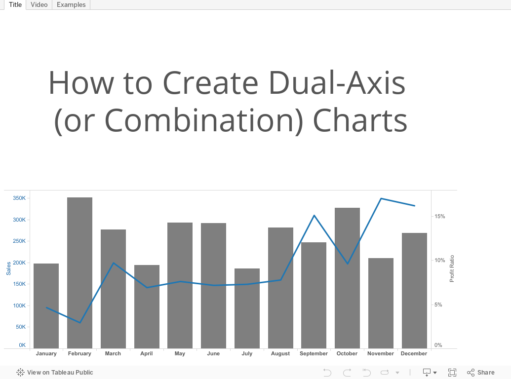
Tableau Tip Tuesday: How to Create Dual-Axis Charts

August 27, 2011
Tableau Tip: 7 easy steps to create a combination chart with overlapping bars & a line
As a follow up to my previous post, which showed how a dual-axis chart looks in Tableau (compared to the Excel version I wrote about in the post previous to my previous post), I was asked by someone named Anonymous (I can never seem to identify him/her) to create similar instructions for building the dual-axis overlapping bar and line chart in Tableau.
Here are the steps I used to produce the chart (there are a billions ways to skin the cat, so take it for what it is):
Step 1: Place the Week dimension on the Columns shelf and the Measure Values measure on the Rows shelf

Step 2: Drag the Number of Records pill off of the Measure Values shelf to remove it

Step 3: Drag the Units pill from the Measure Values shelf to the right edge of the chart (i.e., the secondary axis). You know you’re on the secondary axis when you see the dashed vertical line

You’re entire canvas should now look like this:

Step 4: Right-click on the Units pill, choose Mark Type => Line

You’re viz should now look like this:

Step 5: Right-click on the Measure Values pill, choose Mark Type => Bar

STOP! Pop the top off that next bottle of Blue Moon. Double-check your work. You’re viz should now look like this. If not, click the Undo button until you get back to a good spot.

Step 6: Drag the Measure Names dimension onto the Size shelf

Step 7: At this point, the bars are stacked. So on the Analysis menu, choose Stacked Marks => Off

That’s it! You’re done! There’s some formatting you could do like adjusting the width of the bars, changing the number format on the axes, etc., but the essence of the chart is now complete. Seven simple steps in 15 seconds (I wrote 90 seconds in my last post, but I timed myself this time).


