November 1, 2022
#MakeoverMonday Week 44 - Fundraising vs. Spending by Members of the 117th Congress

The midterm elections in the US are next week. If you're able to vote, please do. Democracy is at stake.
This week's data was about fundraising, spending and debt by people currently in Congress. If you missed #WatchMeViz, I showed 16 different ways to visualize this data set. Hopefully they give you a bit of inspiration for creating your own.
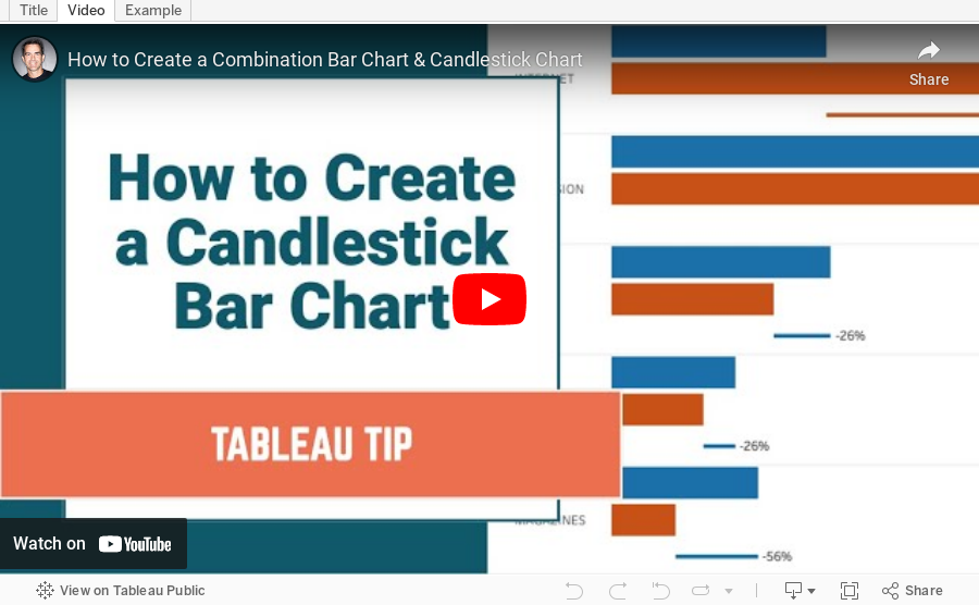
Catch up with the show below. In the end, I went with a bar chart that compares funds raised vs. spent by State. I also have a gantt bar to show the difference between the two. I have a tutorial of that chart here.
Below this video is an image of the dashboard I created. Click on it to see the interactive version on Tableau Public.
June 7, 2021
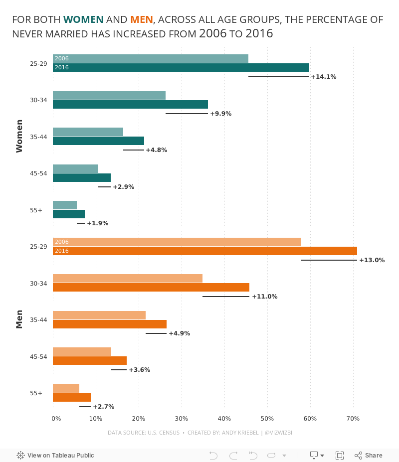
#MakeoverMonday 2021 Week 23: The Percentage of Never Married is on the Rise

- Final Viz (and below)
- Preferences file (all of my custom color palettes)
- How to Create a Combination Bar Chart & Candlestick Chart
January 13, 2021
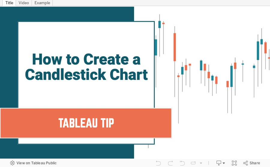
How to Create a Candlestick Chart

What is a Candlestick Chart?
A candlestick chart is a style of financial chart used to describe price movements of a security, derivative, or currency. Each "candlestick" typically shows one day, thus a one-month chart may show the 20 trading days as 20 candlesticks. Candlestick charts can also be built using intervals shorter or longer than one day.It is similar to a bar chart in that each candlestick represents all four important pieces of information for that day: open and close in the thick body; high and low in the “candle wick”. Being densely packed with information, it tends to represent trading patterns over short periods of time, often a few days or a few trading sessions.~ Source: Wikipedia
In this tutorial, I show you how to build a candlestick chart in Tableau. They are built as Gantt charts with a couple of simple calculations. Follow along by downloading the data set here.
November 24, 2020
How to Create a Combination Bar Chart & Candlestick Chart

In a recent Makeover Monday #WatchMeViz, I showed how to create a bar chart to compare two measures and then add a candlestick chart as well to show the difference between the two measures. It's actually quite simple; it requires some knowledge of:
- How Measure Names and Measure Values work together
- How to create a combined axis chart
- How to create a dual axis chart
- How to create a Gantt chart