January 13, 2021
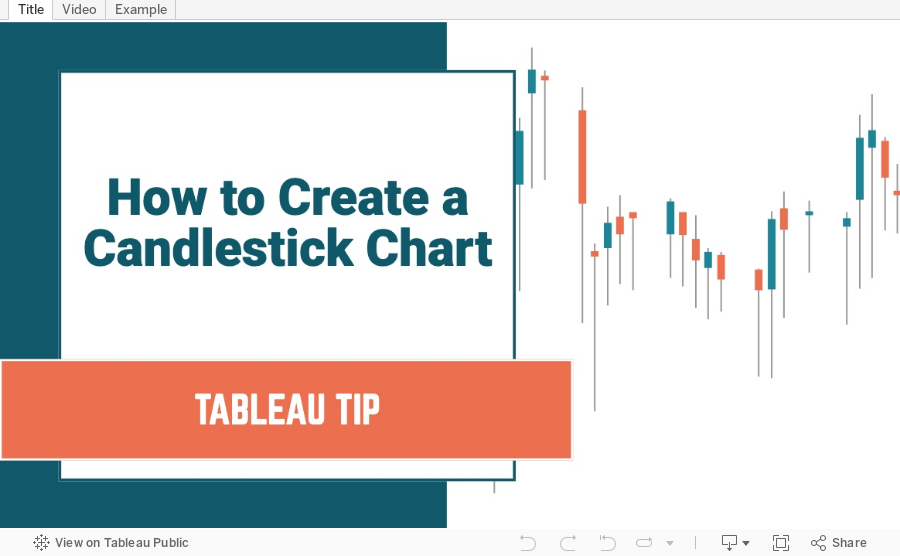
How to Create a Candlestick Chart
calculated field
,
candlestick chart
,
change
,
chart
,
dual axis
,
gantt
,
graph
,
how to
,
line chart
,
measure names
,
measure values
,
stock
,
table calculation
,
tableau
,
tip
,
tutorial
No comments

What is a Candlestick Chart?
A candlestick chart is a style of financial chart used to describe price movements of a security, derivative, or currency. Each "candlestick" typically shows one day, thus a one-month chart may show the 20 trading days as 20 candlesticks. Candlestick charts can also be built using intervals shorter or longer than one day.It is similar to a bar chart in that each candlestick represents all four important pieces of information for that day: open and close in the thick body; high and low in the “candle wick”. Being densely packed with information, it tends to represent trading patterns over short periods of time, often a few days or a few trading sessions.~ Source: Wikipedia
In this tutorial, I show you how to build a candlestick chart in Tableau. They are built as Gantt charts with a couple of simple calculations. Follow along by downloading the data set here.
Subscribe to:
Post Comments
(
Atom
)


No comments
Post a Comment