November 29, 2017
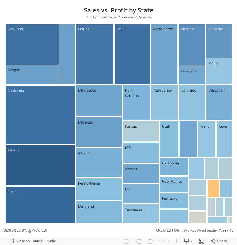
Workout Wednesday: Treemap Drilldown
This week's Workout Wednesday from Emma builds primarily on several previous challenges, primarily:- Week 12: Highlight a Treemap
- Week 17: Product Spread Treemap (Part 1)
- Week 19: Product Spread Treemap (Part 2)
- Week 41: State to City Drilldown
If you haven't done those weeks yet, I would highly encourage you to tackle those first. They build upon each other and make this week's challenge much easier.
As for week 48, Emma asked us to build this treemap:
Go to Emma's blog for the requirements. For me, this was pretty straightforward as I'd done the other challenges. The only part that tripped me up was the sorting of the States. Once I got that figured out, it all fell into place.
Good luck! Here's my viz:
November 27, 2017
Makeover Monday: Two Simple Ways to Improve the World
To celebrate week 100, Eva and I will be hosting a webinar next Monday and we'll be joined by Andy Cotgreave (yes I know it's week 101). Register here. In this webinar we'll reflect on the first 100 weeks and answer any questions you have. It's going to be fun!
In addition, we have two more webinars coming up this week. You can find all of our webinars here.
- Wednesday, Nov 29 @ 6pm GMT - Week 48 Viz Review
- Thursday, Nov 30 @ 4pm GMT - All I want for Christmas is Maps (with Mapbox)
This week, Eva picked something relating to 100.

What works well?
- It's quite attention grabbing due to the overall design and color.
- The big text in the middle catches your eye.
- Every section is clearly labeled.
- Underlining each slice with the color it represents.
What could be improved?
- There's no overall structure or order.
- At first glance it looks like a donut chart, but each section adds up to 100 by itself.
- The grey background behind each section label is unnecessary.
- Within each section, the segments should be ordered by size.
My design this week is heavily influenced by Eva and Charlie Hutcheson. Both of them made very simple visuals that are quite stunning and stop you in your tracks and make you think. So how could I do something similar? Well, here it goes...
November 22, 2017
Workout Wednesday: Fun with Formatting
brands
,
challenge
,
formatting
,
rank
,
Rody Zakovich
,
table calculation
,
Workout Wednesday
4 comments
The week 47 challenge builds upon this viz from Zen Master Rody Zakovich which has you taking 100 rows of data and displaying it in a single viz as five columns. Sounds simple right? It's not.The data this week is the top 100 global brands, which you will need to download here. The data is only two columns: (1) the name of the company and (2) it's 2017 value.
Here are the requirements:
- Everything MUST be done in a single worksheet. Yes, the title, subtitle, footer, etc. all must be done in one sheet.
- Put the worksheet in a dashboard before publishing that is 1200x650, but DO NOT add anything else to the dashboard.
- Display the data in 5 columns, with each column being a grouping of 20 brands.
- The brands must be displayed in order based on their value.
- Include the ranking next to each name. These need to be left aligned.
- Match the tooltips (easy)
- Make sure every line you see in mine is in yours.
- The title should be 24pt Tableau Semibold. The subtitle is Tableau Book 9pt.
- The footer is 12pt.
- The column headers are 14pt Tableau Medium.
- Everything else is Tableau Book 9pt.
Click on the image below for the interactive version. Post your solution to Twitter and tag @EmmaWhyte and @VizWizBI. Most importantly...have fun!
That's it! Good luck!
November 21, 2017
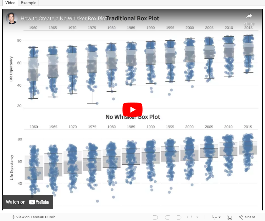
Tableau Tip Tuesday: How to Create a No Whisker Box Plot
In a recent Makeover Monday viz review, I mentioned how I find the whiskers on box plots distracting at times. This is only helpful advice if there's a way to create a no whisker box plot. In the box and whisker settings in Tableau, there's no way to NOT show the whiskers. So this week's tip shows you how to work around that.Enjoy!
November 20, 2017
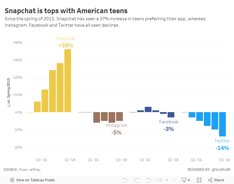
Makeover Monday: Snapchat is tops with American teens
Business Insider
,
facebook
,
instagram
,
Makeover Monday
,
snapchat
,
social media
,
teens
,
trends
,
twitter
4 comments
The original viz comes to us from Business Insider:

What works well?
- Catchy title that quickly tells the story of the viz
- Bar charts are simple to understand and they show the pattern well
- Sorting the apps by the most recent value
- Including the axis, otherwise we wouldn't know what the labels mean on the top of the bars
What could be improved?
- The fading colors across the time periods are unnecessary. Include a time axis instead.
- Change the numbers above each bar to percentages
- The color legend doesn't match any of the bar charts and should be removed.
My Ideas
I started by looking at slope graph comparing the starting and ending periods.
This tells the story simply, but also doesn't show enough of the change over time. Next, I took the original and turned it into a line chart, labeling only the start and the end and also changing the colors to match the official colors of each app.
I think the line charts help make the change and trends much more obvious than the bar charts in the original. From there, I decided to look at the change since the starting period (spring 2015) to make the growth or decline of each app easier to understand. And with that, here's my Makeover Monday week 47.
November 17, 2017
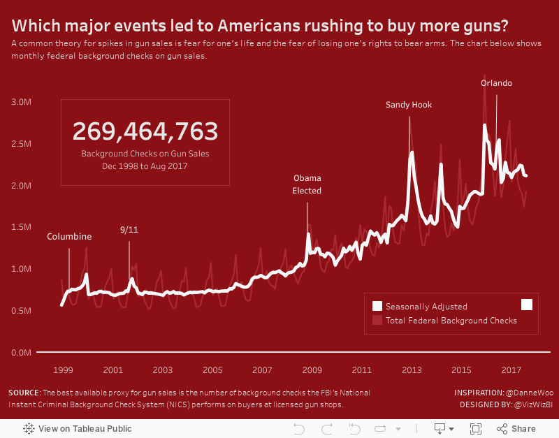
America's Love Affair With Guns
America
,
Danne Woo
,
data.visual
,
gun control
,
guns
2 comments
Another debate for another time.
I bring this up because I saw this really striking viz from Danne Woo, Founder of data.visual. I met Danne a few years ago when I was working at Facebook and we've stayed in contact since. I really like the work he and his team create.
I reached out to Danne because I wanted to recreate his chart in Tableau for practice. He gladly sent me the data and encouraged me to do so. I designed it slightly differently, while maintaining the thematic colors Danne chose.
What did I change?
- I put the title in the form of a question.
- I included a BAN for the total number of background checks to give the viz (and the problem) some overall scale.
- I removed the gridlines (thanks to Jonathan MacDonald for that suggestion).
- I made the white line thicker than the red line to make it stand out more.
- I made the scale all the same number type. The original mixes K and M.
The best way to improve it to practice. Learning is never done.
November 15, 2017
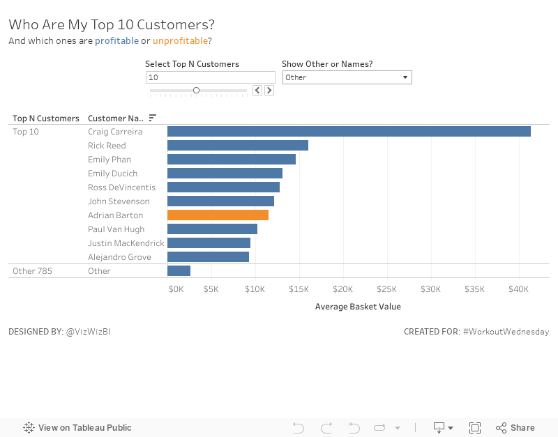
Workout Wednesday: Top N Customers with a Twist
boolean
,
computed set
,
parameters
,
sets
,
top
,
Workout Wednesday
No comments
For Workout Wednesday week 46, Emma had a nice little twist on the standard top N scenario. Head over to her blog for the requirements.I learned a bit about calculated sets and mixing them with parameters in calculations. Overall, not too bad. Good luck!
November 13, 2017
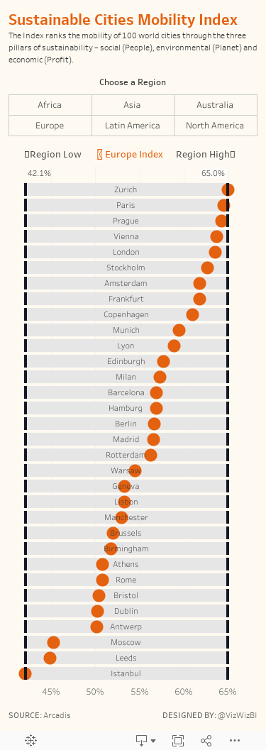
Makeover Monday: Sustainable Cities Mobility Index

What works well?
- Ranking the countries from highest to lowest
- Good title and sub-title that explain the viz
- Including the city names
- Noting how the index was calculated
- Including the data source
- Choosing colors that go well together
What could be improved?
- Make the bar charts bar charts. Making them look like the front of a train is cute, but it's also distracting.
- It's limited to the top 10. What are the other 90 cities? How can I find the ranking of cities in my region?
- The icons off to the right are unnecessary.
My goals
- Keep it simple; I only had around 30 minutes to work on this
- Allow the user to pick a region
- Use the design from last week's Workout Wednesday so I could practice it some more. I was excited to find a dataset that allowed me to use this technique again.
- The vizzes on the Arcadis website are pretty good. Can I build upon those? Can I use their colors?
- Include a description of the index
- Create a mobile version
With those goals in mind, here is my makeover for week 46.
November 8, 2017
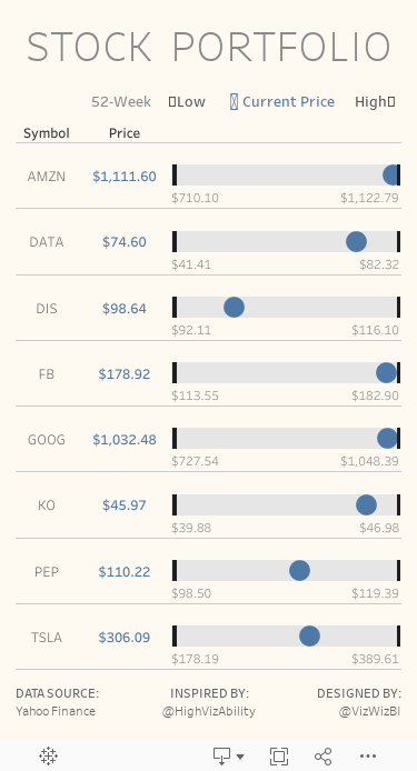
Workout Wednesday: Stock Portfolio
calculations
,
data prep
,
Jeffrey Shaffer
,
portfolio
,
reshape
,
stock
,
Workout Wednesday
3 comments
Here's what you need to do:
- Download the data here. You will most likely need to do a bit of data prep like pivoting, at least I needed to.
- Match the title
- Match the legend
- Match the tooltips
- The black bars represent the 52-week low and 52-week high for each stock and the text below each bar also shows these values.
- The blue dot represents the latest price.
- Size should be 375x667 to fit on a mobile device. If it doesn't display properly on my phone, then it's not right. Use Device Designer.
- Rebuild everything to look identical to mine.
Good luck!
November 7, 2017
Data Science Go - The Next Big Data Analytics Conference?
conference
,
Data Science
,
DSGO
,
recruiting
,
speaking
,
talent
No comments
If you're nearby and want to come, you can still attend. In fact, get 50% OFF using the coupon ANDY50OFF.
See you in San Diego!
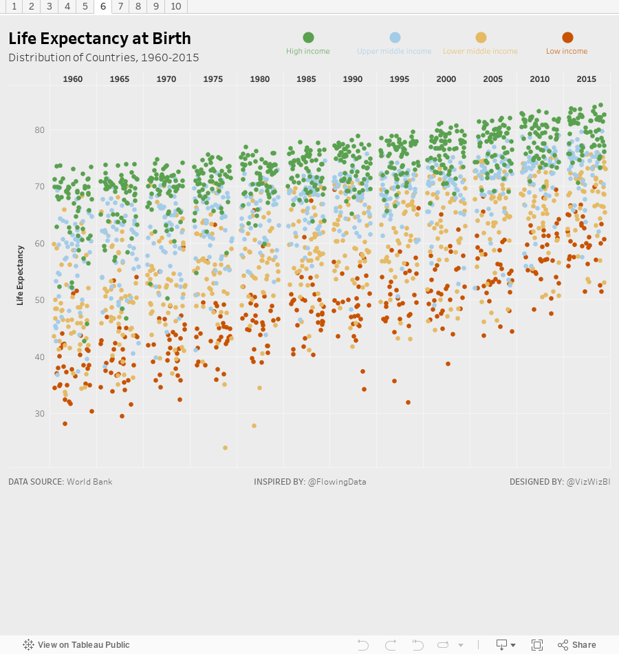
November 6, 2017
Makeover Monday: Life Expectancy at Birth, 1960-2015
I went a bit overboard this week. Before I get to that, let's review the original viz:
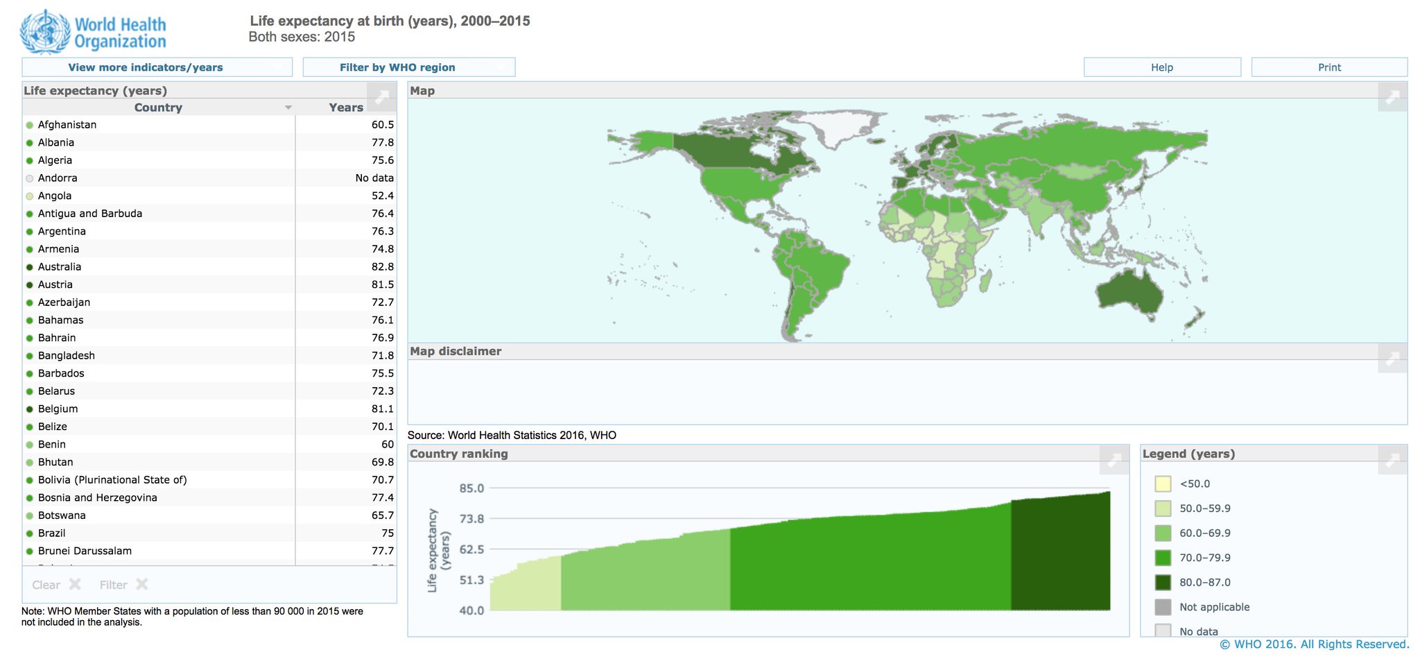
What works well?
- Nice interactivity across the charts
- Maps are always easy to understand and audiences recognize them quickly
- Using simple colors for the color legend
- Simple, easy to use filtering
What could be improved?
- The bar chart should start at zero.
- The bars are in reverse order.
- The map makes comparing small countries nearly impossible.
What I did
I found a great post by Nathan Yau back in January based on this same data set. In it, he created 25 different vizzes with this data, which helped me draw inspiration. I had also been planning a table calcs training class for The Data School, so I spent a lot of time on this over the past month or so building lots of vizzes. In the end, I've come up with 10 alternatives.
The first viz is my the favorite of everyone I've shown these to, so I'll use this as my entry for this week. Farther down, you'll see the other nine as images, which you can click on to go to the live version.
Subscribe to:
Posts
(
Atom
)


