December 20, 2021
How to Filter by Rank Across Multiple Worksheets
In this tip, I show you how to use a parameter to filter the rank across multiple worksheets or an entire dashboard.
December 3, 2019
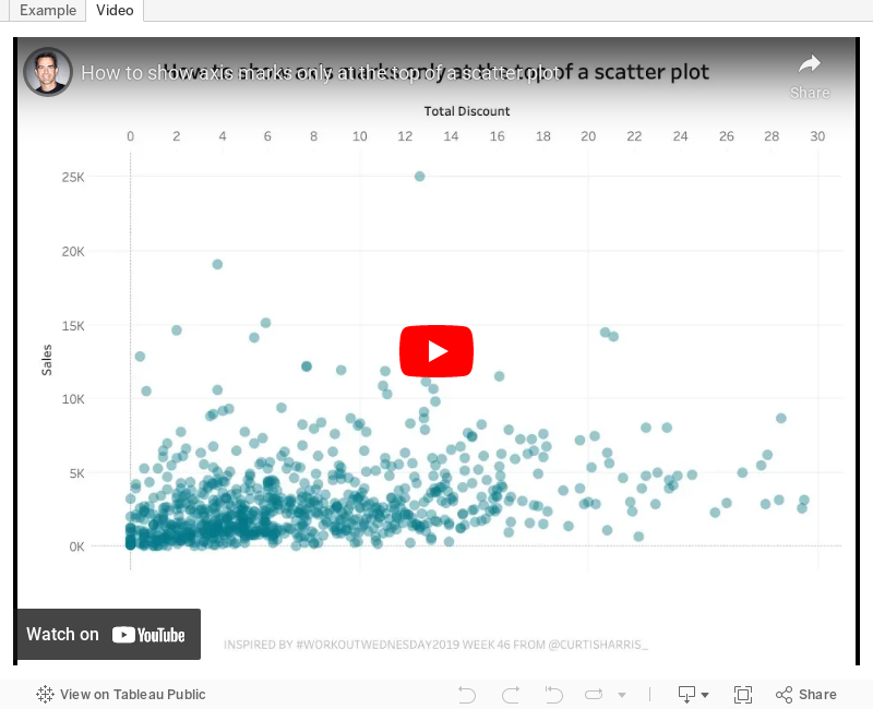
#TableauTipTuesday: How to show axis marks only at the top of a scatter plot

In this week's tip, I show you how to show the axis of a scatter plot only on the top of the view. Tableau doesn't provide an option to move the axis to the top, so this trick shows you a simple workaround.
Enjoy!
November 15, 2017
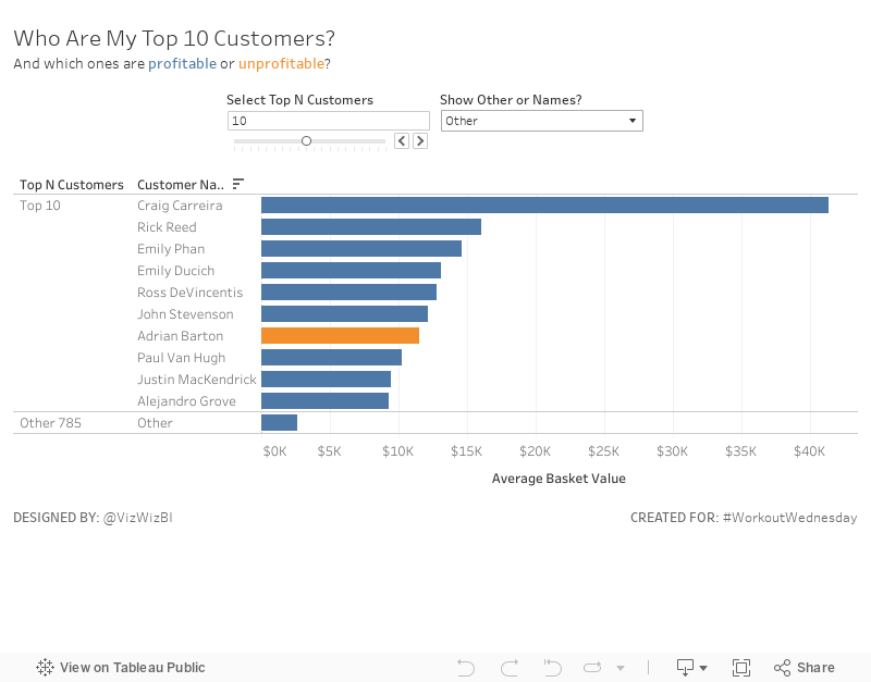
Workout Wednesday: Top N Customers with a Twist
I learned a bit about calculated sets and mixing them with parameters in calculations. Overall, not too bad. Good luck!
July 26, 2017
Workout Wednesday: Order Analysis with LODs
- The first chart should could the number of customers by the number of orders they have made.
- The first chart should have its bars coloured blue for 10 orders and above.
- The title and tooltip should match as well. The title and tooltip changes as you select a Region.
- The bottom chart (Top 10 products) should be filtered by the Region also. The top 10 products should change depending on the Region you select.
- When you click on a bar in the top chart it should also filter the top 10 products.
- The title and tooltip on the second chart should also change when you select a Region.
February 24, 2015
Makeover Monday: From Sunburst to Story - The State of American Well-Being

The story the designer is trying to tell is really quite simple. The longer the bar, the higher the ranking. The problem, though, is that they are order alphabetically which makes ordering them by rank basically impossible.
I was able to locate the source of the data on the State of American Well-Being website. From there, I had to download the reports for 2013 and 2014 and then I consolidated them into Excel, which you can download here.
At first, I was thinking a simple bar chart would work, but that turned out really boring because the only data to display is the ranking, not the value that makes up the ranking. I decided instead to create this story in Tableau.
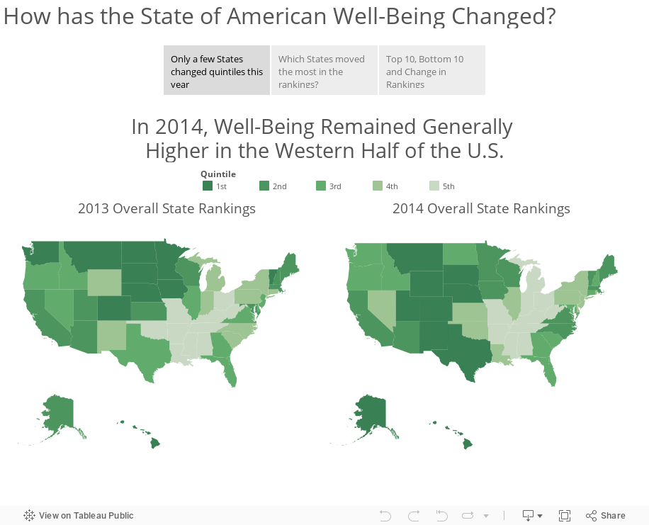
Download the workbook used to create this story here (requires Tableau 9).
January 6, 2012
Information is Beautiful? Only if you like a totally useless mess of nothingness
I have a problem with David McCandless of Information is Beautiful. From his own website he says:
A passion of mine is visualizing information – facts, data, ideas, subjects, issues, statistics, questions – all with the minimum of words.
I’m interested in how designed information can help us understand the world, cut through BS and reveal the hidden connections, patterns and stories underneath. Or, failing that, it can just look cool!
So let’s look at a couple of these statements in the context of his latest infographic.

Has David met any of his own criteria? Let’s check.
- Minimum of words – No! All this infographic contains is words…horrible!
- Facts – Maybe. If you consider a bunch of words facts, then I guess he meets this criteria.
- Data – No, not even close
- Ideas – No, nothing that I can see
- Can help us understand – No, not for me
- Reveal the hidden connections, patterns and stories – No, absolutely not!
- It can just look cool – Seriously?
To summarize, this is one of the worst infographics I’ve EVER seen. Shouldn’t we expect better from an “expert”? It’s impossible to gleam even the slightest bit of insight or data outside two things: nationality and that the album falls somewhere in the top 21.
How am I supposed to deduce the rank? The size? The width? The font? The location? I have no idea and no one else will likely know either. Throw me a bone and at least give me some type of instructions for making sense of this mess.
And another thing. Why the top 21? At first, I thought the list only went to 21, but Metacritic.com lists the top 30. And four albums are tied for 20th. The top 21 makes no sense whatsoever! Maybe David likes blackjack?
Let’s consider the definition of an infographic from Wikipedia (not the defining source, I know). I’ve bolded what I consider the key points.
Information graphics or infographics are graphic visual representations of information, data or knowledge. These graphics present complex information quickly and clearly.
Did David meet any of these criteria?
- Graphic visual representation – No, he merely created a wordle.
- Present complex information quickly and clearly – No. I can’t garner any insights quickly and clearly. Can you?
Ok, you can tell that I think his work is a totally useless mess. But how would I present the data to allow for quick and clear insights? I’d use Tableau.
My viz may not be an “infographic” in its purest sense since it doesn’t have all of the cute pictures, figurines, and unnecessary clutter, but I have met David’s criteria, the criteria for an infographic, plus much more.
- Graphic visual representation – Check
- Present complex information quickly and clearly – Check
- Minimum of words – Check
- Facts – Check
- Data – Check
- Ideas – Check
- Can help us understand – Check
- Reveal the hidden connections, patterns and stories – Check
- It can just look cool – Check
But Tableau let’s you go above and beyond.
- Interact with the filters and highlighting
- Change the Points Type
- Filter and/or highlight nationalities
- The data is ALWAYS ranked based on the selections you make
I’m sick and tired and tired and sick of seeing useless infographics like this one. I won’t keep my finger crossed that they’re going away anytime soon though.






