Showing posts with label sunburst. Show all posts
September 26, 2022
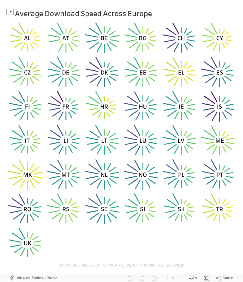
#MakeoverMonday Week 39 - Average Internet Speeds Across Europe
data prep
,
europe
,
internet
,
LOD
,
Makeover Monday
,
small multiples
,
spiral
,
starburst
,
sunburst
,
table calc
,
trellis chart
,
union
No comments

My goal this week was to correct my failures from last week, so I focused almost exclusively on building the starburst/sunburst chart. As promised to the viewers, I will also record a separate tip video for how to build them.
Here's the WatchMeViz and the viz is below that.
March 7, 2018
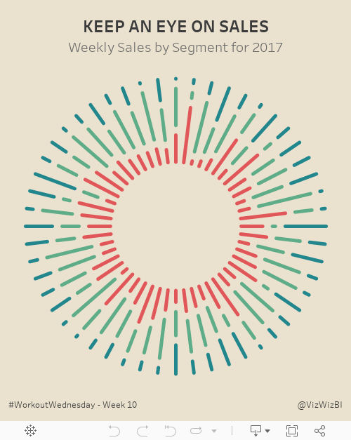
Workout Wednesday: Keep an Eye on Sales
Let's all start week 10 by agreeing that Luke is mean. Just kidding Luke! Workout Wednesday is supposed to be difficult and this week it sure was. This was definitely the hardest week for me so far.
We had to build this sunburst chart:

I had built sunburst charts before (link) so I opened that workbook knowing that would at least get me started. Ok, I was quickly about 75% of the way done, but my colors were all overlapping and starting at the same spot. The requirement has them essentially stacked with a gap in between.
I tried over and over again, but couldn't get the calculation right. So I went to lunch and went for a walk to get away from the computer and do some thinking. To figure it out, I thought about it as one week at a time, figuring if I get one week right, I might have it all correct.
The trick is figuring out the length of each segment within each week. Notice how they all end at the same spot. That's a pretty big hint. Then once you figure that out, you probably won't have a gap between the colors. That part is pretty simple.
Good luck!
We had to build this sunburst chart:
I had built sunburst charts before (link) so I opened that workbook knowing that would at least get me started. Ok, I was quickly about 75% of the way done, but my colors were all overlapping and starting at the same spot. The requirement has them essentially stacked with a gap in between.
I tried over and over again, but couldn't get the calculation right. So I went to lunch and went for a walk to get away from the computer and do some thinking. To figure it out, I thought about it as one week at a time, figuring if I get one week right, I might have it all correct.
The trick is figuring out the length of each segment within each week. Notice how they all end at the same spot. That's a pretty big hint. Then once you figure that out, you probably won't have a gap between the colors. That part is pretty simple.
Good luck!
February 24, 2015
Makeover Monday: From Sunburst to Story - The State of American Well-Being
bottom
,
change
,
filled maps
,
Makeover Monday
,
map
,
rank
,
slope graph
,
story points
,
sunburst
,
tableau
,
top
,
United States
,
USA
,
well-being
,
year over year
No comments
Blog reader B Winds Cogley sent me this beauty last week as a makeover candidate:

The story the designer is trying to tell is really quite simple. The longer the bar, the higher the ranking. The problem, though, is that they are order alphabetically which makes ordering them by rank basically impossible.
I was able to locate the source of the data on the State of American Well-Being website. From there, I had to download the reports for 2013 and 2014 and then I consolidated them into Excel, which you can download here.
At first, I was thinking a simple bar chart would work, but that turned out really boring because the only data to display is the ranking, not the value that makes up the ranking. I decided instead to create this story in Tableau.
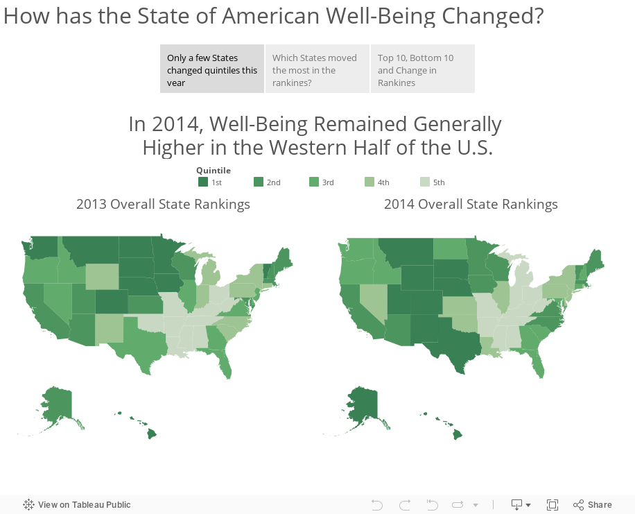
Download the workbook used to create this story here (requires Tableau 9).
The story the designer is trying to tell is really quite simple. The longer the bar, the higher the ranking. The problem, though, is that they are order alphabetically which makes ordering them by rank basically impossible.
I was able to locate the source of the data on the State of American Well-Being website. From there, I had to download the reports for 2013 and 2014 and then I consolidated them into Excel, which you can download here.
At first, I was thinking a simple bar chart would work, but that turned out really boring because the only data to display is the ranking, not the value that makes up the ranking. I decided instead to create this story in Tableau.
Download the workbook used to create this story here (requires Tableau 9).
Subscribe to:
Posts
(
Atom
)


