April 13, 2024
How to Create a Proportional Stacked Bar Chart in Tableau
Proportional stacked bar charts are a good way of showing the size and proportion of data at the same time.
September 15, 2022
Table Calculations vs. Level of Detail Expressions - % of Total
May 31, 2022
Proportional Brushing with a Set Action

August 24, 2021
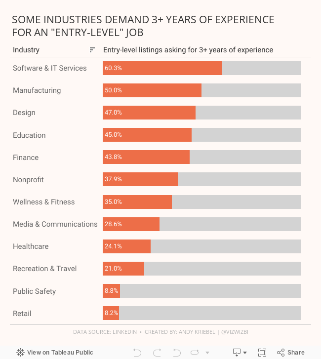
#MakeoverMonday 2021 Week 34 - Entry-Level Jobs on LinkedIn Requiring 3+ Years Of Experience

November 10, 2020
#TableauTipTuesday: How to Reorder a Stacked Bar Chart with Set Actions

November 9, 2020
#MakeoverMonday Week 45 - Global Share of Nintendo Switch Software & Hardware Sales
For #MakeoverMonday week 45, we were analyzing the software and hardware units sold across several regions, as defined by Nintendo itself. The data was pretty simple. I started by doing some basic data prep to simplify the names of the fields and to pivot the data to make it easier to compare the years.
In this video, I will first review the initial visualization and talk about what works and what does. I then iterate through several methods for visualizing the data, hoping to find one that works well with this data set. With feedback from the viewers, I was able to create a bar chart that compares the percentage of global units sold of software vs. hardware for Nintendo.
I showed several methods for visualizing the data:
- Line charts (several versions)
- Stacked bar chart
- Side-by-Side Bar
- Tables
- Scatter plot
- Connected scatterplot
Resources:
- Data Set - https://data.world/makeovermonday/2020w45-dedicated-video-game-sales-units
- Final visualization - https://bit.ly/MM2020W45
- Tableau Color Palette Generator - https://color.tableaumagic.com/
- Colors from Image Tool - https://html-color-codes.info/colors-from-image/
- ASCII character reference - https://jrgraphix.net/r/Unicode/27F0-27FF

August 16, 2018
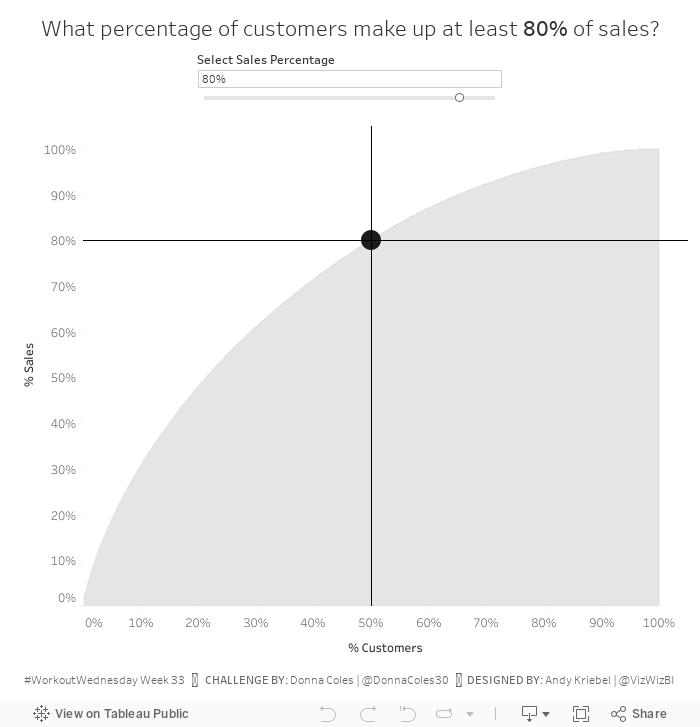
Workout Wednesday: How many customers make up XX% of sales?
Find all of the details of the challenge here. The only requirement I chose to ignore was the dashboard size. I created it 700x700 instead of 800x800 because it fit on my screen nicely.
Some hints for this challenge:
- You'll need to know your table calcs.
- This video will be helpful in creating the Pareto chart.
- You'll need extra calculations for the tooltip and the lines and the dot.

March 28, 2018
Workout Wednesday: Color and Ordering
I had done something like this previously for the color. What tripped me up was the sorting calculation. It's not overly complicated. The only hint I'll provide is that you can't sort the subcategory by this calculation. Click on the image below for the interactive version.
March 14, 2018
Workout Wednesday: Candy Button Small Multiples
One thing he mentioned in the blog is that now you can use unicode characters in 10.5, however, I've been using them for a long time. I got to this site, find the character I want to use, and paste it into the calculation or field name.
The trickiest part for me on this challenge was getting the dots in the right place, that is, starting at the bottom right. I had to swap some of the logic of the calcs around and it was done. As for the headers above each set of dots, well, I'll leave that to you to figure out. Here's my tip: don't overcomplicate it; it's quite simple.
Again, find all of Rody's requirements here. Click the image below for the interactive version.
March 7, 2018
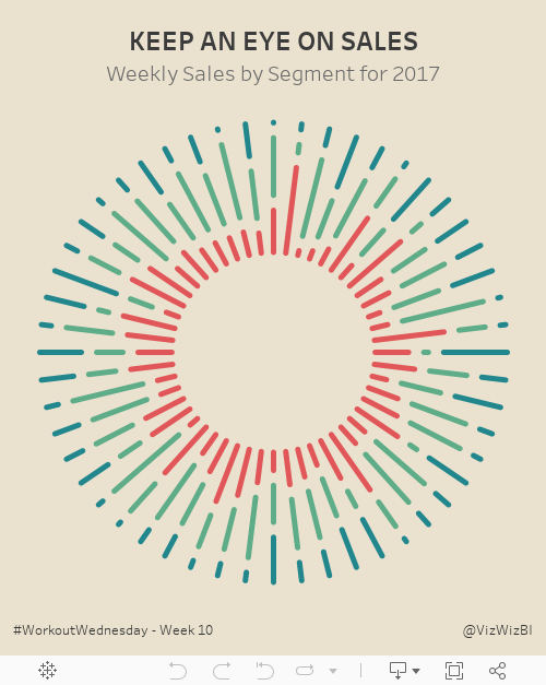
Workout Wednesday: Keep an Eye on Sales
We had to build this sunburst chart:
I had built sunburst charts before (link) so I opened that workbook knowing that would at least get me started. Ok, I was quickly about 75% of the way done, but my colors were all overlapping and starting at the same spot. The requirement has them essentially stacked with a gap in between.
I tried over and over again, but couldn't get the calculation right. So I went to lunch and went for a walk to get away from the computer and do some thinking. To figure it out, I thought about it as one week at a time, figuring if I get one week right, I might have it all correct.
The trick is figuring out the length of each segment within each week. Notice how they all end at the same spot. That's a pretty big hint. Then once you figure that out, you probably won't have a gap between the colors. That part is pretty simple.
Good luck!
August 23, 2017
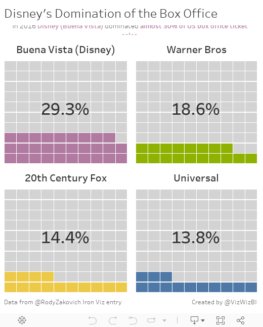
Workout Wednesday: The Waffles of Disney's Domination
The waffle chart bit was pretty straight forward. The trickiest part for me was the calculation to get the % of total.
Fun one! Give it a go!
April 26, 2017
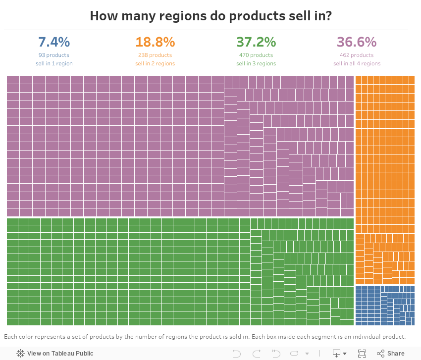
Workout Wednesday - Product Spread Treemap (Part 1)
Use this data source to build this treemap. The idea is to be able to count how many regions each product sells in. Here are the requirements:
- Dashboard needs to be 850x700
- Include a summary table at the top that shows the number and % of products that sell in each region.
- Match the color-coding and text of the table.
- Create a treemap that segments the products by the number of regions it sells in.
- Match the tooltips in the treemap.
- Clicking on a color in the summary table should highlight that segment in the treemap.
- Include the caption on the treemap
April 13, 2017
Mac’s Declining Relevance To Apple | A Tableau Remake

I had a few minutes this morning so I decided to build a Tableau version. The first problem I ran into was getting the data in fiscal quarters. I couldn't find the data quickly, so I went with calendar quarter data that I found on Bare Figures. My data doesn't match the original above due to the calendaring, but that wasn't the point of the exercise. This was all about practice for me.
Essentially I wanted to replicate the viz with a more impactful title and some other minor formatting changes. Here's what I came up with. Click on the image for the interactive version.
April 17, 2016
Makeover Monday: Where Do Women Have the Most and Least Political Representation in the U.S.?

Yes, it’s Sunday, but there are weeks when I simply don’t have the time for Makeover Monday on Monday. This is one of those weeks. For Makeover Monday this week, we are reviewing a visualisation created by the National Conference on State Legislatures. According to the NCSL:
"Approximately 1,809 women serve in the 50 state legislatures at the beginning of the 2016 legislative session. Women make up 24.5 percent of all state legislators nationwide."
Wow! Only 24.5%…that’s sad America. We need to do something about it. Those figures are accompanied by this map that shows the percentage of women in state legislatures in 2016.

This viz is definitely not terrible. There are several things that this map does well:
- Using four distinct bins for the colouring makes it easy to see concentrations like all of the yellow in the middle of the U.S. and all of the green on the west coast and northeast
- Making the extra squares for the small states that would be tough to click on
- Nice interactivity on hover
- Good tool tips
But I feel like this is so much more to this story. So when I created the data, I included population rates by state. This way I could look at thedisparity between the female population in each U.S. state and the percentage of women in state legislatures.
What would I do differently?
- Get rid of the filled map; while they included the extra callouts for the small states, it add more to the viz than is needed
- There’s no sense of how under-represented women are. Are we supposed to just assume each state is 50% female then do the math in our head? I think that’s too much work for the reader.
- No mobile version
- Not enough distinction in the colours. Why not use a continuous colour scale?
- Need a more impactful title
- Need a better way to make comparisons
- There’s no ranking of the states. How do I identify the best and the worst?
Given these recommendations, I’ve create the viz below. I also made this device responsive, so you will see a different viz depending on whether you’re on a computer, tablet or phone. I did this because I want to learn to design for mobile first, something John Burn-Murdoch has recommended to us when he’s come to chat with us at the Data School.
March 16, 2016
The Data School Gym - Sort and Filter by % of Total
A new week means another challenge in the Data School Gym. This challenge came about because Nai Louza had a tough calculation she needed help figuring out. Here’s the final result you should produce:
 |
| Click on the image for a larger version |
Requirements
- Build a stacked bar chart that shows % of total sales for the East and West within each Product Sub-Category
- Sort the bars by the % of total sales in the East
- If you reorder the Regions, the sort should switch to the % of total sales in the West
- Provide a method for the users to pick how many product sub-categories they want to include
Hints
- You can do this with table calculations. You do not need to use LOD calcs.
- For the sorting, you have to figure out how to sort by only the value of the East (or West if you change the order on the color shelf).
- The Top N filter you see above is NOT a parameter.
You can find the final solution that I created here. Don’t cheat. Try to figure it out before looking at the solution. Reverse engineering is such a great way to learn.
March 1, 2016
Tableau Tip Tuesday: How to Display the Top N and Retain the % of Total

This week’s tip was sparked by a question that Jules Winceslaus of the Data School asked during a project we worked on last week for a customer. He created a bar chart that showed the percent of total, yet when he filtered the dimension, he wanted the original percent of total to remain. That is, the bars shouldn’t be recalculated based on the filter.
In the video and example below, you’ll learn how the rank function can be used to filter the results in the view without impacting the percent of total calculation.






