Showing posts with label revenue. Show all posts
August 25, 2019
#MakeoverMonday: Mobile is taking over the global gaming market
console
,
gaming
,
Makeover Monday
,
market share
,
mobile
,
pc
,
revenue
No comments

This week's chart is from Statista:

What works well?
- The title clearly explains the story in the chart.
- The colors are easy to distinguish.
- The bar chart helps us see the increasing revenue.
- Placing mobile at the bottom of the stacked bars makes it easy to see the increase in the mobile share.
What could be improved?
- All of the labels make the chart look quite busy.
- Is the image of the platforms necessary?
What I did
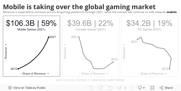
- I wanted to look at the relationship of share and revenue over time, which led me to a connected scatterplot.
- I thought it was important to look at each platform independently, so I placed them inside "cards".
- I included BANs based on the estimated revenue for 2021.
Let me know what you think.
April 13, 2017
Mac’s Declining Relevance To Apple | A Tableau Remake
% of total
,
annotations
,
apple
,
Business Insider
,
line chart
,
mac
,
Mike Nudelman
,
remake
,
revenue
,
share
No comments

I had a few minutes this morning so I decided to build a Tableau version. The first problem I ran into was getting the data in fiscal quarters. I couldn't find the data quickly, so I went with calendar quarter data that I found on Bare Figures. My data doesn't match the original above due to the calendaring, but that wasn't the point of the exercise. This was all about practice for me.
Essentially I wanted to replicate the viz with a more impactful title and some other minor formatting changes. Here's what I came up with. Click on the image for the interactive version.
August 31, 2015
Makeover Monday: Mobile Internet to Be Worth $850B by 2018
bar chart
,
change
,
commerce
,
internet
,
Makeover Monday
,
pie chart
,
revenue
,
slope graph
No comments

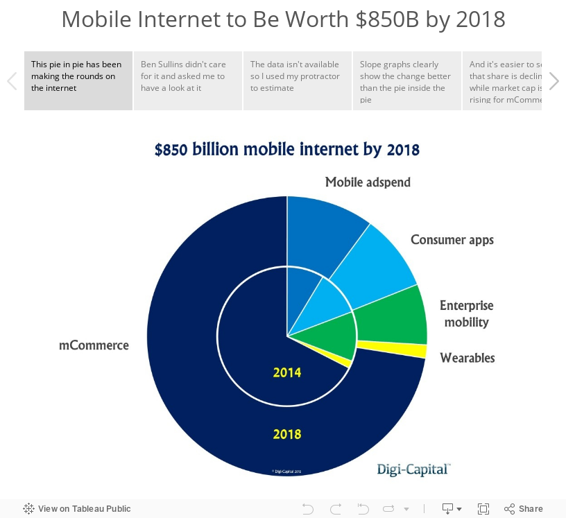
It may be a bank holiday here in the U.K., but that doesn't stop me from getting out a #MakeoverMonday post. This week, I'm using story point to walk you through the makeover.
June 1, 2015
Makeover Monday: China Is Poised to Surpass the Americas as Apple's Largest Market
apple
,
Chart of the Day
,
emphasis
,
line chart
,
Makeover Monday
,
revenue
,
stacked bar chart
,
storytelling with data
No comments

I am not a very big fan of stacked bar charts, particularly those that try to represent change over time, like this week’s makeover candidate from Chart of the Day.

The article is trying to emphasize the change in the share of Apple revenue in China compared to the Americas. Here are some problems I have with this chart:
For the makeover, I’m going back to some of the things I learned in Cole Nussbuamer’s fantastic course about emphasising the data that you want people to pay attention to.
Here’s what I’ve done differently:
Which version do you prefer? What would you do differently? There are so many ways to redesign charts and no single way is 100% correct.
- It’s very hard to compare stacks in a bar chart over time because each stack is influenced by those stacks below it.
- The title of the article and the chart don’t match. The article says China vs. the US, but the chart is China vs. the Americas.
- There is not enough emphasis on the comparison. The rest of the regions should fall to the background.
- I don’t like the legend above the chart in this case because I’m constantly having to go back and forth.
For the makeover, I’m going back to some of the things I learned in Cole Nussbuamer’s fantastic course about emphasising the data that you want people to pay attention to.
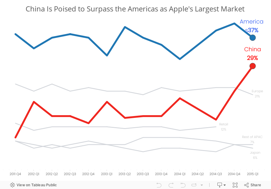
Here’s what I’ve done differently:
- I changed the title to reflect the purpose of the story.
- I changed the chart to a line chart to make it easier to see the trends for each region.
- I’m only emphasising the Americas and China. The rest of the regions are in a light grey.
- I’ve added annotations to make it easier for the reader to see the values.
- I removed the color legend as it’s not necessary since I’ve labeled the end of each line.
Which version do you prefer? What would you do differently? There are so many ways to redesign charts and no single way is 100% correct.
December 16, 2014
College Football's Richest Teams
bar chart
,
Big 12
,
Big Ten
,
college
,
expenses
,
football
,
infogr.am
,
interactive
,
revenue
,
SEC
,
smartycents
No comments
As a follow up to my post about how rich the University of Alabama football team is, I wanted to show a quick overview of the top 10 richest teams. Note that, despite making $47.1M in revenue in the 2012-2013 season, Alabama only ranks 6th.
The data comes from smartycents.com. I would encourage you to read their article if you're curious to know where all of this money comes from. It's pretty fascinating just how big of a business college football has become.
Initially, I was going to create the viz for this post in Tableau, but I was reading the Interactive Inspiration article on Visualoop and saw this ad for infogr.am:

The ad reminded me of Datawrapper, so I thought I would give it a try. I must say I was super impressive with infogram's simplicity. In just a couple of minutes, I registered for an account and had this nice interactive chart.
There are three things I wish I could do with infogram that I can't out of the box:
The data comes from smartycents.com. I would encourage you to read their article if you're curious to know where all of this money comes from. It's pretty fascinating just how big of a business college football has become.
Initially, I was going to create the viz for this post in Tableau, but I was reading the Interactive Inspiration article on Visualoop and saw this ad for infogr.am:
The ad reminded me of Datawrapper, so I thought I would give it a try. I must say I was super impressive with infogram's simplicity. In just a couple of minutes, I registered for an account and had this nice interactive chart.
- Auto-sort the bars based on the metric selected
- Color the bars by a dimension, conference in this case; This would allow me to highlight that 5 of the top 10 teams are in the SEC.
- Hide the axis; I don't need it on this view since I'm labeling the bars directly.
December 11, 2014
Makeover Monday (on Thursday): How one of the richest teams in college football makes & spends its money
Alabama
,
big business
,
college
,
Cork Gaines
,
emily kund
,
expenses
,
football
,
Makeover Monday
,
NCAA
,
Nick Saban
,
profit
,
rank
,
revenue
,
SEC
,
sort
6 comments
In late November, Cork Gaines of Business Insider wrote about how the University of Alabama football team makes and spends its money. The two articles were accompanied by these two pie charts:


There are many issues with these charts:
First, I need to give a special thanks to Emily Kund for reviewing this viz and providing some great feedback. For example, it was her idea to use the Alabama official colors in the viz. Thanks Em!
- They are pie charts, which makes comparing the slices difficult.
- The slices are not labeled with the amount, so I have to make some guesses as to their contribution to the whole and then multiply that by the total shown in the titles. That's way too much work.
- There are categories missing from the source data.
- Why are these in two separate articles since they are a related story? Why aren't they combined in a single story?
- There's no mention of the profit the football team turns.
I could go on, but I'll stop there. One of the great things Cork does in his articles is link to the source data. This allowed me to download the data from this website and build my own visualization.
 |
| NOTE: This is an update of the original chart based on feedback from Nelson Davis. Nelson suggested making the bar sizes relative across the charts, which my first version failed to do. |
First, I need to give a special thanks to Emily Kund for reviewing this viz and providing some great feedback. For example, it was her idea to use the Alabama official colors in the viz. Thanks Em!
In my version of the viz I wanted to:
- Bring the revenue and expense data into the same view
- Provide a high-level overview, including profit
- Rank the categories in descending order, except for "Other", which I prefer to place last in the sort
- Include the actual amounts by labeling the bars
July 21, 2014
Makeover Monday: Slicing Up the La Liga & Premier League Revenue Pies
dataremixed
,
La Liga
,
lollipop
,
Makeover Monday
,
pie chart
,
Premier League
,
proportions
,
revenue
,
tableau
19 comments
Over the weekend, Reader Ben Jones sent me a message on Twitter pointing me to this post by @kmgfootball, which he thought would be great for a Makeover Monday example.

The point the writer is trying make is clear: Barcelona & Real Madrid combined get almost as much revenue as the rest of the clubs in La Liga, whereas in the Premier League, there's much more parity and revenue sharing. The problem is that the charts are basically unreadable.

I chose a lollipop chart because I wanted to show the data in a bar chart view, but accentuate the end points. I then color-coded the dot on the end of the lollipop by the revenue and kept the range consisted across the leagues. In addition:
- There are 20 slices in each pie.
- Each slices contains way too much content: team logo, team name and revenue, yet it lacks the percentage each team takes in, which is more meaningful than the revenue in this case.
- The image is blurry.
- The fonts are tiny.
I chose a lollipop chart because I wanted to show the data in a bar chart view, but accentuate the end points. I then color-coded the dot on the end of the lollipop by the revenue and kept the range consisted across the leagues. In addition:
- I kept the scales for the bars the same on both charts so that you could see how the leagues compare to each other.
- I converted the Pounds to Euros (1 british pound sterling = 1.26 Euro) to make the data more comparable.
- I included the share of revenue as a label on the lollipop.
- There are only two teams that matter to TV networks in Spain.
- The Premier League is very, very rich. The team will the lowest revenue allocation is higher than the third highest team in La Liga.
Subscribe to:
Posts
(
Atom
)






