Showing posts with label NCAA. Show all posts
May 24, 2017
Workout Wednesday: NCAA Final Score-by-Score
basketball
,
cumulative
,
Gonzaga
,
NCAA
,
North Carolina
,
sports
,
table calc
,
tarheels
,
UNC
,
Workout Wednesday
2 comments
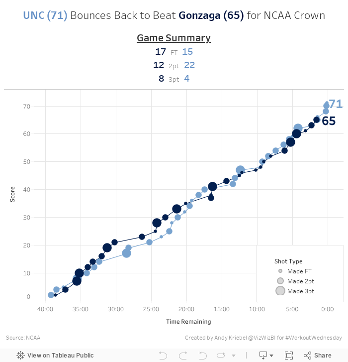
Here's your challenge:
- Final dashboard is 700x700
- Everything must be a single sheet except for the footer
- Match the title, summary below the title, colors, and tooltips
- Each circle represents a score
- Circles are sized by the type of basket (FT, 2Pt, 3pt)
- Score must be cumulative across the game; note that time counts down in basketball
- Tooltips should shows the score at that moment in time and a description of what happened
- UNC color is #6490C6 while the Gonzaga color is #00143F
- Gridlines should be displayed every 5 minutes and every 10 points
- Last basket for each team should be labeled with the cumulative score
Download the data here. I think that's it, but if I missed a requirement, let me know and I'll update this post. Good luck!
March 20, 2017
Makeover Monday: The Giant Killers of the NCAA Tournament
basketball
,
Business Insider
,
Cork Gaines
,
line chart
,
Makeover Monday
,
March Madness
,
NCAA
,
upset
3 comments

What works well?
- Years are in order
- Nothing else
What doesn't work well?
- It makes no sense whatsoever to add up the seeds.
- There is no consistency in the coloring of the bars.
- The text call out in the middle has nothing to do with the chart.
- It's way too busy.
- I have to rotate my head sideways to read the years.
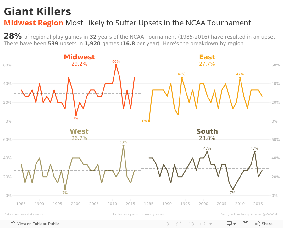
For my view, I wanted to focus on the upsets because that's what makes the NCAA Tournament so exciting! Cinderella can make it to the ball and often does. I went with American Typewriter for the font to make it look more like a newspaper headline. The regions are ordered geographically (thanks for the feedback Eva).
September 21, 2015
Makeover Monday: SEC Football Claims Some of the World's Largest Stadiums

Saturday Down South, which focuses almost exclusively on Southeastern Conference (SEC) football, posted an article back in January about the size of SEC football stadiums. In the article, they have a great line:
2. Salt Lake Stadium (Kolkata, India): 120,000
3. Michigan Stadium (Ann Arbor, Mich.): 109,901
4. Beaver Stadium (State College, Pa.): 107,282
5. Kyle Field (College Station, Texas): 106,511*
6. Estadio Azteca (Mexico City, Mexico): 105,000
7. Ohio Stadium (Columbus, Ohio): 104,944
8. Neyland Stadium (Knoxville, Tenn.): 102,455
9. Tiger Stadium (Baton Rouge, La.): 102,321
10. Bryant-Denny Stadium (Tuscaloosa, Ala.): 101,821
11. Bukit Jalil National Stadium (Kuala Lumpur, Malaysia): 100,411
12. Darrell K Royal-Texas Memorial Stadium (Austin, Texas): 100,119
13. Melbourne Cricket Ground (Melbourne, Australia): 100,024
14. Camp Nou (Barcelona, Spain): 99,786
15. Soccer City (Johannesburg, South Africa): 94,713
16. Los Angeles Memorial Coliseum (Los Angeles, Calif.): 93,607
17. Sanford Stadium (Athens, Ga.): 92,746
18. Rose Bowl (Pasadena, Calif.): 92,542
19. Cotton Bowl (Dallas, Texas): 92,100
20. Memorial Stadium (Lincoln, Neb.): 91,471
21. Wembley Stadium (London, England): 90,000
22. Ben Hill Griffin Stadium (Gainesville, Fla.): 88,548 23. Gelora Bung Karno Stadium (Jakarta, Indonesia): 88,306
24. Jordan-Hare Stadium (Auburn, Ala.): 87,451
25. Borg El Arab Stadium (Alexandria, Egypt): 86,000
Simple enough, right? The focus of the article is on SEC football stadiums, but their method of emphasising (via bold text) is easy to overlook and comparisons to other stadiums is difficult.
For my makeover, I’ve:

The conference’s stadiums are some of the biggest in the world, representing four of the top 10 and seven of the Top 25, many in towns that more than double in population on game days.They wrap up the article with this basic table:
WORLD’S LARGEST STADIUMS RANKED BY CAPACITY
1. Rungrado May Day Stadium (Pyongyang, North Korea): 150,0002. Salt Lake Stadium (Kolkata, India): 120,000
3. Michigan Stadium (Ann Arbor, Mich.): 109,901
4. Beaver Stadium (State College, Pa.): 107,282
5. Kyle Field (College Station, Texas): 106,511*
6. Estadio Azteca (Mexico City, Mexico): 105,000
7. Ohio Stadium (Columbus, Ohio): 104,944
8. Neyland Stadium (Knoxville, Tenn.): 102,455
9. Tiger Stadium (Baton Rouge, La.): 102,321
10. Bryant-Denny Stadium (Tuscaloosa, Ala.): 101,821
11. Bukit Jalil National Stadium (Kuala Lumpur, Malaysia): 100,411
12. Darrell K Royal-Texas Memorial Stadium (Austin, Texas): 100,119
13. Melbourne Cricket Ground (Melbourne, Australia): 100,024
14. Camp Nou (Barcelona, Spain): 99,786
15. Soccer City (Johannesburg, South Africa): 94,713
16. Los Angeles Memorial Coliseum (Los Angeles, Calif.): 93,607
17. Sanford Stadium (Athens, Ga.): 92,746
18. Rose Bowl (Pasadena, Calif.): 92,542
19. Cotton Bowl (Dallas, Texas): 92,100
20. Memorial Stadium (Lincoln, Neb.): 91,471
21. Wembley Stadium (London, England): 90,000
22. Ben Hill Griffin Stadium (Gainesville, Fla.): 88,548 23. Gelora Bung Karno Stadium (Jakarta, Indonesia): 88,306
24. Jordan-Hare Stadium (Auburn, Ala.): 87,451
25. Borg El Arab Stadium (Alexandria, Egypt): 86,000
Simple enough, right? The focus of the article is on SEC football stadiums, but their method of emphasising (via bold text) is easy to overlook and comparisons to other stadiums is difficult.
For my makeover, I’ve:
- Changed the view into a bar chart, which helps see the size variances between the stadiums
- Used colour to group the stadiums as to whether they are in the SEC, another college football stadium, or something else
- Used the SEC’s official yellow for the background and blue for the bars of the SEC stadiums
- Used the News Gothic font, which is the closest I can get to Benton Sans, the font the SEC uses on their website
- Included a map for the locations of the college football stadiums (this was also my first time creating a custom Mapbox map)
December 11, 2014
Makeover Monday (on Thursday): How one of the richest teams in college football makes & spends its money
Alabama
,
big business
,
college
,
Cork Gaines
,
emily kund
,
expenses
,
football
,
Makeover Monday
,
NCAA
,
Nick Saban
,
profit
,
rank
,
revenue
,
SEC
,
sort
6 comments
In late November, Cork Gaines of Business Insider wrote about how the University of Alabama football team makes and spends its money. The two articles were accompanied by these two pie charts:


There are many issues with these charts:
First, I need to give a special thanks to Emily Kund for reviewing this viz and providing some great feedback. For example, it was her idea to use the Alabama official colors in the viz. Thanks Em!
- They are pie charts, which makes comparing the slices difficult.
- The slices are not labeled with the amount, so I have to make some guesses as to their contribution to the whole and then multiply that by the total shown in the titles. That's way too much work.
- There are categories missing from the source data.
- Why are these in two separate articles since they are a related story? Why aren't they combined in a single story?
- There's no mention of the profit the football team turns.
I could go on, but I'll stop there. One of the great things Cork does in his articles is link to the source data. This allowed me to download the data from this website and build my own visualization.
 |
| NOTE: This is an update of the original chart based on feedback from Nelson Davis. Nelson suggested making the bar sizes relative across the charts, which my first version failed to do. |
First, I need to give a special thanks to Emily Kund for reviewing this viz and providing some great feedback. For example, it was her idea to use the Alabama official colors in the viz. Thanks Em!
In my version of the viz I wanted to:
- Bring the revenue and expense data into the same view
- Provide a high-level overview, including profit
- Rank the categories in descending order, except for "Other", which I prefer to place last in the sort
- Include the actual amounts by labeling the bars
April 26, 2014
Makeover Friday: Chart of the Day's NCAA Basketball Championships
bar chart
,
basketball
,
Business Insider
,
championships
,
Chart of the Day
,
Cork Gaines
,
makeover
,
NCAA
,
Tableau Mac
No comments
It's not quite midnight on Friday night, so I still have time to get this post out. Like I mentioned last week, I'm going to try to do a chart makeover every Friday. Most of them will be short blog posts with the before and after images.
This week, my inspiration comes once again from Cork Gaines of Business Insider Sports. I also knew since it was getting late that it wouldn't take me long to find something on their blog that needed a makeover. Cork presented the chart below, which shows the NCAA Basketball Championships won since 1939 broken down by gender.

Some problems immediate jump out:

Download the data here and the workbook here (requires Tableau 8.2 beta - I made this with Tableau for Mac)
This week, my inspiration comes once again from Cork Gaines of Business Insider Sports. I also knew since it was getting late that it wouldn't take me long to find something on their blog that needed a makeover. Cork presented the chart below, which shows the NCAA Basketball Championships won since 1939 broken down by gender.
Some problems immediate jump out:
- The chart is sorted backwards. The purpose of this chart is to emphasize the schools with the most titles, so they should be listed first.
- You have to turn your head sideways to read the school names. Horizontal bars would be better.
- He's trying to show both men's and women's championships together, yet the date ranges aren't the same for both genders. To make it an apples to apples comparison, I would start my men's titles at 1982 as well.
Download the data here and the workbook here (requires Tableau 8.2 beta - I made this with Tableau for Mac)
March 20, 2011
A 17-slice pie chart is a bit excessive
bar chart
,
basketball
,
chart junk
,
Chart of the Day
,
Cork Gaines
,
NCAA
,
pie chart
,
sports
2 comments
The commentary included with the pie chart below is fantastic, but the pie chart is absolutely horrible.

A simple bar char is much more effective. With the bar chart, it’s so much easier to see just how favored Ohio State is to win the tournament. Also, there’s no color legend, therefore you’re not tempted to assume the colors mean something.
With the bar chart, I can clearly see that Florida and UNC are way overrated and Texas is way underrated (the seeds are in parentheses).

Subscribe to:
Posts
(
Atom
)






