July 19, 2017
Trump is Historically Unpopular

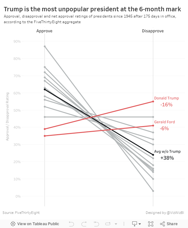
The table is ok in that it lists the presidents in descending order by net approval rating. However, I thought a visual display would be more effective. I used Google Sheets to import the table and quickly connected it to Tableau and built a slope graph to more effectively display the data.
It only took about 15 minutes to build this, so I'm surprised FiveThirtyEight didn't include a visual. I wonder what their reasoning is for including a chart vs. a table. What do you think? Which view works better for you?
July 15, 2017
A New Way to Visualize an Income Statement
Scroll down on the page and you see a series of examples. I clicked on the first one titled "Track profit and loss with an intuitive CFO dashboard". Yes! Had we found the Holy Grail? Turns out these are for the most part Excel dashboards rebuilt in Tableau, which is sadly how many finance departments choose to use Tableau. Take pity on them I say. Let's have a look at what Tableau created:
Keep in mind, this is billed as an "intuitive dashboard", but is it really? Normally when I write about makeovers, I list out the things that work well. With this dashboard, I can't think of a single thing that works well. Ok, maybe the title is clear and the filters are obvious. I don't see anything else that is even remotely intuitive otherwise.
Let's look at the viz in two separate pieces.
STACKED BAR/DUAL AXIS CHART
What else fails?
- The way this chart is designed, it's too much work to know which axis goes with which metric.
- Why use a dot plot when this is a time series? Wouldn't a line look better?
- Why are there separate summaries for the years? When you first look at the top section, your eyes go all the way across before you realize you're now looking at a yearly summary. Poor design.
- Why the heck is the Profit Margin legend so weirdly aligned?
- Net profit is stacked in front of net sales. I get that, but then I have to do that math in my head for the difference. Why not just express it as a profit ratio, making it much more intuitive?
- The dashboard is set to automatic size, which is never, ever a good choice.
FINANCE TABLES
Tables in Tableau annoy me probably more than anything else. Yes, I understand people like tables, especially finance people. However, we all know that all they want to do is copy/paste it into Excel. Just give it to them in Excel if that's what they want.What's wrong with this table?
- The table doesn't align with the bar charts.
- Again, they provided a separate yearly summary way off to the right. Why aren't the year totals after each year?
- I have to scroll to see all of the data in the table.
- There are way too many metrics. Breaking down COGS and OPEX into all of its parts is completely unnecessary.
- There are absolutely zero actions you can take from the table. It doesn't tell you anything about what's going well nor what needs attention.
- YTD vs. PY Bullet Graph - The bar chart represents YTD for the given metric and the reference line represented the same period of the prior year (PY). The bar is then colored based on the variance to PY. Blue is good, orange is bad. For some of the metrics, being beyond PY is good, like Gross Sales. However, for other metrics like COGS, being above PY is bad. Hence why you see some bars orange that extend beyond PY.
- Variance to Budget Sparklines - Below each bar chart is a sparkline that goes back to January of PY. In this case, the sparklines represent 17 months. As new data comes in, the line grows. The sparklines show the variance to the budget for each metric. A reference line at zero represents being "on budget". The dot on the end of each line is color by the variance to the budget for the most recent month.

VIDEO OF MOBILE VERSION
October 21, 2016
Fix It Friday: Ten Alternatives Methods for Presenting Alcohol Consumption in OECD Countries

Interesting @OECD chart on alcohol consumption. By country & trend. E.g Austrians drink twice as much as Italians pic.twitter.com/OOGYJ3BpAq— Paul Kirby (@paul1kirby) October 19, 2016
You might think "It's just a chart Andy, relax!" True. It's a chart. It's not changing the world or anything. There are several things that have me a bit upset:
- Paul Kirby calls the chart "interesting" and maybe the CONTENT is interesting, but the chart is terrible.
- He says "Austrians drink twice as much as Italians", a fact that is simply not true. They drink 61% more than Italians. You can't just spout facts like that.
- Paul is visiting professor at the London School of Economics. I can only assume that his students follow him on Twitter. When he tweets things like this, his student will assume that this is how charts should be made, which only proliferates the number of poor charts we'll continue to see.
- It's too dark overall. The dark red bars and dark bottles are hard to see against the blue background.
- The flags are unnecessary. What value do they add?
- The bottles are cute, but unnecessary decoration.
- The legend is in reverse order.
- Do the bottle extend beyond the bars or do they start from the same baseline?
- It has a weak title. What's the story?


October 6, 2016
Progress for Sci-fi Reviews by Women

This also got me thinking about the work by Stephanie Evergreen and her focus on effective, impactful titles. I recommend to people that when they are creating visualisations, assume the audience will see a static image. If they can't understand it, then it should be changed.
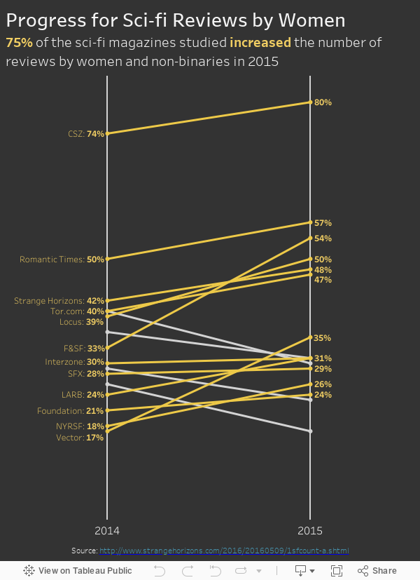
First, here's the visualisation that Emma created:
 |
| Click for the interactive version |
There are a few things I would change:
- Give it a stronger title that explains the visualisation and the key message
- Only label the lines that are increasing
- Only show the magazine name on the left label to minimize the text
- Make the footer legible (brown on black is too hard to read)
If you do nothing else to improve a weak visualization, you’ll still seriously improve its interpretability by giving it an awesome title.I certainly wouldn't classify Emma's viz as weak, it merely could be more effective.
June 29, 2016
WTF Wednesday: Misconceptions About Muslim Population

This morning I was going through the backlog of Makeover Monday candidates that I have saved in Pocket and it’s quite an extensive list. So I thought I’d knock one off the list and start up #WTFWednesday for those of us that just can’t have enough Tableau in our lives.
For this makeover, I look back at this viz from The Guardian about the misconceptions about Muslims by Europeans. If you’d like to have a go at it, the data is here (XLS) and here (TDE).

What works well?
- It’s neatly organised by the amount of misconception
- Colors follow Guardian standards
- Nice title that sets the story
What doesn’t work well?
- When I first read it, I assumed the darker blue was the average guess, but that’s not the case. This should be made clearer.
- Comparing countries could be made easier
- Stacked bars with overlapping labels look very cluttered
I didn’t want to spend a lot of time on this so I decided to make a simple barbell chart sorted by the largest misconception. This was also the first time that I’ve put bar charts in tooltips, which works well for allowing the user to see the precise values.
June 5, 2016
Data Scientists Need Alteryx

As I was about to land in San Diego for Alteryx Inspire I happened to look through my backlog of makeovers and saw this beauty.

The whole purpose of these charts is to show the difference between the tasks a data scientist spends time on and the least enjoyable part of their job. These two charts completely fail in telling getting that message across.
So with 15 minutes remaining on my flight, I threw together this alternative.

The only point I’m trying to drive home is that cleaning and organizing data is by far the task data scientists spend the most time on AND it’s the one they like the least. I’m fairly sure no one surveyed has used Alteryx because, if they had, the percentages would swing dramatically towards mining data and defining algorithms, which is really the important work data scientists do.
So here’s the question, how do we get Alteryx into the hands of those people that traditionally code all of their data prep? How can we enable them to do more impactful work? The answer is easy really, they need to do a 14-day trial of Alteryx and give it all they can for those 14 days. I’m confident Alteryx is the tool to solve the imbalance in their work.
May 27, 2016
Fix it Friday: Early Leavers from Education and Training in Europe

On the train to work this morning I was reading through the blogs I follow and ran across this amazing visualisation from Stephanie Evergreen:

I love small multiples and I love slope charts, and this in an amazing combination of the two. Shortly thereafter, I ran across this chart from the Financial Times:

To me, this chart is screaming out for a slope chart. Also, I don’t understand why they didn’t include all countries in Europe. I downloaded the data from Eurostat and created this small multiples slope chart in Tableau.
I also was able to include an option that allows you to pick a gender or the overall. Notice how the title changes color to match the lines in the slope graph. Do you know how I did that?
Which one do you think tells the story better? Does the bar chart of the slope chart make comparing the years easier?
August 19, 2015
How Has Poverty in Metro Neighborhoods Changed from 1970 to 2010?

I navigated to the site that shows the full report and at the bottom was a link to the original source, which was this story done in Tableau.

What struck me about this was that the titles of each story point are quite good, yet the visualisation is just a table, which makes it hard to find any insight. I decided to download the workbook and create this interactive version using the same story points. I think this tells the story of the changing poverty in America’s metro areas much more clearly, plus I allow for additional exploration and insight via the sort parameter.
Thoughts? Which one works better? What would you do differently?
January 29, 2015
Emergency Makeover: Vaccination Rates at California Elementary Schools
Consider this Viz of the Day from January 28, 2015.

What is incredibly ironic is that I saw this literally minutes after having talked about color blindness in a data viz class I was teaching. In the room was a colleague of mine, who is red-green color blind. I showed it to him and said "What do you see?" to which he responded "A bunch of brown dots."
I ran the map through the Vischeck color blindness simulator and low and behold, this is what you get:

Now can you understand why I'm getting so upset? Who picks VotD after all? Why aren't best practices part of the criteria? Does anyone know the criteria? Is there a criteria?
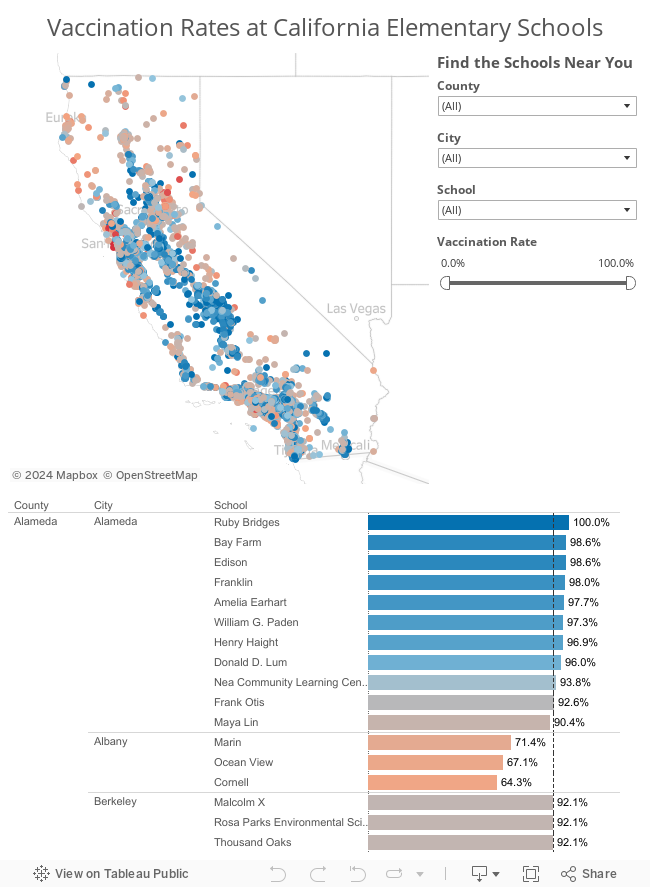
I downloaded the workbook and made a few simple adjustments to it. Here's my version after about 15 minutes of TLC. I focused on color, sorting, tooltips and filtering.
Don't get me wrong; It's a huge honor to get chosen for VotD. I know I get excited every time one of my vizzes is chosen. But what I really want, and I think there are lots of other people with me, is for VotD to be an amazing gallery that everyone recognizes as the most outstanding work done with Tableau. Work that's designed well. Work that's visually appealing. Work that follows best practices. Work you'd want to emulate.
With the visibility that the Viz of the Day gallery has, am I asking for too much? If I am, please tell me. Explain to me why I'm off base. If you're in agreement with me, let your voice be heard.
December 18, 2014
Makeover Thursday: Average Daily Time Spent on Smartphones
 |
| Courtesy Darkhorse Analytics |

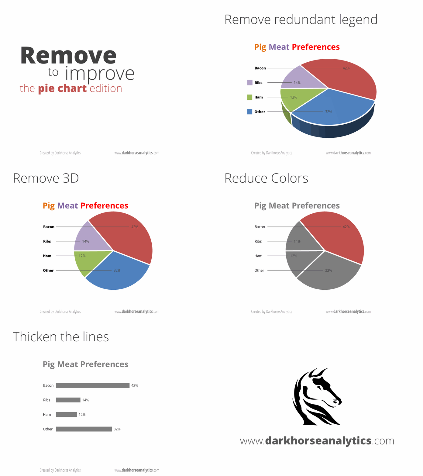
Here are some of the problems with this chart:
- It's a pie chart.
- Each slice is labeled with the category and the amount. Why not just make it a table if you're going to do that?
- There's no apparent order to the slices. At least sort the slices in descending order starting at 12 o'clock.
- In the article, they emphasize the top 3 categories, but they don't emphasize them in the pie chart.
June 9, 2014
Makeover Monday: Label bar charts for easier comprehension

This chart seems innocent enough, yet I found myself having to constantly reference the legend because they didn't bother including the labels directly on the chart. A more understandable alternative might look like this:

- Added labels for the bars
- Removed the legend and the different colors for each Chromebook
- Made the bar horizontal bars so that the labels are easier to read. I also find it easier to compare the length of the bars on horizontal bar charts, but that's a personal preference.
- Added a metric to show how much slower the other Chromebooks are compared to Wirecutter's recommendation (Dell Chromebook) and colored the bars by the % difference. This helps provide more context to the speed comparisons and I don't have to do the math in my head.
June 2, 2014
Makeover Monday: The Face Pie - Taking an Analogy Too Far
Edward Tufte likes to say "the only worse design than a pie chart is several of them." Today's makeover takes this even one step farther. Someone at Pew Research decided that since the topic of their chart was "The Changing Face of America" that they should uses faces instead of pies.

Humans are poor at judging angles in a pie. I can't even imagine how bad we are at judging angles in obscure shapes. Also, the purpose of this graphic is to show change. It’s very difficult to understand trends in a series of face pies. I would present the data as a line chart like this:

Now it’s much, much easier to see the changing demographics of the United States. Keep it simple people!
May 19, 2014
Makeover Monday: India's BSE Sensex as an Area Chart
I'm not a huge fan of area charts, especially stacked area charts. Much like bar charts, the axis for an area chart needs to start at zero, otherwise you're not showing the total area, thus defeating the purpose of using an area chart in the first place.
As an example, here's a recent chart from Chart of the Day about India's stock market.

Notice how they've started the axis at 2,600. This distorts the slope of the graph and also the area of the graph is not complete.
Contrast this to Yahoo!'s chart, which is executed perfectly.

Yahoo! is showing the entire scale and nice proportions. Without noticing these subtle differences, you might interpret a very different story. Moral of the story: always start the axis for area charts at zero.
May 12, 2014
Makeover Monday: Will Johnny Manziel stop the run of terrible QBs for the Cleveland Browns?
The NFL Draft is somewhat of a national holiday here in the US. It’s the day when all fans can dream of their team using their picks to turn the fortunes of their franchise around. QBs are particularly in the spotlight. In this spirit, Chart of the Day published a chart on Friday after the first round of the NFL Draft showing the number of starting QBs for each NFL team since 1999.

Accompanying the chart was this statement:
“Since 1999, 20 different quarterbacks have started for the Browns, the most in the NFL. Meanwhile, the New England Patriots have had just three starting quarterbacks over the same span.”
This statement implies that there is a relationship between number of starting QBs and success (because they’re only talking about the outliers), yet they provide no additional context. I downloaded the winning percentages for every NFL team since 1999 from SportingCharts.com and joined it to the Chart of the Day data.
I like how they’ve sorted the bars in ascending order by number of QBs, yet I don’t like how they always have the labels rotated. A horizontal bar chart would be much easier to read.
Given that we can easily compare number of QBs and win %, I turned to Tableau and build this simple view.

Looking at the data this way, it becomes much more clear that there is no direct correlation between the number of starting QBs and win % (as implied by COTD).
- Detroit is an absolutely horrible franchise, yet they’re right in the middle of the pack with starting QBs.
- Chicago has a winning record, yet they’ve used the third most QBs.
- Cincinnati and Houston have had pretty stable QB situations, yet they don’t win even half of their games.
One particular insight that sticks out to me is the amazing amount of parity that exists in the NFL. 25 or 32 teams have between 40-60% win percentage. In any given season, you can pretty much count on around 80% of the teams winning between 9.6 and 6.4 games per season. This is exactly what the NFL wants and is a large reason that they run a socialist type model of revenue sharing.
What else do you see? You can click on a team to highlight them. Download the data here and the workbook here.
May 5, 2014
Makeover Monday: Vaccine-Preventable Outbreaks
The Council on Foreign Relations maintains this map, sponsored by the wonderful Bill & Melinda Gates Foundation, that “plots global outbreaks of diseases that are easily preventable by inexpensive and effective vaccinations.”
Click on the map to interact.

Of course, there’s no way that you can criticize the cause, but the map itself suffers from several basic flaws:
- The data is pretty messy. I’m not sure how they were able to categorize data into years in their map. They might be showing the same dot in multiple years. I took the liberty to clean up the data a bit.
- The color of the bubbles on their map are too strong and there’s no transparency. There are dots behind dots, but you would never know it.
- The size of the bubbles are not relative to each other. For example, there are ten cases of measles in northeast Brazil and the dot immediately below represents 138 cases. Clearly the lower dot is not 13 times larger as it should be.
- When you click on a Region on the left filter of their map, the map doesn’t actually filter, it merely repositions.
There are lots of other issues too, but I’ll stop there; you get the idea.
It’s great that they make the data available, as they should, so kudos to the foundation for that. I created the version below to communicate the story more effectively.

I believe I have addressed the sizing and colors of the bubbles issues. I’ve also added bar charts to provide a high-level overview of diseases and impact. Finally, I’ve made different metrics available. Their version only showed cases, where they also provided fatality data. Therefore, I included fatalities and fatality rate metrics.
Last, but not least, I wanted to give a special thank you to Emily Kund for her feedback!






