December 18, 2014
Makeover Thursday: Average Daily Time Spent on Smartphones
bar chart
,
Business Insider
,
business intelligence
,
infogr.am
,
makeover
,
pie chart
,
sort
1 comment
My dislike for the pie chart is well documented. Yesterday morning, Tableau Zen Master Matt Francis sent me this gif of a pie chart makeover.
At the same time, I was reading an article by Business Insider about how people spend time on their smartphones. The article contained this pie chart:

Here are some of the problems with this chart:
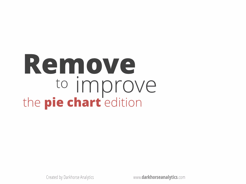 |
| Courtesy Darkhorse Analytics |
Here are some of the problems with this chart:
- It's a pie chart.
- Each slice is labeled with the category and the amount. Why not just make it a table if you're going to do that?
- There's no apparent order to the slices. At least sort the slices in descending order starting at 12 o'clock.
- In the article, they emphasize the top 3 categories, but they don't emphasize them in the pie chart.
Subscribe to:
Post Comments
(
Atom
)


it is very nice and informative post. I benefited this post and also now I know what is smartphones time spent.
ReplyDelete