December 22, 2014
Makeover Monday: Instapurge - Which accounts lost the most Instagram followers?
action
,
bar chart
,
donut chart
,
infogr.am
,
instagram
,
Makeover Monday
,
order
,
sort
,
spam
,
tableau
No comments
If you're an Instagram user, you likely noticed last week the message on the app indicating the sweeping cleanup of spam accounts that was coming. The cleanup took place late last week and shortly after I saw this donut chart from Zach Allia.
Click on the image below to go to the interactive version.

Holy cow! What an overwhelming mess! So what's wrong?
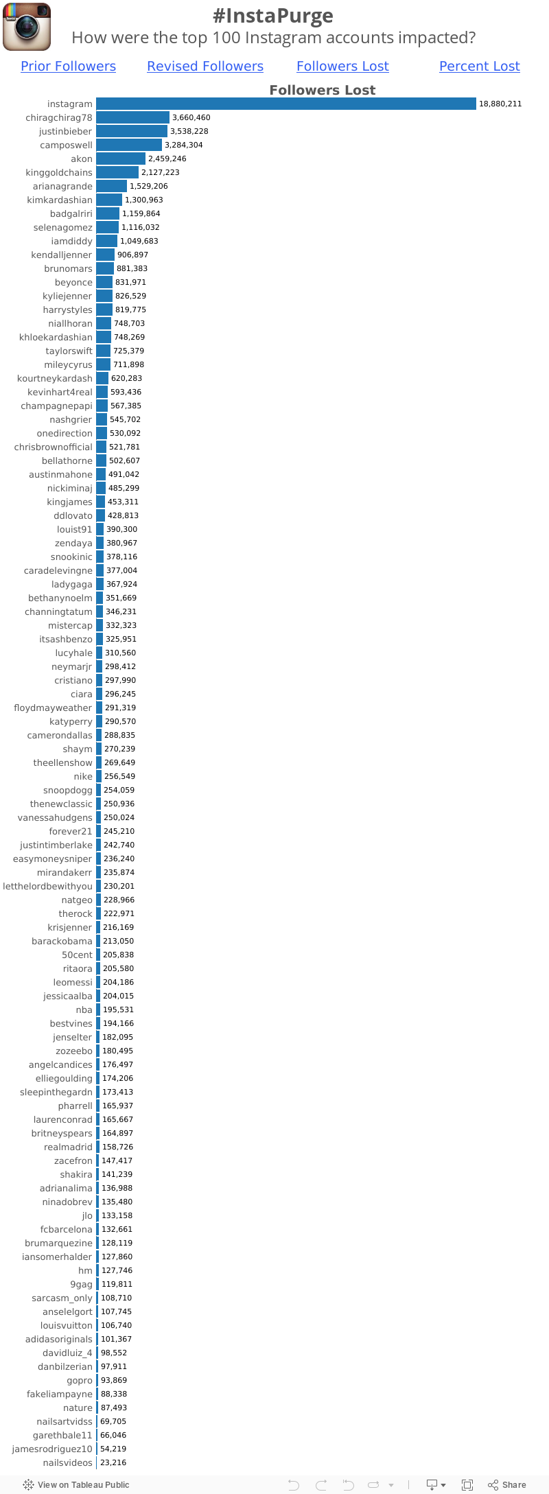
Click on the image below to go to the interactive version.
Holy cow! What an overwhelming mess! So what's wrong?
- It's a donut chart, which is a terrible way to display ranking relationships.
- When you change the metric, the sorting gets lost.
- There are way, way, way too many colors.
- It's impossible to make any sense of this.
Whenever I see pie charts or donut charts, I immediately turn to bar charts as a way to communicate better. Some might call me boring, but I'm ok with that. Here's my makeover. Click on a metric to see it's value and to sort by that metric.
Subscribe to:
Post Comments
(
Atom
)


No comments
Post a Comment