December 1, 2014
Makeover Monday: What it feels like when a bar chart doesn't start at zero
axis
,
bar chart
,
chart junk
,
Makeover Monday
,
non-zero baseline
,
tips
,
Victor Blaer
4 comments
This week's Makeover Monday is written by reader and friend Victor Blaer. Victor sent me this rant:

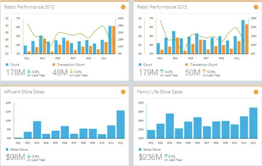
Victor provided the following two examples:
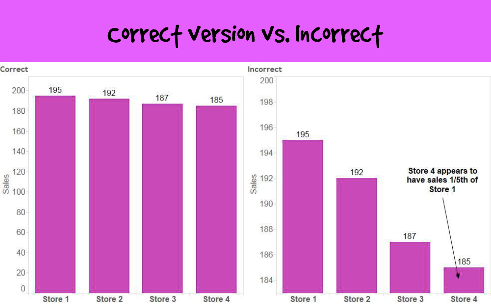
Victor's explanation about why these don't work:
Victor provided the following two examples:
Victor's explanation about why these don't work:
The primary problem with these graphs is that they visually misrepresent the truth. They mislead the viewer by manipulating the data.
The primary misrepresentation involves the use of a non-zero baseline. If you look at the vertical axes on all of these bar graphs, you'll notice that none of them start at zero. This would be fine if lines or dots were used to encode the values, but because the length of the bar encodes its value rather than just the position of its endpoint in relation to the quantitative scale, the use of a non-zero baseline doesn't work. By starting the quantitative scale above zero, the relative differences in the values represented by the bars have been exaggerated.Additional references:
http://www.perceptualedge.com/example14.php
http://www.excelcharts.com/blog/of-bars-and-lines/
Subscribe to:
Post Comments
(
Atom
)


I think it's dependent on the data being presented. Andy Cotgreave had a post on this that I thought was quite informative. http://gravyanecdote.com/uncategorized/mythbusters-should-you-start-your-axes-at-zero/
ReplyDeleteEmily, Andy's post is in reference to line charts. The post above is about bar charts, which should 100% of the time start at zero, no exceptions.
DeleteZero Celsius, Kelvin or Fahrenheit?
DeleteTrue. I was thinking about it from a different perspective. Though I think Andy's overarching message is a good one.
ReplyDelete