January 30, 2017
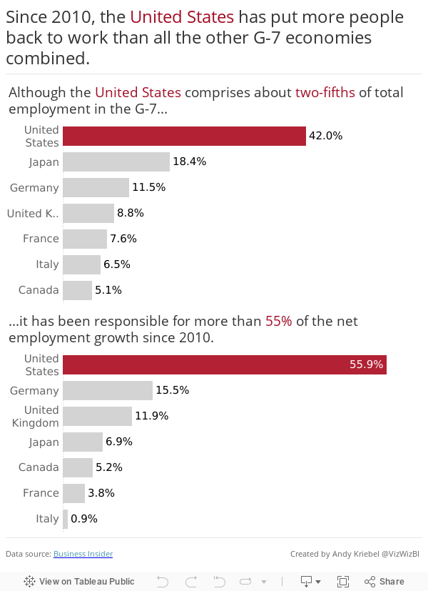
Makeover Monday: Employment Growth in G-7 Countries

What works well?
- Good to add a note about rounding
- Citing the data source
- A clearer title that makes the message more evident
- Countries should be sorted in descending order
- Labels should include the %
- Pie chart is a bad choice for this many categories
- Too many colors
- Chart titles are confusing (to me at least)
January 26, 2017
Makeover Monday: Regional Tourism Spending in New Zealand (Take 3)
Inspired by the visualisation by Harry Enten that I highlighted today on my sister site DataVizDoneRight, I decide to look at the New Zealand tourism data again and see if I could build a similar view. After all, no data visualisation is ever “complete”. I really like how this turned out (and thank you to Eva Murray for feedback).
I incorporated a legend on the upper right to make the bars easier to interpret. Basically the grey bar shows the 25th to 75th percentile of all of the regions and the red dot indicates the median of all regions. I’ve removed the total region from the view.
January 25, 2017
Workout Wednesday: Cumulative Passing Yards for NFL QBs
Nice challenge from Emma this week! She’s a massive NFL fan and since the Super Bowl is upon us, she decide to challenge us to create a common baseline chart that shows the passing yards for QBs in the NFL over the course of their careers. Go to her blog for the full challenge details.
First requirement was to filter to QBs that had played at least 3 seasons and had at least 2000 total passing yards. I did this by adding a data source filter. The benefit of doing this is that my Player list will now only include those that meet the criteria and I won’t need filters elsewhere.

Next, I created a LOD calc to get the first year for each QB.

I built upon that calculation with this calculation that gives me the number of seasons played per QB. This goes onto the Columns shelf.

The cumulative passing yards is merely a running total table calc set at the Year level. This goes on the Rows shelf.

I put Player on the detail shelf to get a line per QB. I also put Year and Yds on the Detail shelf since I need those for the tooltip.
Next was a parameter to pick a QB and use that to highlight the QB chosen. I then created a simple calculation that check the Player again the parameter and put that on the color shelf.
Last was the dot on the end of each line. To do that, I created a calculation that checks if it’s the end of the line and the player selected and, if so, return the cumulative passing yards. Since this is a nested table calc, it’s important to set both table calcs to compute using Year.

Some tidying up, adding the footnotes and I was done. I decided to float all elements on the dashboard to ensure they would render exactly as I wanted them to. Another fun week of learning something new! Thanks Emma!!
January 24, 2017
Makeover Monday: The Regional Disparity of Tourism Spending in New Zealand
This week’s Makeover Monday data was too much fun to not continue to play with. I’ve kind of had a crush on barcode charts/strip plots since Makeover Monday week 44 last year when I created a barcode chart of Scotland deprivation.
Given how this week’s data needed to be viewed at the month, region, visitor type level in order to represent the index properly, I thought I’d give a barcode chart a try. Why do I think it works well in this case?
- By color-coding the overall index red, I can clearly see how it compares to all other regions.
- A barcode chart is great for showing distributions.
- The reference line at zero let’s me see how many regions are above and below the 2008 average.
- Having a row for each month allows me to see which months were more above the average than others, particularly within a year.
- This helps me see the big picture (spending has increased over time) while still giving me all of the details of all regions.
What do you think? Does it communicate well for you? Click on the image for the interactive version.
Tableau Tip Tuesday: Two Use Cases for the New DateParse Feature

Tableau 10.2 is bringing us a new date parse feature. I had two perfect uses cases for this to give it a test. The first is file of WhatsApp messages that requires both splitting and a dateparse. Previously this had to be done either in Alteryx or via a split, then a complicated calculation.
The second example is the data set used in Makeover Monday week 3. If I had the dateparse feature when I created the Tableau extract, I wouldn’t have messed up the data for everyone.
No workbook to accompany the video this week. This short video itself should give you a good idea for how dateparse works.
January 23, 2017
The Pitfalls of Averages of Averages
As soon as I started exploring the data for Makeover Monday week 4, I had a suspicion that people wouldn’t pick up on a few things:

- There was a region named “Total (all TLAs)” that represented the total but was mixed in with all of the other regions.
- The data was an index, which is calculated as a weighted number for each region, month, and visitor type.
- When using indexes in the dataset, using an average aggregation is appropriate as long as you only use it at the individual region, month, and visitor type level. You can’t use an average of the average to represent the total.
I saw a few people make the mistake of using an average of the average very early on (I won’t shame them publicly), so I thought it would be appropriate to explain averages of averages, why they don’t calculate “accurately", and how people should be using them.
Have Increases in Healthcare Spending Led to an Increase In Life Expectancy in America?
Makeover Monday: Domestic & International Tourism Spend in New Zealand
Already four weeks into another fun year of Makeover Monday. As it’s an even numbered week, it’s Eva’s week to pick the topic. I’m really enjoying her helping out with picking topics because it allows me to participate like everyone else. I don’t see anything ahead of time and have to read the article, interpret the data and build a viz all at once. When I pick the topics myself, I tend to think weeks ahead about what I want to create.
This week, Eva chose two charts that are basically the same. There’s one for international tourism spend and one for domestic. Here’s the international spend chart:

What works well?
- Title and subtitle make it easy to know what I’m viewing
- Source is clearly documented
- Colors are distinct enough that it’s clear we’re supposed to look at them individually
- Legend is out of the way
- Axes are clearly labeled
- Minimal gridlines that aren’t distracting
- Removing the vertical axis line
- Nice crisp font (Founders Grotesk)
What could be improved?
- Packed bars make it harder than necessary to follow a year across its months
- 100 is the baseline (see the subtitle), so why isn’t the chart the difference from the baseline?
- Overall too cluttered
- Are there more years that could be used for comparison?
- What was spending like before 2008? How do 2013-15 compare?
- Are we trying to understand the change within each month or the change across the years?
I must admit that I got sucked in by all of the detail Eva provided in the data set. I started by creating a view of the change in spending by year compared to the 2008 average. After all, this is the baseline, so we should be comparing to that. Anything above 100 is an increase compared to 2008; anything below 100 is a decline versus 2008. I wonder how many people are going to catch that subtlety in the data. I understood it after reading the notes that accompanied the chart.
This is what I came up with first. It show the change versus 2008 for each region. Click on the image for the interactive version.
But was I really doing a makeover of the original? No, I wasn’t. The original was look at the country total, so back to the drawing board I went. I really liked the look of the lines I had created so it wasn’t like I was completely starting over. What I wanted to show was:
- How did the overall spending change compared to 2008 for each visitor type?
- What was the change by year within each season? This would help me understand any seasons where tourism spending has decreased.
Overall, a really fun data set to play with and a lesson learned to not get sucked into the data too quickly. I need to think more holistically, think about the story I want to tell, search for idea, do some sketching, and move away from Tableau when I start. Basically, practice what I preach.
January 20, 2017
London Crimes: Exploring the Trends, Locations and Crime Types
Sasha Pasulka has been a good friend of mine for many years and is moving to London from the US soon in her new role with Tableau. Like anyone else that’s moving to a new country, she finds the entire process is ridiculously overwhelming. Trying to find apartments from thousands of miles away, not knowing anything about neighbourhoods, can be an incredibly daunting task. To help her, I decide to build a viz in Tableau.
I started by using the London Crimes web data connector from Tableau Junkie, only to realise that it’s somehow not returning all of the data. It looks like it returns the data via a radius versus for an entire postcode.

No worries though. Instead I went to data.police.uk and downloaded all crimes from the Metropolitan Police Service. This returned a separate CSV for each month and it also wasn’t limited to just the London area. On the London Datastore I was able to find a list of all LSOAs in the London area. Great! All I needed to do was union all of the CSVs then join them to the London LSOAs. I love that I can do all of this straight inside Tableau now.

From there, it was a matter of building a simple visualisation that allows Sasha to pick boroughs and see the crimes in those areas. Note that I set the map to only display when there are 3 or fewer boroughs selected. did this because the map was simply too slow to draw the dots. Hopefully she likes it and makes it easier for her to settle in.
January 18, 2017
Workout Wednesday: The State of U.S. Jobs

Last week on my Data Viz Done Right site, I wrote about a great small multiples visualisation created by Matt Stiles that shows U.S. unemployment compared to the national average for every State. I recreated Matt’s work in Tableau, and your challenge for this week is to do the same. Personally, I find trying to rebuild visualisations a great way to learn.
Below you’ll see an image of what I created. Click on it for the interactive version. I’ve prepared the data for you here (it comes from the Bureau of Labor Statistics). Some things to keep in mind:
- My viz is 875x2150. Your’s doesn’t have to be this size, but I thought I’d provide it for guidance.
- I’m using the Source Sans Pro font, which you can download from Google Fonts. This is the font that Matt used in his version.
- The years should be displayed every 10 years.
- The axis line on for the year should be more distinct than the gridlines.
- The ends of each line should be colour-coded by whether it was an increase or decrease compared to the national average.
- You will need to calculate the national average. The national average needs to include the District of Columbia, but D.C. should not have its own chart.
- Values above the national average should start with a + and and below should start with a -
- The national average is the line you see at 0%.
- This is NOT a trellis chart, but if you think you can make it work as a trellis chart, go for it!
- The area above zero should be shaded. The hex code to use is #F7E6E2 and it should be shaded from 0- to +10%.
- Pay attention to the gaps between each State. I like how this gives it some breathing room.
This will be a very tedious exercise. To provide some context, this took me 2-3 hours to create. Don’t get discouraged and don’t feel like you have to do it all in one sitting. Basically, try to make yours look identical to mine.
Post an image on Twitter when you’re done and hashtag it with #WorkoutWednesday and please tag me so I see it. You can also comment below with a link to your workbook or with any questions you have. Good luck!
January 17, 2017
Tableau Tip Tuesday: How to Create Waffle Charts

I love waffles! So why not learn how to make waffle charts? This week, I show you a very simple way to create them. Inspiration for this post came from this post by Russell Christopher. The difference between his post and mine is that I don’t require any table calculations; that’s nearly always a win for me!
I created a template for the grid layout (the primary data source that I use in the video), which you can find here. I’d love to see more examples that you build with this. Good luck!
January 16, 2017
Makeover Monday: The Tweeting Habits of President-Elect Trump

On January 20th, we’ll have a new President of the United States. With Inauguration Day just a few days away, it seemed appropriate to look at the tweet of President-Elect Trump for Makeover Monday week 3. BuzzFeed News analyzed all the accounts Donald Trump retweeted during his presidential campaign and created this visualisation to accompany it (Note: The visualisation was trimmed for this blog) -

What works well?
- The bubbles are ordered from largest to smallest from left to right in a Z-pattern making it pretty simple who he tweets the most.
- Colouring inactive accounts so they are easier to identify
What could be improved?
- Bubble charts are notoriously hard to use for comparison; a simple bar chart would be so much easier to read.
- The viz lacks insight or a story.
- The article has some in-depth writing; would have been great to include that in the visualisation.
I must admit that I struggled a bit this week. I was trying too many charts and had trouble focusing my story. On top of that, I messed up the TDE that I created for everyone. Note that when you use the DATEPARSE function hh means hour in am/pm (1~12) whilst HH means hour in day (0~23). I had used hh initially which made it look like Trump takes lunch off from Twitter.
I really liked Eva’s idea of using the Montserrat font that’s on Trump’s website, so I’ve knicked that idea. I also wanted to stick to Twitter’s official color palette and try as much as possible to quantify and simplify the amount of tweets that Trump produces. With these in mind, here’s my Makeover Monday week 3 visualisation:
January 12, 2017
Workout Wednesday: Showing Nothing When 'All' is Selected

Really fun challenge from Emma Whyte for this week’s Workout Wednesday that helped me learn loads! I’ll highlight some of those below, but first, here’s the challenge:
- The dashboard title should change to say 'All Departments' when you select 'All' in the filter
- The department logo should change when you select a department, but disappear when you select 'All'
- The line chart title should update when you change the filter
- All the charts and tooltips should look the same as Emma's
And here’s my final version:
Here are some things that helped me along the way. First, when I need to add a dot onto the end of a line, I usually create a table calc or LOD calc and create a dual axis chart, but that’s totally unnecessary. I never knew that when you turn on mark labels you then have the option to show only the Most Recent. The great thing about this option is it make the mark a dot. Perfect for this exercise!

To get the dashboard title to update dynamically, I created a sheet instead of using the dashboard title. This gives me more flexibility to use calculations. I created this LOD calc to first count the number of categories in the view and then return a string based on that result.

I then placed this new field on the Detail shelf and updated the title of the sheet.
For the department logos, I knew I wanted to only show a shape when “All” is NOT selected, so I created a new sheet and then created this LOD calc that simply checks whether the number of product categories is 1.

I then placed the field on the Filter shelf and chose to Exclude False (keeping True only works too). From there, I placed the Product Category field on the Shape shelf and assigned the shapes for each Department.
To get the month into the title of the line chart I created this LOD calc to return the latest month.
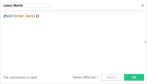
I placed this field on the Detail shelf and changed it to continuous Month and updated the title. The title is also supposed to show sales for the most recent month. I did this with a table calculation.

That’s about it. The rest was formatting and dashboard layout. Emma floated some things in her dashboard whereas I chose to tile everything. Both work just fine.
Overall, I learned quite a bit and that’s what Workout Wednesday is all about!
January 10, 2017
Tableau Tip Tuesday: How to Sort via a Cross-Database Calculation

With Tableau 10 came the ability to create cross-database joins. In this video, I show you how to:
- Create a cross-database join
- Create a calculation across the data sources
- Use the calculation to sort the view
- Use the calculation as a boolean
January 9, 2017
Makeover Monday: Have Apple Lost Their Edge With iPhone?

The iPhone…what would I do without mine? We’ve become so dependent on our mobile phones and this is primarily due to the revolution that Steve Jobs launched back in 2007. This week for Makeover Monday, we look at this chart from DazeInfo:

What works well?
- Title captures your attention
- Nice highlighting of the declining bar in 2016
- Simple colors that work well
- Pretty simple, easy to understand viz
What could be improved?
- Beveled bars are unnecessary; just make them flat
- What does the * mean next to 2016?
- Is the axis needed if the bars are labeled?
- Inconsistent label formatting; make them all the same number of decimals
- Remove the gridlines
For my version, I wanted to focus on the story that was in the article itself. I was particularly struck by the percentage of revenue that the iPhone now accounts for in Apple’s overall revenue.
January 4, 2017
Workout Wednesday: Comparing Year over Year Purchase Frequencies

What is Workout Wednesday? It’s a set of weekly challenges from Emma Whyte and me designed to test your knowledge of Tableau and help you kick on in your development. We will alternate weekly challenges: I will take the odd weeks and post them on my blog; Emma post challenges on the even weeks on her blog.
The idea is to replicate the challenge that we pose as closely as possible. When you think you have it, leave a comment with a link to your visualisation and post a pic on Twitter for others to enjoy.
Ok, so for week 1, I challenge you to recreate the visualisation below that helps identify the year over year purchase frequencies of Superstore (get the data here). The workbook is downloadable, but don’t cheat. Give it a real go before you download it to see if you got it right.
Here are the requirements:
- Y-axis is the cumulative % of total orders
- X-axis is the day of the year
- One line for each year, with the latest year highlighted
- Include a reference line for the target, which should adjust based on what the user enters
- Single select filter for Product Sub-Category
- Multi-select filters for Year, Region and Customer Segment
- Include a dot on each line at the first day when the cumulative % of order crosses the target
- Make the tooltips match mine
- Title should update based on the target entered by the user
January 3, 2017
Makeover Monday: Australia’s Income Gender Gap

2017 is here and with it another 52 weeks of Makeover Monday. ICYMI, this year Eva Murray is joining me on the project. We’ll be rotating each week, which I’m looking forward to as it’ll help challenge me more.
For week 1, we’re reviewing this article from Women’s Agenda about the massive pay gap that exists in Australia’s 50 highest paying jobs. Interestingly, we’re not making over a chart this week; instead it’s two ordered lists.

What works well?
- An ordered list is great for showing ranking
- Splitting the lists between men and women makes it easy to see which jobs pay them most for each gender
What doesn’t work well?
- It’s basically impossible to compare men and women in the same jobs, which was the whole purpose of the article.
- Within a gender, you have to do the math in your head to compare jobs. A simple bar chart, would make it to compare at a glance.
- There’s no “story” to the data. What’s the call to action?
- The lists only show the top 50 for each gender distinctly, making it really hard to find an overlap in the lists.
- There’s no sense for the “overall” gender pay gap when limiting the list.
For my version, I started with a Google image search to get some inspiration. I pulled various parts and pieces from different infographics that resonated with me to put together this infographic. I had a few objectives:
- Use an impactful title
- Break the infographic into several parts by adding divider lines
- Start with a high-level summary of the gender gap for all jobs in the data set and just the top 50 jobs
- Quantify the pay gap for the reader to improve the context
- Show the wage gap in the top 50 jobs via a slope chart and highlight the jobs when women earn more than men (sadly only 2 jobs)
- Create a mobile version that allows for scrolling through the story
With these goals in mind, here’s my first Makeover Monday of 2017.


