October 25, 2017
Workout Wednesday: The Seasonality of Superstore
This week's challenge builds upon Ben's work. First, you'll need this version of Superstore (which is different to Ben's but the same one I normally use for WW).Anyone ever noticed a seasonal trend in the number of products sold in the binder category before? #SampleSuperstoreInsights @tableau pic.twitter.com/zmTJeli7Yv— Ben Moss (@benjnmoss) October 15, 2017
Here are your requirements:
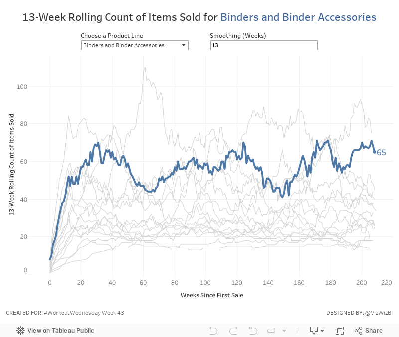
- Create a line chart of the rolling N week cumulative products sold since the first week each product sub-category was sold. In this case, a product sold is the count of the product names.
- Allow the user to pick a sub-category to highlight. Make it blue and all others grey.
- The sub-category highlighted should also be slightly thicker than all other sub-categories.
- Allow the user to define the number of weeks over which to compute the smoothing. The user should only be able to enter values between 8 and 52.
- The title and the y-axis should update dynamically based on the number of weeks entered for the smoothing.
- Match the tooltip in the chart
January 20, 2017
London Crimes: Exploring the Trends, Locations and Crime Types
Sasha Pasulka has been a good friend of mine for many years and is moving to London from the US soon in her new role with Tableau. Like anyone else that’s moving to a new country, she finds the entire process is ridiculously overwhelming. Trying to find apartments from thousands of miles away, not knowing anything about neighbourhoods, can be an incredibly daunting task. To help her, I decide to build a viz in Tableau.
I started by using the London Crimes web data connector from Tableau Junkie, only to realise that it’s somehow not returning all of the data. It looks like it returns the data via a radius versus for an entire postcode.

No worries though. Instead I went to data.police.uk and downloaded all crimes from the Metropolitan Police Service. This returned a separate CSV for each month and it also wasn’t limited to just the London area. On the London Datastore I was able to find a list of all LSOAs in the London area. Great! All I needed to do was union all of the CSVs then join them to the London LSOAs. I love that I can do all of this straight inside Tableau now.

From there, it was a matter of building a simple visualisation that allows Sasha to pick boroughs and see the crimes in those areas. Note that I set the map to only display when there are 3 or fewer boroughs selected. did this because the map was simply too slow to draw the dots. Hopefully she likes it and makes it easier for her to settle in.
August 2, 2015
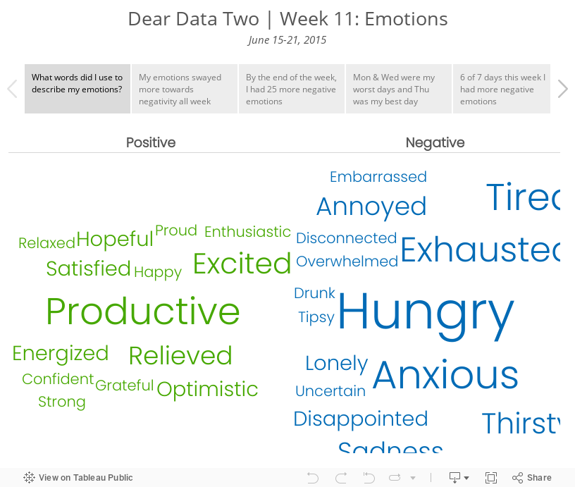
Dear Data Two | Week 11: Emotions

Week 11 could not have come at a more perfect time for me. I had so much going on in my life:
- Putting my family on a plane to Atlanta (before they headed to London a few weeks later)
- Saying my final goodbyes at Facebook
- Packing the rest of our stuff for storage
- Selling our car
- Saying goodbye to my sister
- Heading back to London
- Finishing prep for The Data School.
Throw in marathon training and needless to say, my emotions were all over the board. Basically, I was operating on fumes all week.
My data collection was pretty simple. Since I was already using IFTTT to log Swarm check-ins to Google Sheets, I simply added a column for my emotional state at the time of the check-in. I intentionally did not look back through the data until I was done because I didn't want to bias myself.
The summary is simple: I basically had the emotional state of an 6-month old. I found this to be a really fun analysis, one that I've never done before, and it gave me a very different insight into my week than I expected. Data for the win!
April 7, 2015
Tableau Tip Tuesday: How to Create a Moving Reference Line

June 21, 2010
Map: Where Americans Are Moving
Click on the map and you can interact with it yourself. If you want to do any further research, the outbound data can be found here and the inflow data can be found here.






