January 30, 2017
Makeover Monday: Employment Growth in G-7 Countries
bar chart
,
Business Insider
,
economy
,
G-7
,
growth
,
highlight
,
Makeover Monday
,
pie chart
,
United States
2 comments

What works well?
- Good to add a note about rounding
- Citing the data source
- A clearer title that makes the message more evident
- Countries should be sorted in descending order
- Labels should include the %
- Pie chart is a bad choice for this many categories
- Too many colors
- Chart titles are confusing (to me at least)
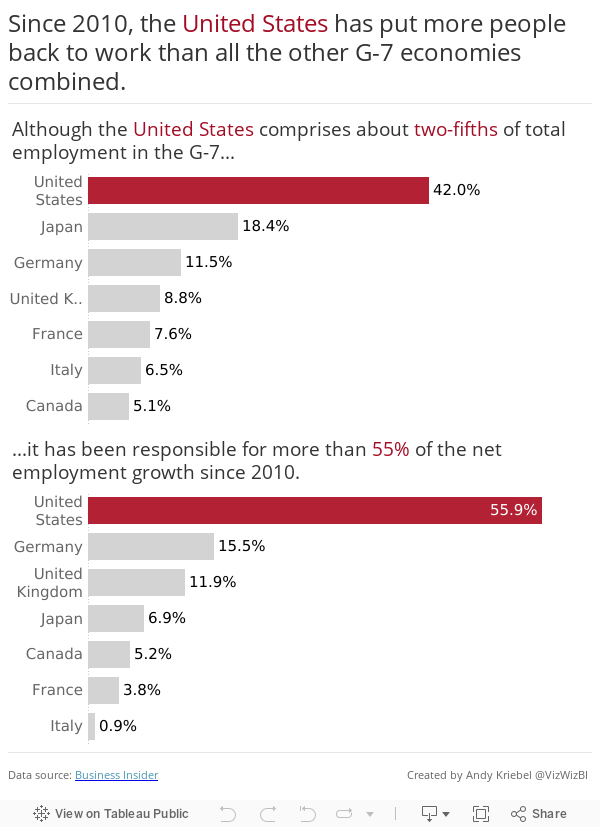
I took the time to read through the article and to read the section of the original report that is referenced. After reading them, the intent of the pie charts was clear. The articles helped me organize my visualisation in a manner that makes the message more clear. I decided to highlight the U.S. with the official red of the U.S. flag. For me, the bar charts are much more clear than the pie charts and they help me break the story into two parts.
Subscribe to:
Post Comments
(
Atom
)


What I love about the remake is that it makes the data comparable for further questioning. The first thing the clean up made me want is population as a denominator to compare relative rather than absolute performance.
ReplyDeleteThe ever-reliable Wikipedia gives me relative 2010 populations of:
USA 42.3%,
Japan 16.9,
Germany 10.7,
UK 8.6,
France 8.8,
Italy 8.1,
Canada 4.7.
This gives me the rough baseline buckets for 2010 of over-represented (Japan, Canada, Germany, UK) and under-represented (Italy, France, USA). All things being equal, I'd expect regression to the mean with first 4 growing "less". Relative growth since then sees Germany, UK and Canada remain over-represented; USA switching from under-to over; Japan from over to under; whilst the relative representation of France and Italy has continued to worsen.
I presume Business Insider were focused on the US reader perspective, but relative to starting positions and relative growth, I'd have the countries ranked Germany, UK, USA, Canada, France, Japan, Italy. Germany started over-represented and continued to add to their relative weight, so the US perspective feels more like "Corner turned and chasing down Germany." But that's a completely different graph, so probably not really the ethos of a makeover...
Great idea Paul!
Delete