August 19, 2021
#MakeoverMonday 2021 Week 33 - UCAS Daily Placements

July 28, 2016
Bowdoin vs. Vassar: An Analysis of Malcolm Gladwell’s Revisionist History Podcast

Malcolm Gladwell, one of my all-time favorite authors, recently started the Revisionist History podcast. In his typical style, it is absolutely amazing!
"Each week for 10 weeks, Revisionist History will go back and reinterpret something from the past: an event, a person, an idea. Something overlooked. Something misunderstood."
In the middle is a three-episode series about education in the United States. One story in particular caught my attention and, coincidentally, I happened to listen to this podcast on the same day that The Data School was working on their dashboards based on the College Scorecard data.
Here’s Gladwell’s summary of episode 5: Food Fight!
Bowdoin College in Maine and Vassar College in upstate New York are roughly the same size. They compete for the same students. Both have long traditions of academic excellence. But one of those schools is trying hard to close the gap between rich and poor in American society—and paying a high price for its effort. The other is making that problem worse—and reaping rewards as a result.
In the spirit of not accepting statements as fact, I decided to create this visualisation comparing the two colleges. In every section I start with a similarity then next to it I point out a difference. This really helped me compare the schools and confirm much of what Gladwell spoke about in the podcast.
July 4, 2016
Makeover Monday: Where Are the Best & Worst States to Raise a Child in America?

This week the UK Zens are on Tour and we’re taking Makeover Monday on the road with us. And it’s Independence Day in America so I chose a visualisation about raising children in America. Happy birthday ‘Merica!


What works well?
- Nice big titles make it easy to know what the map is about
- The colors make is easy to see the good and bad concentrations.
- Alaska and Hawaii are neatly brought in under the continental U.S.
What doesn’t work?
- The ranges for the colors are equivalent.
- Using a filled map could lead to visually distortion; poor Rhode Island!
- The separate maps that you have to page through make comparisons too difficult.
- There’s no way to see a State’s ranking in all categories at once.
I iterated through lots of ideas this week and found two that I think work well.
- I changed the filled map to a hex map then put all of the maps side by side.
- I created heat maps and bump charts that show the individual State rankings in each category.
- I added bar charts in the tooltips.
- I included highlighting interactivity.
Both views are shown below. Which one do you prefer?
May 27, 2016
Fix it Friday: Early Leavers from Education and Training in Europe

On the train to work this morning I was reading through the blogs I follow and ran across this amazing visualisation from Stephanie Evergreen:

I love small multiples and I love slope charts, and this in an amazing combination of the two. Shortly thereafter, I ran across this chart from the Financial Times:

To me, this chart is screaming out for a slope chart. Also, I don’t understand why they didn’t include all countries in Europe. I downloaded the data from Eurostat and created this small multiples slope chart in Tableau.
I also was able to include an option that allows you to pick a gender or the overall. Notice how the title changes color to match the lines in the slope graph. Do you know how I did that?
Which one do you think tells the story better? Does the bar chart of the slope chart make comparing the years easier?
May 5, 2016
Makeover Monday: The Rising Cost of Tuition in the United States - Highcharts Edition

However, until these problems are fixed, I need to find another way to create visualisations that work well on mobile. Enter Highcharts. It’s a javascript-based charting tool that has proven super easy to learn. I’ve never coded in JS before, yet I was able to reproduce my entire Makeover Monday viz from this week without too much fuss. Yes, it takes me longer than Tableau, but the extra time is worth the control I have over the visualisation.
Give it a play, especially on your phone. I think you’ll find it a much better experience than the Tableau version.
May 2, 2016
Makeover Monday: The Rising Cost of Tuition in the United States

This week for Makeover Monday, we look at an article and viz from Online MBA Page about the cost of college tuition in the United States.

What works well?
- Very clear subtitle that describes the visualisation
- Used a two-color diverging scale to identify the change
- Nice labels above the color legend to ensure you know what is good and what is bad
- Good use of red for bad
- Including the US Avg for context
- Using % change provides better context than the raw numbers
What doesn’t work well?
- The irregular state shapes - is a map even necessary?
- The color bins are not equal size - notice how the first two are different sizes than the rest
- Bar chart should be rotated 90 degrees to make it easier to read
- What year does the bar chart represent? I can’t find anywhere that tells us.
- Do you really need the ranking numbers below the bar chart?
The data that was available goes back 12 years, so why did the author only choose to look at the change over the last 5 years? For my version, I’m going to consider all of the years because I think that provides better context as to how much tuition has changed.
I started by looking at maps. I created this small multiples version, which shows the difference for each state to the U.S. average year by year.

This doesn’t work well because all of the maps basically look the same. For the most part, the northeast is higher than the national average consistently. It also doesn’t allow me to easily compare one state to the others.
I tried a hexmap and circle maps, but none of them worked well for me. In other words, just because we have geographical data, it doesn’t mean we HAVE to create a map. For me, what’s more important is including context. How can I best compare the States? How can I compare to the U.S. Average? What’s the best way for me to show how the cost of tuition has changed?
Given all of these questions, I decided that a series of three line charts were the best way to go for my story. In this view I can show:
- Yearly tuition rates for each State
- Highlight a selected State, but include the others for context
- Include the U.S. average for context
- Show the change over the last 12 years
- Show the variance to the U.S. average
Each of these provide much greater context than the original visualisation and tell a more compelling story about the escalating rise in tuition across most of the U.S.
April 27, 2015
Makeover Monday: Where Is the Global Talent Pool Expected to Come from in 2030?

The global talent pool has never been larger, will grow to 2030, read http://t.co/aA9AyLEXta (pdf) #education #stats pic.twitter.com/aiIiTDbZt9
— OECD (@OECD) April 24, 2015
These pie charts are part of a larger study conducted by OECD, which you can read here. Some thoughts about these pie charts:
- The author is trying to show the change from 2013 to 2030. Using two pie charts makes this more difficult than necessary. At least, though, they kept the countries in the same order.
- The pies do not add up to 100%, I assume due to rounding. The 2013 pie adds up to 101% and the 2030 pie adds up to 102%.
- The focus is on the top 20 countries, so the “Other” category isn’t needed.
- The labels on the pies include both the country name and the value. A table would be better than this. Adding all of these labels makes the chart way too busy.
- There are two key metrics in the data: share of degrees and the number of degrees. The pie chart doesn’t provide enough context for understanding where the number of degrees will be coming from.
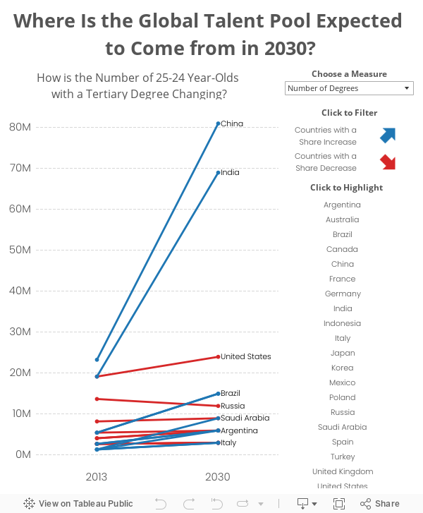
Given all of the above, I decided to create a slope graph.
- I included a parameter which allows you to select the metric.
- This option, along with using a slope graph, really helps show how dramatic the change is for China and India.
- Switch back and forth between the parameter options and you’ll see quite a different story.
February 28, 2012
Stop Stealing Dreams (what is school for?)
"What do you think we ought to do about education?"Download it here.
My readers ask me that question more than just about any other. So here's my question back: What is school for? (Click the link to get to the free download).
I've just published a 30,000 word manifesto, totally free to read, share, translate, print and, most of all, use to start an essential conversation. It took a lot to get it to you, and I'm encouraging you to take a few minutes to check it out. After you read it, perhaps you'll write one of your own.
This is an experiment in firestarting--I'm hoping that removing friction from the sharing of this idea will help it spread.
Ultimately, our future belongs to a generation that decides to be passionate about learning and shipping, and great teachers are the foundation for that.
June 14, 2011
How wide is the UK education gap? Hint: It’s wider than you think
Back in December I critiqued a viz about the gap between the Russell Group of universities and several of the rest. The postgrad.com Data Visualization Challenge sparked me work on part 2 of my analysis.
Over here in the States, when you hear of Oxford or Cambridge, you think of exclusivity and an incredible (and incredibly expensive) education. I never knew much about the UK educational system until recently, thanks to the Guardian Datablog.
I’ve once again turned to the flexibility of Tableau (the parameters feature is a huge help) to create this viz which details the gap between what is essentially the rich and the poor. Play around with the colors, shape sizes and the scatter plot. Click on a bubble and its stats will appear at the bottom.
You’ll certainly find something interesting including:
- Kings College London has the highest % of free school meal students, but only at 5.3% (the average is 6.47%)
- Oxford is indeed elitism, at least the data suggest such: 47% of students are independent while only 0.8% are FSM
- 60 of the 87 schools in the dataset (69%) have a below average % of independent students, none of the schools being in the Russell Group
What do you see?
April 4, 2011
Student Achievement in the Cobb County School District – Is the Balanced Calendar Working?
I’ve previously published research regarding the Cobb County School Board’s decision to revert to the “traditional” calendar. Much to the dismay of the board members, many of the parents have not let this unpopular change go away.
In a very rare move, the Cobb school board was called to testify in front of a grand jury to discuss the recent calendar decision and the board’s overall decision-making process. The outcome/recommendation from the grand jury will likely not be known until early-May.
The remainder of this blog post contains excerpts from research conducted by a friend and fellow Cobb County parent with respect to academic gains achieved to-date under the “balanced” calendar. View the research in its entirety here or see the bottom of this post.
In November of 2009, the CCSD approved a balanced calendar for a three-year period to begin in 2010-2011. The district committed to monitor the impact of the balanced calendar on key operational areas including student achievement.
On February 17, 2011, the Board of Education overturned this decision before the first year under the balanced calendar had even been completed, approving “traditional” calendars for the following two school years. Although this reversal was shocking, even more stunning was the fact that the board overturned its 2009 decision without honoring the commitment made to the district when the balanced calendar plan was established.
Because the 2010-2011 school year has not yet been completed, a full assessment of student achievement under the balanced calendar is not possible. However, the three assessments completed to date – The Iowa Tests of Basic Skills (ITBS), The Georgia High School Writing Test (GHSWT), and the End-of-Course Test (EOCT) – can provide some insight into the impact of the balanced calendar on student achievement.
The Iowa Tests of Basic Skills (ITBS)
Students are assessed in the fall on the Iowa Tests of Basic Skills (ITBS). This is a norm-referenced assessment that measures student achievement in comparison to other students nationwide. Students in grades 3, 5, and 7 are tested in Reading, Mathematics, Language Arts, Science, Social Studies and Sources of Information. Results include:
- ITBS Grade Equivalency (GE) scores for Cobb’s third, fifth, and seventh graders had all been declining in recent years. However, for the first time since 2007, ITBS GE scores in Cobb County increased in 2010
- In 2010, GE scores for third graders increased to 3.59, an increase of 3.5% in just one year
- GE scores for fifth graders increased 1.8% in 2010 to 6.05
- GE scores for Cobb’s seventh graders increased slightly by 0.6% to reach 8.05 in 2010
- Percentile rankings for all three grade levels increased by 1.5% in 2010

The Georgia High School Writing Test (GHSWT)
High school students are assessed on the Georgia High School Graduation Tests (GHSGT) and the Georgia High School Writing Test (GHSWT). Most students take the GHSWT during the fall of their junior year and are required to pass the test to earn a regular education diploma. Results include:
- GHSWT results improved by 3.3% in 2008 with 95% of the students passing the assessment
- Results declined slightly in 2009, falling to 94%
- Results have increased dramatically in 2010 with a 4.3% increase to an all-time high of 98%

End-of-Course Test (EOCT)
All students take the End-of-Course Test (EOCT) after completing various courses in four different categories: English and Language Arts (ELA), Math, Science, and Social Studies. Results of the EOCT are used for diagnostic, remedial and accountability purposes to gauge the quality of education in the state and also count as part of the student's final grade in the course. Results include:
- Results in ELA and Social Studies have maintained a slight but steady increase through the 2010-2011 school year
- Results in Science showed a slight decrease in 2010-2011, returning to their 2008 level of 71%
- After a 23% decline in 2008-2009, results in Math dramatically improved by 26% in 2009-2010. They continued to improve by another 11% to 75% in 2010-2011, reaching a level not obtained since 2006-2007

Summary
Quantifiable year-to-date student achievement in the Cobb County School District during the first year of the Balanced Calendar can be summarized as follows:
- ITBS Grade Equivalency scores and national percentile rankings had all been declining in recent years but increased in 2010-2011 for the first time since 2007
- GHSWT passing rates had improved in 2008-2009 and declined in 2009-2010, but then they increased dramatically in 2010-2011 to an all-time high
- In 2010-2011, EOCT passing rates declined slightly in science, continued a steady increase in ELA and social studies, and continued to increase significantly in math
Of course, the results of only three assessments cannot definitively establish the impact of the balanced calendar on student achievement. Ten total assessments are published each year in the CCSD, and full evaluations of all ten at the end of the 2010-2011 and 2011-2012 school years would have provided the most reliable gauge of the balanced calendar’s impact.
However, these are the only assessments that have been completed to date, and one thing can be said for certain. The balanced calendar has not had an adverse affect on student achievement in the Cobb County School District to date in 2010-2011. In fact, all indications so far suggest that the balanced calendar has had a positive impact on student achievement and is promoting improved results.
March 15, 2011
Cobb County schools with a high reduction in student absences are down more than 3 to 1 to high increases
There was a biased comment made by Mr. Sweeney (email him here to call him out on it) during the discussion phase last week of the Cobb County School Board meeting. He started spouting off schools that have had significant INCREASES in student absence. While the schools he mentioned did indeed have a high increase in absences, he failed to mention some key facts.
Only 15 of 199 (12.6%) schools had a > 10% increase in absences, meanwhile 48 of 119 (40.3%) schools had a > 10% DECREASE in absences. It's disappointing that none of the other board members called him on this (though I know three of them never would).

March 9, 2011
Facts are friendly. Why the Cobb County School Board should reinstate the balanced calendar.
Today I presented the information below at the monthly Cobb County School Board meeting. As some background, the previous board approved a three-year “balanced” calendar that provides more frequent breaks throughout the year. However, a new board was “elected” (some ran unopposed) and they decided that, despite the overwhelming evidence in support of the balanced calendar, they wanted to go back to the “traditional” calendar.
Naturally, I used Tableau to analyze the data that was provided by the county itself (some board members were using their own data which could neither be validated nor would they share). The key points:
- The Balanced Calendar has resulted in a 26% reduction in teacher absences for a total savings of $987K. Previously when this data has been presented, it has not factored in the additional savings that result from a $10 decrease in daily substitute pay.
- The Balanced Calendar has resulted in a 4.2% reduction of student absences, with over 75% of school reporting a reduction in absences. In the past, analysis has not considered that there were 88 schools days in 2010 compared to 85 in 2011. Another interesting fact is that a school board member reported incorrect information. I corrected him.
- Utility cost trends are in alignment with my costs at home. My assumption, though likely too broad, is that my utility costs are in alignment with other residents of Cobb county.
The board is supposed to vote on the calendar again today or tomorrow, but I’m not holding out hope that the board members that voted against the balanced calendar will be swayed by facts.
I closed my comments with the following from Seth Godin:
Before we invest a lot of time in evidence-based discussions, please tell us what evidence you would need to see in order to change your mind. If the honest answer is, "well, actually, there's nothing you could show me that would change my mind," you've just saved everyone a lot of time. Please don't bother having fact-less discussions.
February 19, 2011
A broken Electorate system. The Cobb County school calendar poll results visualized.
Last year, the Cobb County Board of Education voted on a balanced school calendar that starts school at the beginning of August and provides more frequent breaks throughout the year. Despite this being voted in as a three-year calendar, some of the recently elected board members put forth a motion to change the calendar back to a more traditional calendar. Here are the results from the survey they conducted to get community feedback:

View the School Board’s version of the results here. I wonder if they intentionally put the results on separate pages to make it difficult to compare them side by side. In the view above, you can clearly see that community overwhelmingly favors the August 1 calendar (the current calendar).
Which way did the school board vote? 4-3 in favor of the August 15th calendar. Seriously! How the hell does this happen? Watch the motion hearing here.
Needless to say, parents are outraged.
In a Democracy, an Electorate system is often put in place so that the interests of many are represented by a few. The way it is “supposed” to work is that the representatives heavily weigh the opinions of their electorate when making decisions, but clearly four members of the school board have not in this case. It’s incredibly sad that special interests appear to have played a part in the vote, but then again, that’s nothing new here in the USA; votes can easily be bought (see campaign contributions and pork barrel spending).
Some quotes of note:
WSB-TV: School board member Tim Stultz said “I'm not prepared to let one side just rule because they have majority numbers.”
Marietta Daily Journal:Beth Kriebel (a parent, PTA member, and my wife) spoke at the meeting and said “I think you’re taking a huge risk in changing something that greatly impacts any family that has a student in the school district. While campaign promises were made last year by some of you, what about the majority of Cobb County parents who have adjusted to the balanced calendar on good faith that no changes would be made?”
I’m proud of my wife for standing up and representing the interests of the great majority of Cobb County residents.
December 30, 2010
UK University Elitism? Independent vs. Free Meal Students – Part 1
This is part one of a two part analysis of private education in the UK. The chart below was published on Flickr by li_jacq.

Two simple improvements:
- A bar chart would be more effective than a column chart because you don’t have to turn your head to read the labels
- The data should be ranked. This seemingly sporadic display does not provide any insight
I pulled down the data to reconstruct the chart.

As you can see, I’ve made the adjustments I noted above and now you can make more sense of the data.
My curiosity is leading me to look into this further. My questions include:
- Why are only 16 universities listed? These don’t represent the top 16 for this measure, so what’s their significance versus the others?
- What’s the relationship between Independent and Free Meal school students?
- Does the region of the UK impact anything?
I’ll answer these questions and more in a future post.
February 19, 2010
Improving Graphs in College Textbooks
Quantitative Literacy Across the Curriculum: Improving Graphs in College Textbooks
To subscribe to Few's monthly Visual Intelligence Newsletter, click here.