November 12, 2019
#MakeoverMonday: Literacy Rates Around the World

Here's the original viz:

What works well?
- The data by region is ordered alphabetically, making it easy to find each region.
- The bar chart is sorted by largest to smallest.
- Nice filtering options
What could be improved?
- A diverging color palette should only be used when there is a logical midpoint or goal. I don't see those in this viz.
- The squares are hard to understand.
- I don't find the map very useful. It would be more useful if it zoomed in when a region is selected.
- There's no title.
- There's too much text.
- The bar chart seems to go out past the edge, or at least visually it appears that way.
What I did
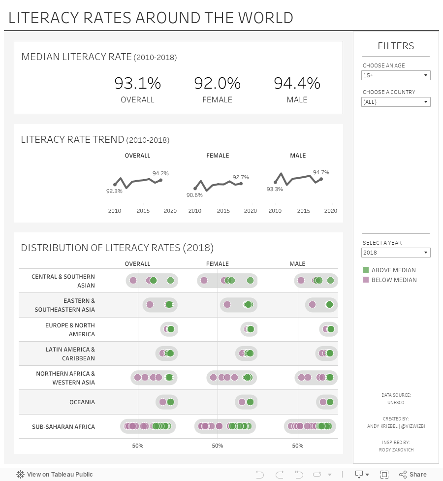
- I created a KPI scorecard so that I could understand the patterns for the overall or an individual country. Are literacy rates improving or regressing?
- Show the distribution of the rates of the countries within each region
- Within each region, which countries are above or below the median for that region?
- How has the literacy rate changed over time?
- Allow simple filtering options.
July 4, 2016
Makeover Monday: Where Are the Best & Worst States to Raise a Child in America?

This week the UK Zens are on Tour and we’re taking Makeover Monday on the road with us. And it’s Independence Day in America so I chose a visualisation about raising children in America. Happy birthday ‘Merica!


What works well?
- Nice big titles make it easy to know what the map is about
- The colors make is easy to see the good and bad concentrations.
- Alaska and Hawaii are neatly brought in under the continental U.S.
What doesn’t work?
- The ranges for the colors are equivalent.
- Using a filled map could lead to visually distortion; poor Rhode Island!
- The separate maps that you have to page through make comparisons too difficult.
- There’s no way to see a State’s ranking in all categories at once.
I iterated through lots of ideas this week and found two that I think work well.
- I changed the filled map to a hex map then put all of the maps side by side.
- I created heat maps and bump charts that show the individual State rankings in each category.
- I added bar charts in the tooltips.
- I included highlighting interactivity.
Both views are shown below. Which one do you prefer?
April 25, 2016
Makeover Monday: Victims of the 21st-century Slave Trade

This week for Makeover Monday we are looking at this Viz of the Day from CNBC as seen on Tableau Public. For me, this is a really poorly done viz that really doesn’t tell us anything. When I look at this and say to myself “so what?”, I can’t answer that question.

Let’s start by looking at what works well:
- The table provides a nice summary of how many countries in each region fall into each tier.
- Clicking on a region and/or tier filters the map
- Nice “About” option
Really, that’s about all I can come up with that works well. There are so many things that could be done better:
- The most major problem is that there’s no context. What is good and what is bad? Is the situation getting better or worse? Context is so critical in visualisation and this viz totally lacks context.
- The title is misleading; was that intentional? These countries aren’t necessarily trafficking the children. Yes, it’s unbelieably terrible how the children are treated, but the title needs to be more accurate.
- The bubbles in the table add no value.
- Poor color choices
- Tooltips are useless
- There are no trends
- There’s no call to action. What am I supposed to do with this information? Again, so what?
Keep in mind that Makeover Monday is NOT about criticizing the author, it’s about critiquing the visualization and trying to create a more compelling story and more interesting visualizations.
What I wanted to try to focus on this week is whether or not childhood slave trade is getting better or worse. The data set that I created contains data back to 2007. Since we have geographical data (i.e., countries), I first wanted to see if viewing the countries by their tier status as a series of small multiple maps would reveal anything.
 |
| Click on the image to interact |
Unfortunately seeing trends across multiple maps is extremely difficult. Even if I drill into a specfic region, Africa for example, it’s still really hard to see patterns.
 |
| Click on the image to interact |
Ok, so maybe filtering even further by tier status would help. Let’s first look at all tier 3 countries.
 |
| Click on the image to interact |
Maybe you now have a case for making sense of the small multiple maps, but it takes too much work to see the rate of change. Enough of the maps, clearly they won’t work for displaying change. Fortunately Tableau lets us fail fast!
An alternative to the small multiple maps would be a heat map. In this view, I placed Country in the Rows and Year in the Columns and added a filter for Region.
 |
| Click on the image to interact |
Now we’re getting somewhere. I really like this view because it shows concentrations well. At a glance I can see that there were fewer Tier 2 in 2015 than in 2007 and more contries have moved towards Tier 3. It’s also clear that there are no more Tier 1 countries in Africa.
Contrast that to Europe.
 |
| Click on the image to interact |
Nearly every country in Europe is Tier 1 or Tier 2 and have been consistently. The transition in Russia from a Tier 2 Watch List to Tier 3 pops out as well.
So far, the heat map is my favourite. In Tableau though, since it’s so easy to create lots of views, I iterated some more. Next, I created this unit chart which shows each country in each region by year, simply color-coded by their tier status.
 |
| Click on the image to interact |
I love the look of this unit chart. Notice that I intentionally made each section 5 circles wide. I did that so they’re easier to count. Two things in particular jump out to me in this view:
- The number of Tier 2 Watch List and Tier 3 countries in Africa is growing.
- Asia had an increase in Tier 2 Watch List countries early on and is not slowly progressing more countries towards Tier 2 status.
To get an even better look at whether regions are progressing, I can filter the unit chart to only Tier 2 Watch List and Tier 3 countries. Filtering the data makes my two impressions above even more evident.
 |
| Click on the image to interact |
Lastly, I wanted to look at a time series view. In this case, I need to aggregate the data up to the Region level and count the number of countries in each Tier. The rationale behind this is to simply see how regions are doing over time. Are they getting better or worse? Is the number of Tier 1 and Tier 2 countries growing or are the number of Tier 2 Watch List and Tier 3 countries increasing?
 |
| Click on the image to interact |
It makes complete sense that the time-series view would reveal patterns best. That’s exactly the best use case for a line graph. I like the clean look about this chart. It’s easy to compare within a region and tier or across regions or across tiers or across regions and tiers.
But does this give me the BEST context? Is there a better way to show how the situation has changed since 2007? Yes, by comparing each year to the first year. In this view, I’m now showing the % change in the number of countries in each region in each tier since 2007. I’m using % change because it’s more contextual than simply the change.
 |
| Click on the image to interact |
In this post, I’ve shown you many ways to iterate through the data to find a compelling story, but this doesn’t bring it all together quite yet. In order to do so, I need to combine some of these views into a dashboard. I’m going long-form again this week as there’s simply too much information that needs to be shown to be effective in a single screen.
I’ve created both desktop and mobile version with the design a bit differnent in each.
December 14, 2012
A map that says it all - States with stricter gun control laws have fewer deaths from gun-related violence
From the Washington Post. Enough said. Let the political posturing begin.






