Showing posts with label SDG. Show all posts
November 12, 2019
#MakeoverMonday: Literacy Rates Around the World
children
,
country
,
dot plot
,
goal
,
line chart
,
literacy
,
Makeover Monday
,
median
,
men
,
rates
,
SDG
,
trend
,
women
No comments

Here's the original viz:

What works well?
- The data by region is ordered alphabetically, making it easy to find each region.
- The bar chart is sorted by largest to smallest.
- Nice filtering options
What could be improved?
- A diverging color palette should only be used when there is a logical midpoint or goal. I don't see those in this viz.
- The squares are hard to understand.
- I don't find the map very useful. It would be more useful if it zoomed in when a region is selected.
- There's no title.
- There's too much text.
- The bar chart seems to go out past the edge, or at least visually it appears that way.
What I did
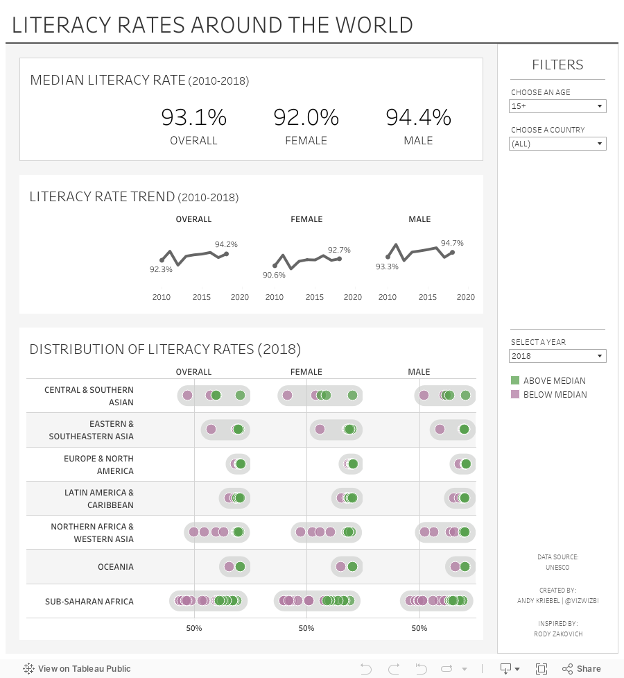
- I created a KPI scorecard so that I could understand the patterns for the overall or an individual country. Are literacy rates improving or regressing?
- Show the distribution of the rates of the countries within each region
- Within each region, which countries are above or below the median for that region?
- How has the literacy rate changed over time?
- Allow simple filtering options.
I drew inspiration from Workout Wednesday week 51 2018: Container Fun from Rody Zakovich. I love finding reasons to practice techniques I've tried before and want to master. Consider challenging yourself to learn something new each week.
Enjoy!
September 16, 2019
#MakeoverMonday: Committed Forever to Positive Impact Events


What works well?
- Everything looks very crisp, as it always does on Google Data Studio.
- Good filtering capability
- Allows you to explore the data in any way you desire
- Colors of the bar chart are easy to distinguish
What could be improved?
- It's way too long; I know I would never read all of it.
- The stacked bar / treemap charts things don't make sense at all.
- There's no structure to guide the user; like what is most important?
What I did
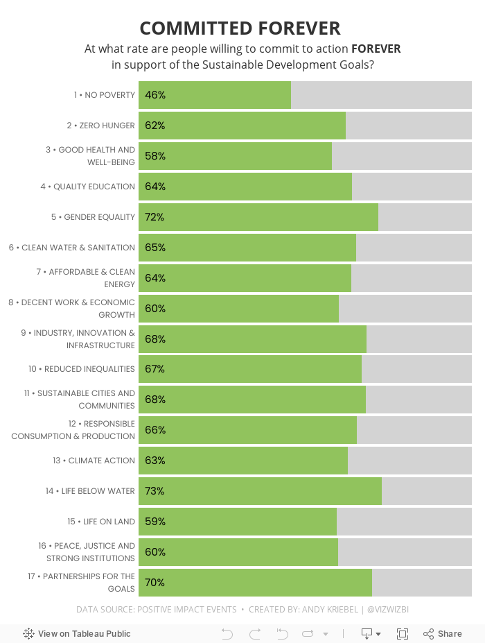
- I focused on the high-level goals.
- I noticed that there were a lot of people that said they would commit to action forever, so I made that the focus of my viz.
- I had originally split the view up by gender, but that didn't add anything to the analysis, so I took it out.
- I used the colors and fonts from the Positive Impact Events website.
And here's my makeover...
September 4, 2017
Makeover Monday: Which UN Sustainable Development Goals Are of Most Immediate Concern?
Let's have a look at the original viz:

What works well?
- Nice interactivity with the icons at the top
- Easy to see the breakdown by demographics
- Simple filtering
- Neatly organized
- Labeling the boxes on highlight
- Ordering the icons by goal
What could be improved?
- Way too many colors
- You eye goes all the way across making it look like all of the demographics are connected
- Seems very busy
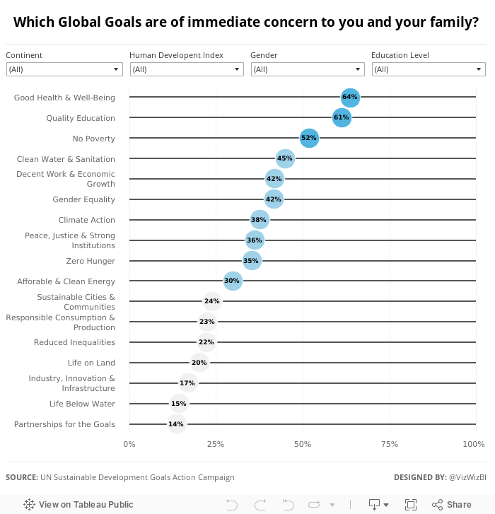
I wanted to keep the visualisation very simple, start with an overview, and allow the user to pick what they want to see. I ended up with this simple dot plot. I also used Device Designer to create a mobile version which will render if you're seeing this on your phone.
Subscribe to:
Posts
(
Atom
)






