May 1, 2024
How to Create a Cycle Plot in Tableau
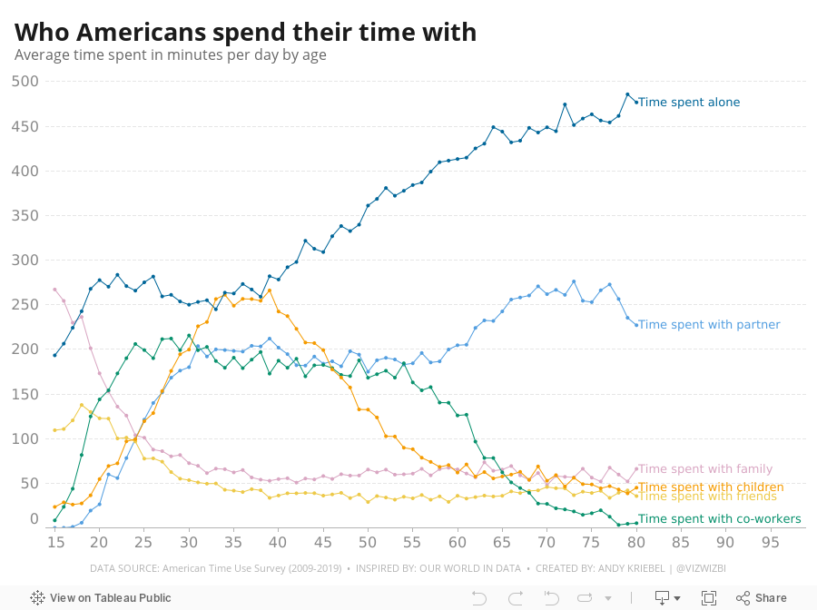
November 8, 2022
#MakeoverMonday Week 45 - Who Americans Spend Their Time With

September 6, 2021
#MakeoverMonday 2021 Week 36 - How Has American Support For Abortion Changed Since 1975?

Despite the massive setback to women's right in Texas, less Americans are anti-abortion than in 1975. Now maybe if the barbaric dinosaurs in Congress in Texas came into the 21st century, they'd finally realize women are our equals and we shouldn't control them. It's all very, very disgusting. They should be ashamed, but of course they're not. In fact, they are quite proud of what they "achieved".

August 9, 2021
#MakeoverMonday 2021 Week 32 - Mortality Rates in England and Wales

I couldn't find too much to do with this week's data set, so I ended up with some simple BANs and line charts that take the original and reorganize them a bit to make them more clear.
Resources:
- Data set - https://data.world/makeovermonday/2021w32
- Chart Guide - https://chart.guide/
- Final Viz - https://bit.ly/mm2021w32
June 30, 2021
Sample KPI Dashboard
- Mastering Containers (Part 1)
- Mastering Containers (Part 2)

November 19, 2020
Pregnancy, Birth, and Abortion Rates in America

With Amy Coney Barrett being sped through the confirmation process of the US Senate before the 2020 Election (as hypocritical as it was) to become the 9th justice on the Supreme Court, there is now a conservative stranglehold on the judicial branch of government.
Justice Barrett deflected all questions about her stance on abortion during the confirmation process and it has raised lots of speculation that Roe v. Wade will be overturned. Yeah, you know, because the government should control a woman's body, yet there is nothing similar for men. Like, why doesn't a man get castrated if he accidentally impregnates a woman? Blasphemy they say; hypocritical I say.
I wonder if any of the anti-abortion Justice or Congresspeople have ever considered their stance if their daughter had an unplanned pregnancy. What is she got raped and pregnant? I bet their tune would change.
Anyway, my political and social views aside, this made me think about abortion rates in America. Since Roe v. Wade, abortion rates in the US have plummeted.

November 9, 2020
Dashboard Templates - Example 1: Customer Service Dashboard
As part of the training at The Data School, we're often tasked by clients to build industry specific dashboards and/or dashboards that can be used as templates for their organization. Of course what the client can ask for is often much more broad. From a dashboarding perspective, we tend to have the freedom to create what we think works best for their data. This them, in turn, helps create a sort of "brand" for their dashboards internally.
That got me thinking about common use cases for dashboards, dashboards that would likely span industries and companies and could serve as templates for others. In this series, I'll be posting templates that I have been building based on the data and sample dashboards from Excel Dashboard School.
Let me make it clear that I am in no way criticizing the work they have created. My intent is to build an alternative method for displaying the data as a template in Tableau. The data and templates they have provided are the starting point for my work. I want to thank them for being so kind and sharing their work.
TOPIC
Customer Service Dashboard
RESOURCES
- Dashboard Overview - https://exceldashboardschool.com/customer-service-dashboard/
- Data and Interactive Dashboard - https://cdnspeed-exceldashboardsc.netdna-ssl.com/wp-content/uploads/2017/08/080_CSD_final.zip
DASHBOARD TEMPLATE

November 18, 2019
#MakeoverMonday: Tween and Teen Smartphone Ownership

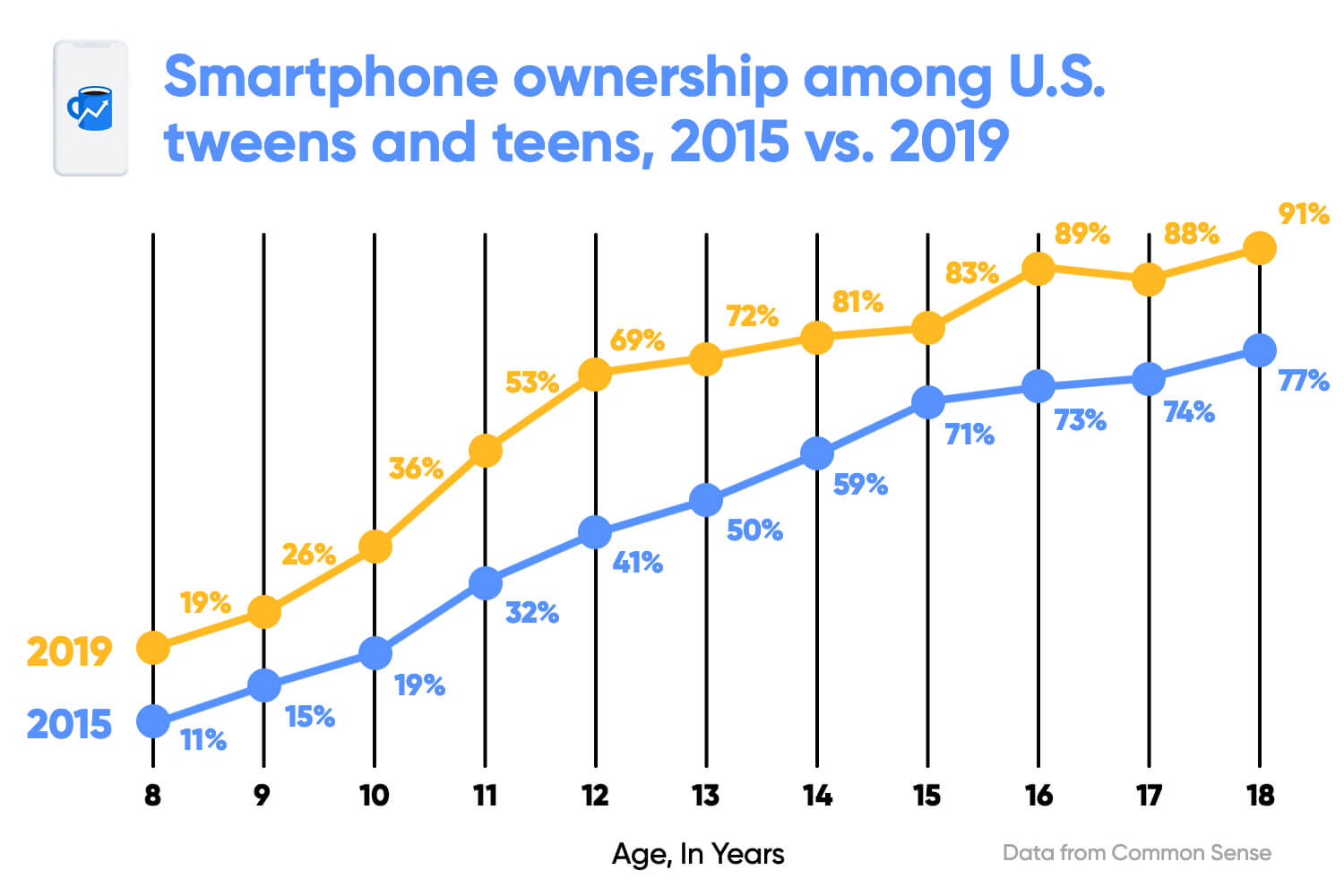 |
| SOURCE: Morning Brew |
What works well?
- Clear title
- X-axis is clearly labeled
- Including the data source
- Colors are easy to distinguish
- Vertical lines help draw the eye to compare the years within each age
- Including labels since the y-axis is hidden
What could be improved?
- The title could be less bold.
- The title uses the color for 2015, but it's not related to one year only.
- The dots are distracting since they are so large.
- The labels are helpful, but do they need to be so big?
- With the vertical lines connecting the dots within the year, and the line connecting the ages across the years, I'm not sure which is more important. Given the title, the focus seems like it should be on comparing years within an age.
- The vertical lines don't need to be so broad.
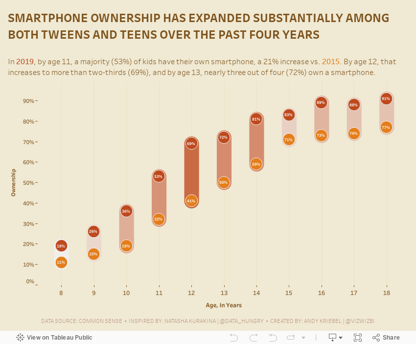
What I did
- Removed the lines to make the focus comparing the ownership within an age group
- Surrounded the dots with a band to ensure the user reads the data within each age group
- Colored the bands by the change to accentuate the ages that have changed the most
- Included the labels, but made them very small as to not distract from the analysis
- Created a mobile version for practice
November 12, 2019
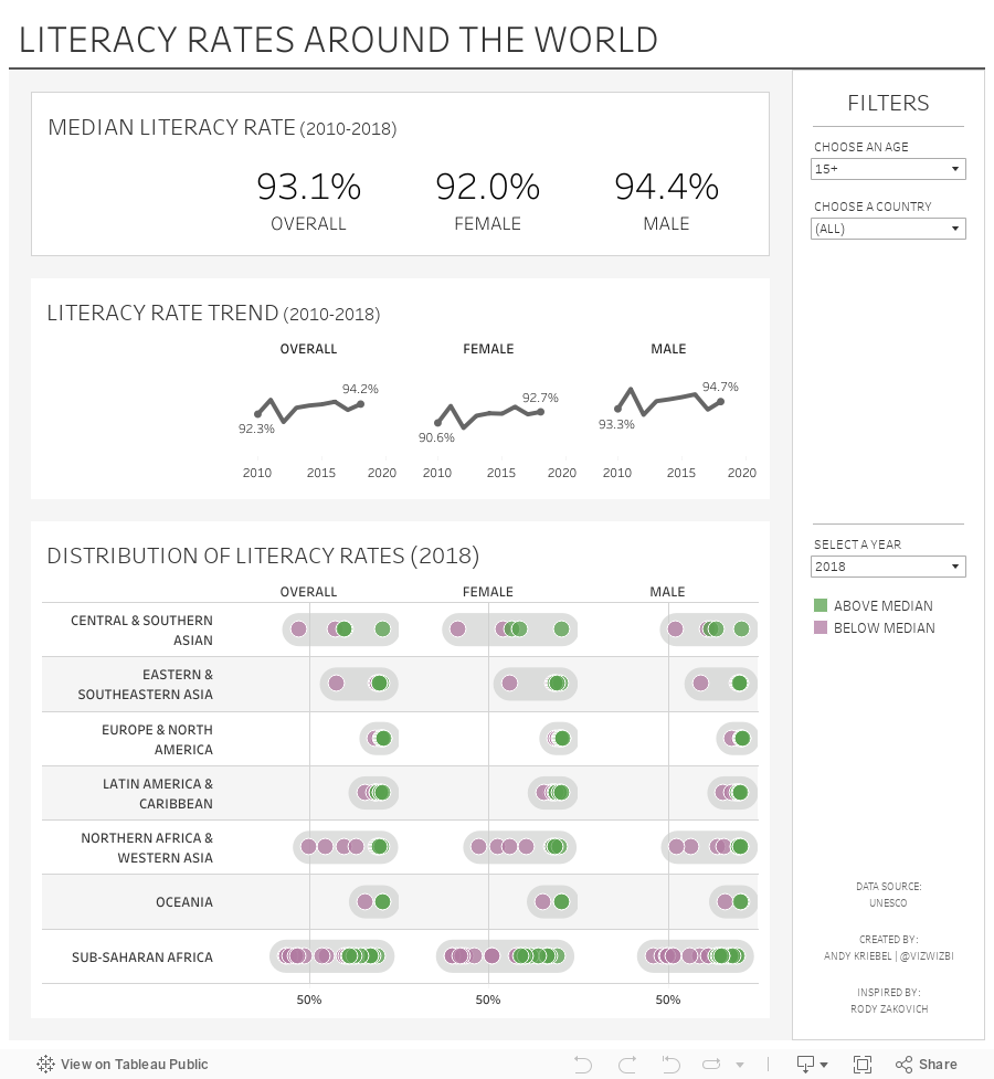
#MakeoverMonday: Literacy Rates Around the World

Here's the original viz:

What works well?
- The data by region is ordered alphabetically, making it easy to find each region.
- The bar chart is sorted by largest to smallest.
- Nice filtering options
What could be improved?
- A diverging color palette should only be used when there is a logical midpoint or goal. I don't see those in this viz.
- The squares are hard to understand.
- I don't find the map very useful. It would be more useful if it zoomed in when a region is selected.
- There's no title.
- There's too much text.
- The bar chart seems to go out past the edge, or at least visually it appears that way.
What I did
- I created a KPI scorecard so that I could understand the patterns for the overall or an individual country. Are literacy rates improving or regressing?
- Show the distribution of the rates of the countries within each region
- Within each region, which countries are above or below the median for that region?
- How has the literacy rate changed over time?
- Allow simple filtering options.
December 30, 2018
Makeover Monday: Team by Team NHL Attendance

For week 1, we're making over this chart from NHL to Seattle. Granted the chart is from 2013, but it's still worth a makeover. If you want to see what John Barr has done since then, you can find a more recent visualization of NHL attendance from him here.
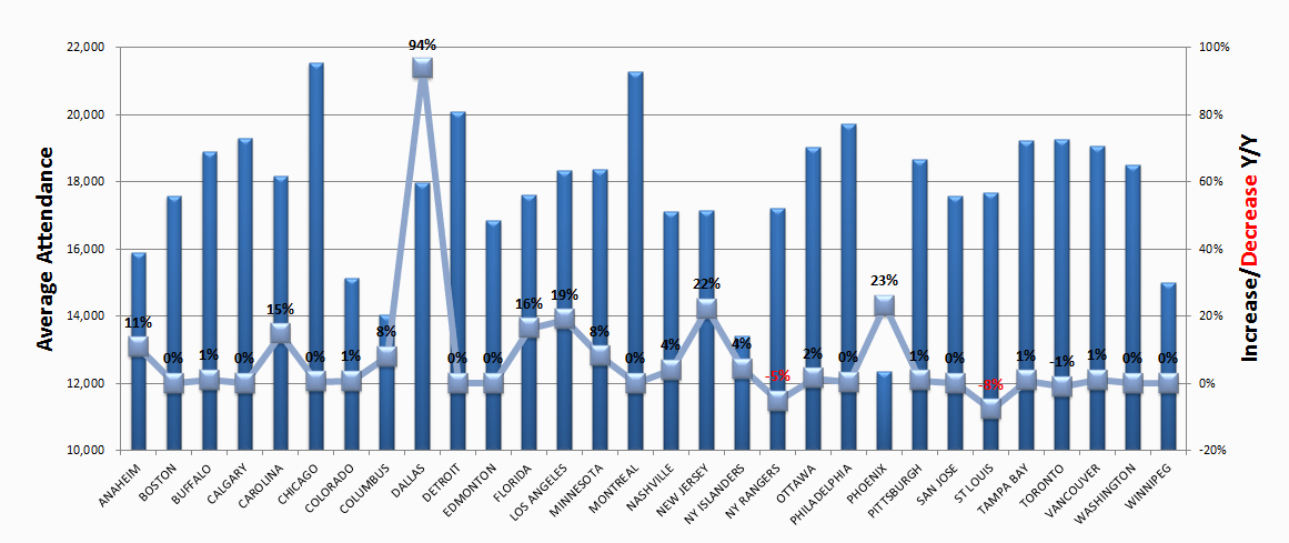
What works well?
- The teams are ordered alphabetically, which makes it easy to find a specific team.
- Axes are clearly labeled
What could be improved?
- You should NEVER EVER truncate the axis of a bar chart.
- You should not use a line chart for non-ordinal data (e.g., team names).
- There's no title.
- 3D bar charts are meh
- Labeling each square makes the viz feel cluttered.
- Ordering the bars from highest to lowest would make it easier to see where a team ranks.
What I did
- I grouped the team into their respective conferences and divisions.
- I create a couple of KPIs and repeated them for each team.
- I started by lining up the teams horizontally, which kept me under an hour. Then I sent a screenshot to Eva and she said it would make more sense to have them vertically and geographically west to east. THAT TOOK FOREVER! Three sheets for each team, each within a "team container", which is inside a "Division" container, which is inside a horizontal container to give each division container the same space. What a pain!
February 13, 2017
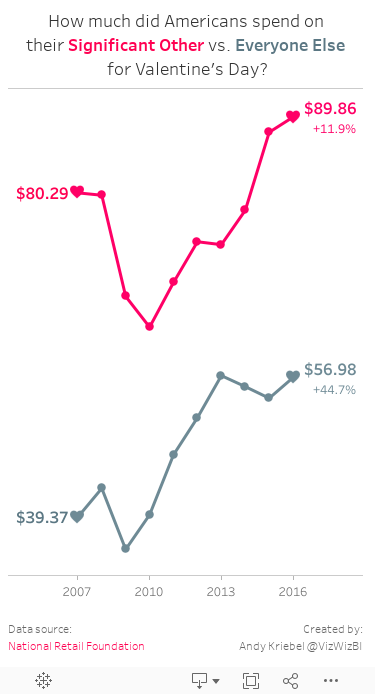
Makeover Monday: How Much Do Americans Spend on Valentine’s Day?
This meant spending my Sunday morning find a new viz and data set. A quick google search turned up this infographic from KarBel Multimedia:Maybe some love or Valentine's Day dataset for #makeovermonday week 7? We love data. It's our day too. @TriMyData @VizWizBI— Staticum (@staticum) February 11, 2017

What I like:
- Color choices that match the theme
- Simple title that tells me what I'm about to see
- Proper sourcing
- Nice description that include a question that explains what the viz is about
- Donut chart works well here as it's only 2 slices
- Clear labeling
What could be improved:
- Why use bubbles to compare the sizes of the spending? A bar chart would be way easier to read.
- There's very little context. Is this spending increasing or decreasing?
- While the color choices work for the theme, this sure is A LOT of pink.
For my viz, I wanted to create a mobile version that looks at the historical spending trends in two groups: significant others and everyone else. I don't lover my effort this week (pardon the pun), but there's only so much time in a day. Lastly, special thanks to Eva for the color palette.
August 24, 2015
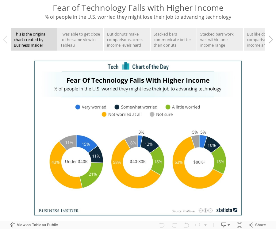
Makeover Monday: Fear of Technology Falls with Higher Income

August 14, 2015
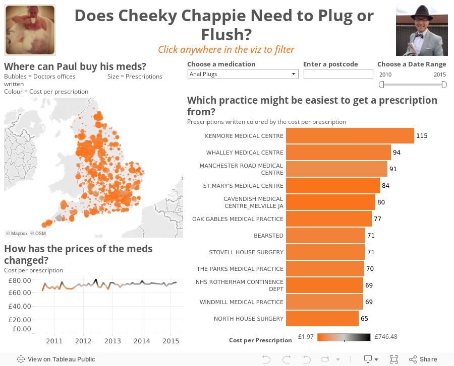
Does Cheeky Chappie Need to Plug or Flush? An Exasol & Tableau Demo Gone a Bit Astray

I started building a few things to show off Exasol's amazing performance and when I put the medication on the filters shelf, Paul's boss laughed when he saw "anal plugs" in the list. Naturally, me be the completely immature 42 year old that I am, I had to turn it into a story about Paul, who probably won't call me a friend for much longer. We checked Paul's town and saw many places where he could buy this product, if so he chose.
From there, I decided to spice it up a little bit, adding another medication and created the viz below. Hopefully he's at least happy that I used easyJet's official colors.
June 22, 2015
Makeover Monday: Historical Rainfall in 3 of Australia's Largest Cities


- They are not too dissimilar from geographical heatmaps in that they tend to skew towards the segments that cover the most surface area, in this case 2015.
- It’s difficult to compare across years, across months, and across months and years.
- Your eyes are drawn all over the place.
- There’s very little sense for trends.
- Like a pie chart, you’re trying to compare the angles of the slices, which is nearly impossible.
- The hover does not work once you get to the smaller segments.
- The labels are quite hard to read.
- When I hover, all I get is the value. This means that I have to look back to the labels to see which month and year it refers to.
- Taken the radial heatmap and flattened it out. I liked their idea of using a heatmap, but needed it to be easier to read.
- Added two trend charts: (1) cumulative rainfall, (2) monthly rainfall
- Added a selector for the city
- Added a highlight action on the year
- Included informative tooltips
- Improved the title
You can download the viz from Tableau Public here. What would you do differently? What could be improved in my version?
May 23, 2015
Dear Data Two | Week 5: Things We Buy

- Track every purchase that I make
- Categorize each purchase by the type of goods
- Locations each place where I made a purchase
Precise times were taken from purchase receipts, along with the categorisations. I then recorded the locations of each place by Swarm check-in, which were uploaded to a Google Sheet via IFTTT. I downloaded both sets of data into excel and manually joined them (there were only 19 records so it wasn’t much effort to do manually).
I then explored the data in Tableau, to see what stories I could find, if any. This week took me longer than I was expecting, mostly because I was having trouble finding anything interesting in the data. The one point that stuck out the most is that I spent more on ice cream than Mother’s Day. Oops! Please don’t tell my mom.
June 28, 2013
Chart of the Day Makeover: Samsung’s rocketing marketing expenses
Chart of the Day recently published an article on Samsung’s Insane Marketing Budget whose primary purpose was to show how Samsung’s budget has increased over time. The article also pushes the reader towards comparing Samsung to other companies included in the chart. To do so, COTD presented this bar chart:

Before we makeover this bar chart, let’s examine it.
- It’s pretty straight forward to compare the years within a single company, but the emphasis is on time, which means a line chart should be the natural first choice.
- But wait. The years are in reverse chronological order, so turn your head 90 degrees to the left and look at the chart. Without referring to the legend, one would likely assume that the most recent year was at the bottom of each set of bars.
- The bars are colored by year, which makes the comparisons across companies for a given year possible, but not easy. It’s easier to compare the years if they’re grouped together.
- Each bar uses gradient coloring and shadowing. Why? What value does this add?
- They’re using red and green bars together. They’re not thinking about the color-blind folks out there. They should be using natural, color-blind friendly colors.
To address these issues, I’ve created the following viz using Tableau. Download a free trial here.

With this viz, you can now see:
- The trend for each company. It’s much easier to see the large increase in Samsung’s budget, while all of the others in the view are relatively flat.
- I thought it was important to emphasize the difference between Samsung and the other companies, thus the five small line charts, which all clearly show how much more Samsung is spending.
How would you do this differently? Download the data here and the workbook here.
April 24, 2012
Do PK decisions in the EPL even out? Fergie thinks so, but the data disagrees.
What makes it even tougher is when the players dive all over the place with no intent other than to con the referee. Is anyone with me on starting a campaign for retroactive suspensions for diving? That would stop all of the diving immediately! Guaranteed!
Ashley Young has been near criminal in two recent matches. He’s even been mentioned for a position on Great Britain's Olympic diving team. Refer to the video of Man U vs. Villa and Man U vs. QPR for some of the finest acting in years. He really ought to be ashamed of himself.
But it’s not only the PKs that are called; it’s those that are not called as well. Refer to the highlights, if you can find them, of the Man U vs. Fulham game on 26 March 2012. The game was at Old Trafford, it was late in the game, there was a CLEAR penalty against Man U and, of course, it wasn’t called.
I’m not saying there’s a bias towards the “bigger clubs”, but looking at penalty kick data sure leans me in that direction. All you need to do is filter the viz below to only include teams that finished 1-4 and you’ll see what I mean.
The top four teams get way more PKs called in their favor than the rest of the clubs AND they significantly more PKs called at home. I simply can’t believe that referees are NOT intimidated by Fergie and Old Trafford?
Click on the Manchester United logo to focus on them. Look at those startling trends that appear at the bottom. Intimidation at its finest!
If you want to see the details behind the charts, go to the Team PK Stats tab.
- Look at how many PKs the top four teams have gotten over the year, both overall and at home
- Now compare that to the relegated teams (18-20)
April 19, 2012
Visualizing the Remarkable Declines in U.S. Teenage Pregnancies
We have one of those TVs in the elevators at work that flashes headlines. While these have kept me a bit more informed about current events, they’ve been detrimental to elevator conversations.
So I’m riding the elevator the other day, talking to no one, and a headline appears about the incredible decline in teen pregnancy rate. I thought this would be a perfect opportunity to “show” the results in Tableau.
The trend data comes from the Guttmacher Institute and the state-level data come from The National Campaign to Prevent Teen and Unplanned Pregnancy. Additional context comes from the CDC.
I used a couple of techniques in Tableau that I will explain after the viz. But first, some notes from explaining the situation.
- Despite legalized aborting in 1973, the significant increases in pregnancy rates in the the 1980s and early 1990s are explained by increased birthrates but stable abortion rates.(Guttmacher)
- Almost all of the decline in the pregnancy rate between 1995 and 2002 among 18–19-year-olds was attributable to increased contraceptive use. (Guttmacher)
- Among women aged 15–17, about one-quarter of the decline during the same period was attributable to reduced sexual activity and three-quarters to increased contraceptive use. (Guttmacher)
- The teen birth rate in the United States declined during 1991--2009 to its lowest level in the nearly 70 years. (CDC)
When looking at pregnancy rates what stuck out to me immediately is the clear dividing line between the north and the south. According to the CDC, teen birth rates in the United States have declined but remain high, especially among black and Hispanic teens and in southern states. Perhaps the higher rates are explained by race, but I wonder if the rates can be partly explained by the religious stigmas that are associated with abortion in the south. Or perhaps sex education programs are not as strongly emphasized. I haven’t found data to support my theories, but having lived here for almost 15 years, I notice what’s going on around me.

This blog post from Matt Stiles made me think not only the number of pregnancies, but also the rate. The rate gives you a much more accurate comparison across states.
You might notice that I have three maps, one for the continental US and then one for each of Alaska and Hawaii. This is done so that the map isn’t so zoomed out when looking at all of the states in one map. Tableau does not come with a map like this so I:
- Created a single map of all states,
- Zoomed in on the continent,
- Pinned the map, and
- Hid the zoom controls.
I then:
- Duplicated the map twice,
- Changed the zoom to Alaska and Hawaii respectively, and
- Placed all three maps on a dashboard.
The reason I duplicated the maps instead of filtering each of the maps is because the color scale would not be accurately represented on any of the maps. I want all states to use the same scale, therefore all states are actually on all of the maps.
I added a subtle feature you may not notice. As you change the statistic from the drop down on the upper left, the title for the color legend changes dynamically. Tableau doesn’t allow you to expose information from the viz in titles for the Size and Color cards like it does for captions, titles, tooltips, etc. Here’s the technique I used to work around this limitation:
1. Create a calculated field for a label based on the statistic selected (which is a parameter)

2. Create a blank worksheet and place this calculated field on the Level of Detail shelf
3. Updated the title of the worksheet to expose this field

4. Format the worksheet so that the rows and columns are as small as possible and the gridlines are removed
5. Place the worksheet on the dashboard above the color legend
6. Change the Fit to Entire View
7. Show the title
That’s it. I now have a dynamic title for the color legend.
April 16, 2012
When did Arsenal’s season really turn around?
As we approach kickoff of the Arsenal vs. Wigan game this afternoon, I thought I’d take a quick look back at the Gunners’ season and when the data says the season may have turned around.
It’s well documented that Arsenal got off to one of the club’s worst starts ever, but gradually they have come back and are currently in third place. With five games remaining, their magic number over Spurs and Newcastle stands at 11 and 8 over Chelsea.
“Magic number” is a phrase we use in the States, particularly with baseball, “to indicate how close a front-running team is to clinching a season title (or third place and a Champions League automatic qualifying spot in Arsenal’s case). It represents the total of additional wins by the front-running team or additional losses (or any combination thereof) by the rival team after which it is mathematically impossible for the rival team to capture the title in the remaining games.”
Many people point to the goal below by Bacary Sagna when Arsenal were down 0-2 against Spurs on 26-Feb as the turning point in the season. (Pardon the poor quality; it’s all I could find on YouTube.) I must say that I love the way Sagna took the goal, followed the ball into the goal, picked it up, ran it to half field and all but said “I’m sick of this!” The entire attitude of the team seemed to shift on this one goal. I get the chills every time I watch it.

Again, I have no doubt about the attitude shift at this single moment, particularly after back-to-back poor results against AC Milan (Champions League) and Sunderland (FA Cup). But looking at the data for the EPL only, one particular match stands out as the turnaround point..the 7-1 thrashing of Blackburn, whom Arsenal somehow managed to lose to during their early season swoon.
Below you will see four chart, all which highlight this 7-1 game.
- Points Trend – the upward trend of full-point matches clearly starts with the Blackburn match
- Points vs. Possible – Here, you want to see a flat green line, which indicates full points are taken from the match. Look at that long run of results that starts with the Blackburn match.
- Table position – What an ugly start to the season! There was a recovery for a few weeks 1/3 of the way into the season, but another string of poor results began with the 0-1 loss to Manchester City. But the run of results beginning with the Blackburn match, combined with a significant dip in form by Spurs, has pole vaulted the Gunners into 3rd place.
- Score vs. Result – This is a simple scatterplot. The darker the bubble, the more results for that score. Excluding the 2-8 drubbing at the hands of Manchester Units, Arsenal have lost every match, bar a 0-2 defeat by only one goals. This indicates that they have been in every match, but haven’t been able to score late to turn the result around. But look at our wins, the scores have been tremendous with a but more than a 4-1 average score.

Touch wood that Arsenal will hold on to third place, and please, please, please RVP, sign a new contract!
February 7, 2012
Tableau Public: Pie Chart Alternatives
Yesterday I wrote about being a hypocrite and walked through several alternatives to pie charts. Today I am sharing a Tableau Public workbook that I created based on comments to the last post.
I received questions about how the different charts would look for different time periods, so I’ve added:
- A year filter
- A parameter that allows you to pick a date format (e.g., view the data by Year, Year/Month, etc.)
You can download the workbook from the viz below or here.


