February 22, 2018
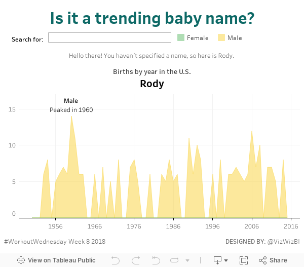
Workout Wednesday: Is it a trending baby name?
Given it's day 2 of training for DS8 in The Data School, I thought they should give this a try, as a group, with me. It was mostly them speaking the logic out loud and me translating into Tableau. It made for a really fun exercise that took us about 3.5 hours.
Looking at Rody and Luke's methods, our's was most similar to Rody's and way different than Luke's. But that's the beauty of Tableau; we all approached it very differently, yet got the same result. Tableau works with the way you think.
Thanks for the challenge Luke! You almost got us! Here's our result:
August 25, 2014
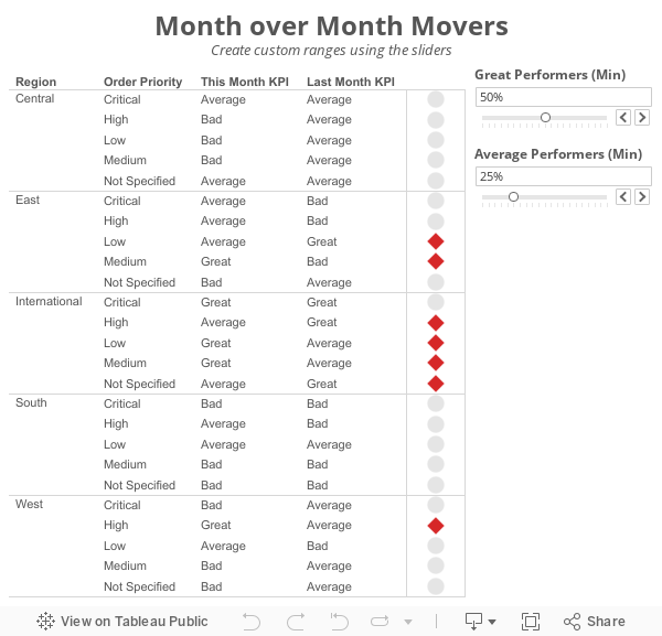
Tableau Tip: Month over Month KPI Movers
I'm currently running some monthly data where a list of records is assigned a KPI indicator like G/Y/R. I've been asked to produce a follow-up piece that would show "movers" from the prior month's data, just in a simple text view. So I guess what I need to try and do is figure out how to do a lookback/compare from prior month data to see who went from Y/R to G on the positive change side and who went from G to Y/R on the negative side.What Brian didn't realize was that answer to his question was pretty much in the question itself; he needs to use to LOOKUP() function. I sent Brian a solution, but decided to fancy it up a bit more and add some more functionality using parameters:
Step 1: On a PC, right-click drag Order Date to the Columns shelf. On a Mac, Option+Drag Order Date. Choose the continuous month option.

Step 2: Right-click on the Order Date pill on the Columns shelf and change it to Discrete.

Step 3: Right-click on the Order Date field on the Column shelf and choose Show Missing Values. This is important because it turns on data densification. Months where data does not exist get displayed.


Step 5: Create a calculated field called Last and change the Default Table Calculation to Order Date.


Step 6: Right-click on the Last field you just create in the Measures area of the Data window and choose Convert to Discrete.
Step 7: Drag the Last field to the Filters shelf and choose 0. This will change the view to only show the latest date.

Step 8: Create a calculated field to get the value for the most recent month. Notice that I'm using the LOOKUP function. Change the Default Table Calculation to Order Date.

Step 9: Create a calculated field to get the value for the previous month. The only difference here is we need to offset the LOOKUP by 1. Change the Default Table Calculation to Order Date.

Step 10: Create two parameters: one to determine the lower limit of the top KPI (Great Performers) and one to determine the lower limit of the middle KPI (Average Performers).


Step 11: Create the KPI calculations for the most recent month and the previous month. Notice that I'm using the parameters.


Step 13: Create a calculated field that returns a boolean to compare the values for this month to determine if they are a "Mover". I'm using Brian's definition for this example.

Step 14: Drag the Movers field to the Color shelf. I chose to set the colors to a light gray when True and red when False. This way only the Movers stand out.

Step 15: Optional - Change the Marks type to Shape and drag Movers to the Shape shelf as well, then pick shapes that give the affect your looking for. I chose diamonds for the Movers and circles for everything else.

Lastly I did a few cleanup items before placing the worksheet on the dashboard you see at the top of this post:
- Moved Order Date to the Detail shelf
- Reduced the level of the row divider
- Removed the bold text from Region
- Added a calculated field to the Filters shelf that checks that the value in the Great Performers parameter is larger than the value in the Average Performers parameter.

This method could easily be changed to accommodate many different scenarios like day over day, week over week or year over year.
Download the sample workbook here.
February 3, 2014
Tableau Tip: Make great looking band lines with area charts
When I was in Israel last week, we wanted to create a visualization that included band lines based on confidence intervals in the database. In other words, our table contained two measures: value and confidence interval.
Allen Smithee had created some interesting looking Bollinger Bands before, so I started there. I downloaded the workbook and noticed that while these look decent, they’re not perfect. This is the initial view:

Looks pretty good. But when you remove the lines for the upper and lower bands (or if you zoom in), you will see that the bands were made via reference bands for each discrete date, which makes them look like bars. I suspect the lines for the upper and lower were included to hide the rough edges of the bars.

Here’s how he created the reference lines:

I don’t think this looks polished enough, so I took an alternative approach: area charts.
December 4, 2013
Tableau tip: Don’t waste the ends of your sparklines…make them actionable!
Sparklines are one of my favorite chart types to include in dashboards, yet I see many people using them without providing enough context. Some people like to add bandlines, some like to add sets of dots, some like to add text, all in an effort to add meaning to sparklines. These are perfectly fine, but I think there’s a better way to make sparklines actionable. Is this the best way? Maybe not, but it is an alternative worth considering.
Sparklines were first introduced by Edward Tufte in his book Beautiful Evidence. Tufte says: “A sparkline is a small intense, simple, word-sized graphic with typographic resolution.” Stephen Few expands Tufte’s definition in his book Information Dashboard Design: “Their whole purpose is to provide a quick sense of historical context to enrich the meaning of the measure. This is exactly what’s required in a dashboard.”
When someone is creating a dashboard, they should provide as much information and meaning as possible to make the information actionable. I don’t see any examples from Tufte, Few or Jim Wahl that provide much meaningful context to the end of a sparkline.
Tufte provides some examples:
He might add a red dot to the end of the line along with some text to highlight the latest value.
While it’s a bit tough to see in this next example, Tufte has used red dots for the beginning and ends of the lines and blue dots to indicate the highest and lowest values.

It’s important to also note how Tufte always includes the values associated with all of the highlighted dots.
There are tons and tons of examples of how Stephen Few uses sparklines. Consider this example from his whitepaper Dashboard Design for Real-Time Situation Awareness.

Few says: “Meaningful context has been added to these metrics in the form of sparklines, which provide a quick sense of the history that has led up to the present.” This small section of a dashboard is a classic Few design. You’ll often see him use (1) sparklines, (2) a visual indicator of health (the red dots in this case), and (3) bullet charts closely together.
When I use sparklines, I like to combine all of the elements of Tufte and Few designs. Let’s look at an example.

On the left you see the sparklines, but notice that I use the dot on the end of the line as an indicator to take action. Tufte uses the dot one the end to indicate you’re at the end. Does that make it actionable? Not necessarily. Few separates the indicator into its own space and does not mark the end of the sparkline. My version saves space, increases the data-to-ink ratio, and provides a visual indicator to the reader in one chart.
The table to the right summarizes the sparkline, pulling from Tufte’s practices. In this example, I’m concerned with comparingthe last two 7-day periods. Notice how I used conditional formatting so that the dot on the end of the line is the same color as the text in the WoW and WoW% columns. I don’t use bullet graphs because I feel that the text itself is sufficient; I don’t want to add a graph for the sake of having a graph for everything.
Simple, concise, actionable…all things you want in a dashboard. Keep reading to see how I built these sparklines in Tableau.
Step 1: The date calculations I use in the example below are simple and efficient when you include a Max Date field in your data source. Creating Max Date as a calculated field directly in Tableau won’t always work since you need the Max Date at the row level. In this example, I’ve switched the Superstore Sales data source to Custom SQL and added a subquery to include the Max Date at the row level.

TIP: If you have a large dataset, Tableau will run more efficient queries if you push the custom SQL into a view in your database. Tableau wraps its own SQL around the custom SQL, which can get quite messy and inefficient. Creating a view will simply the query Tableau runs and improve performance.
Step 2: I like my sparklines to show the last 30 days, so I need to include a date filter. I include my date filter as the first step so that my data set is smaller to work with from the outset.

A Boolean calculation works well here. Notice how it leverages the Max Date field. This wouldn’t work if the Max Date was a calculated field inside of Tableau.

To get my sparklines to look how I like them, the column and row shelves will need to look like this. Let’s break the worksheet down into its pieces.

Step 3: Create a dummy header and place it on the columns shelf. Place it on the Columns shelf and hide the fields labels for the columns.

Step 4: Right-click-drag Order Date to the columns shelf and choose the first option, Order Date (Continuous). Notice how it only shows the last 30 days.

Step 5: Right-click on the Order Date pill and uncheck Show Header. This hides the date axis.
Step 6: Drag Category on the Rows shelf and hide the headers. The headers aren’t needed since they’re on the left side of the table; there’s no need to repeat them.
Step 7: Place Sales on the Rows shelf to the right of Category. This gives us the lines. Make them thinner, change the color to dark gray, and resize the chart to make them look like sparklines.
Step 8: Double-click on the Sales axis to bring up the axis options. Uncheck Include Zero and choose Independent axis ranges for each row or column. This gives us the view that best fits the space. Few talks about the scaling options for sparklines in Chapter 10 of Information Dashboard Design.
Step 9: We need a calculated field to show a dot on the end of the line. You might be tempted to simply turn on the line ends, but that won’t do the trick because you can’t color the line ends only. The calculated field should only capture sales for the last day. This is where our Max Date field comes in handy again.

Step 10: Drag the new Last Day Sales field onto the Rows shelf to the right of the Sales pill. Right-click on the Last Day Sales pill and choose Dual Axis. Right-click on the scale for Last Day Sales and choose Synchronize Axis. Right-click on Sales pill and uncheck Show Header.
We’re almost done. All we need to do now is color the dot.
Step 11: I like my dots to be colored by the week over week change. This requires me to create several calculated fields. You could combine all of these calculated fields into a single calculation, but I like separating the parts of the calculation to make it easier to understand and so that each calculation is reusable.
Create all of these calculated fields in this order (special thanks to Joe Mako for helping me get these calculations working and showing me why they’re more efficient than what I had been doing):
- Last 7 Day Sales:
IF [Order Date] >= DATEADD('day', -6, [Max Date]) THEN [Sales]
END - Prior 7 Day Sales:
IF [Order Date] >= DATEADD('day', -13, [Max Date]) AND [Order Date] <= DATEADD('day', -7, [Max Date]) THEN [Sales]
END - Total Sales - Last 7 Days:
IIF(LAST()=0, RUNNING_SUM(SUM([Last 7 Day Sales])), null) - Total Sales - Prior 7 Days:
IIF(LAST()=0, RUNNING_SUM(SUM([Prior 7 Day Sales])), null) - WoW (week over week):
[Total Sales - Last 7 Days] - [Total Sales - Prior 7 Days] - WoW %:
[WoW]/[Total Sales - Prior 7 Days]

Step 13: Right-click on the WoW % pill, go down to Compute Using and choose Order Date.
Step 14: Double-click on the color legend and change the settings to something like these:

You might need to do a bit more formatting to get your viz just the way you want it, but in the end, you’ll want it to look something to this:

Notice that I keep the row banding. I like to include banding on both the sparkline chart and the table so that the reader’s eyes go across the dashboard.
This might seem like a lot of steps, but once you do it a couple of times, it’s pretty quick; you’ll be able to do this in only a couple of minutes.
Building the table is super simple now that you have all of the calculations (this is why I create all of them individually). Download the workbook here to see how all of this was built.
September 27, 2013
Tableau Tip: Creating a chart that only displays the last day of each year, quarter or month


Download the workbook here.
September 18, 2013
Tableau Tip: Sorting an "Other" dimension member at the end of a list
There are times when you would like to sort the Other member at the bottom of your list. For example, you might have a bar chart of sales by subcategory that you want to sort in descending order, but you want to show the individual subcategories followed by Other at the end. Typically, the bar chart would look like this (I'm highlighting other to make it easier to track for this example):

So how can I get Other to be at the bottom of this list? Simple, create a calculated field that changes "Other" to negative for the measure you want to sort by.

Now, right-click on the dimension you want to sort, choose Sort, then in the Sort by section, choose the calculated field you created in the step above and sort in descending order.

And as easy as that, you have Other sorted at the bottom.

Note: This does not work for groups because Tableau does not allow you to leverage groups in calculated fields.


