Showing posts with label last. Show all posts
September 12, 2023
How to Calculate Weekday-Only Sales in Tableau
aggregation
,
bar chart
,
bullet graph
,
comparison
,
how to
,
last
,
last 10
,
previous
,
table calculation
,
tableau
,
weekday
,
weekends
,
window_sum
No comments

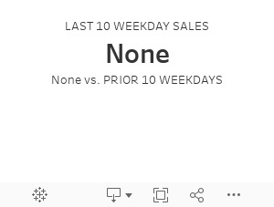
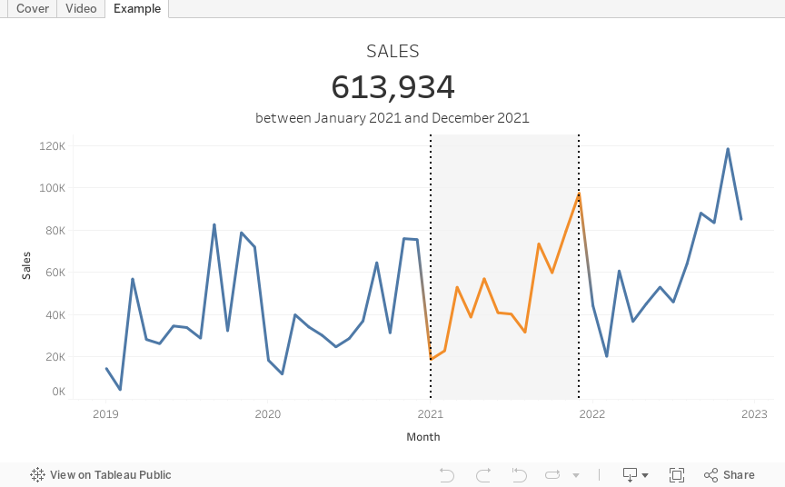
Have you ever wondered how to compare sales performance between two sets of weekdays?
In this video, I'll show you how to calculate and compare sales for the last 10 weekdays against the prior 10 weekdays—all while excluding weekends.
What You Will Learn:
- Setting up your data source for comparison
- Creating calculated fields for two sets of weekdays
- Configuring table calculations to get only the days you need
- Filtering out weekends from both data sets
- Implementing advanced date functions for comparison
- Visualizing and comparing sales for both sets of weekdays
Background Context:
Tableau enables you to conduct intricate data analyses, but comparing specific sets of weekdays can be tricky. This tutorial simplifies that process, focusing on comparing the last 10 weekdays' sales with the 10 weekdays preceding them.
Assumptions:
- You have a foundational knowledge of Tableau.
- Your sales data contains date information.
- You've previously worked with calculated fields in Tableau.
Related Videos:
Resources:
- Workbook & data: Link
January 24, 2023
How to Select a Date Range with a Set Action
calculation
,
color
,
custom dates
,
date range
,
dates
,
first
,
how to
,
last
,
level of detail
,
LOD
,
max date
,
min date
,
reference band
,
select
,
set action
,
summarize
,
tableau
,
tip
No comments

In this tip, I going to show you how to use set actions to select a date range in a line chart and summarize the values in the selected area.
In just a few steps, I’ll show you how to:
1. Create the custom date and set
2. Use the set to create a reference band
3. Color the line within the reference band
4. Calculate the totals sales within the date range
5. Configure the set action
February 16, 2021
Understanding Table Calcs vs LODs: Explained with a Slope Graph
calculated field
,
comparison
,
compute by
,
difference
,
first
,
fixed
,
how to
,
last
,
LOD
,
lookup
,
slope graph
,
table calc
,
table calculation
,
tableau
,
tip
No comments

Table calculations and LODs, especially understanding the difference between when to use each, is one of the most difficult concepts to learn in Tableau. Through my time teaching, one of the most effective means for explaining the differences between them is with a simple slope graph.
The idea is to color each line of the slope graph by whether it represents an increase or a decrease. You'd think this would be super simple, but it's not. In this video, I show you:
1. How to write the required calculations
2. The benefits of table calcs vs. LODs
3. Why table calcs are often more flexible
My general rule of thumb: If all of the dimensions I need for the calculation I want to write are already in the view, start with a table calculation. If all of the dimensions I need are NOT in the view, then you must use a level of detail expression.
Download the sample data set here - https://data.world/vizwiz/car-sales-mock-data

February 27, 2018
Tableau Tip Tuesday: Using LOD Expressions to Return the First & Last Values in a Densified Data Set
context
,
filter
,
first
,
isnull
,
last
,
level of detail
,
LOD
,
Tableau Tip Tuesday
No comments
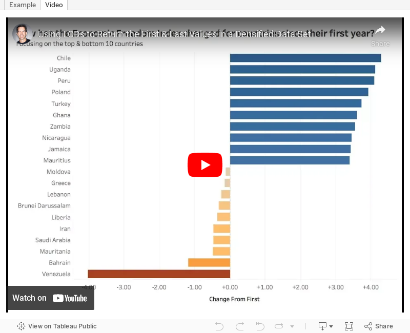
I'd like to get the difference from the first to last year for each country regardless of what year that is. When I use difference from first or a lookup, I get incorrect values for the countries that have a later year start than the others. I tried some LOD calcs, but that didn't seem to work either. Any help is appreciated!This week's tip walks you through tackling this problem. In particular, how do you do three things?
- Ignore years that have no values but a year exists
- Return the value from first and last years where data exists
- Compare the first and year to look at the change
The video and example below demonstrate the solution I came up with. Enjoy!
August 25, 2014
Tableau Tip: Month over Month KPI Movers
Brian Bieber
,
calculated fields
,
change
,
KPI
,
last
,
lookup
,
monitor
,
parameters
,
table
,
tableau
,
tips
13 comments
Reader Brian Bieber (no relation to Justin), a Data Analyst at Vanguard, sent me this question:
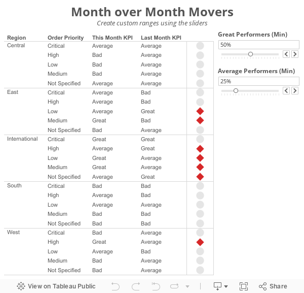 The steps for building a KPI movers viz like this are pretty straight forward. I'm using the Superstore Sales data set that comes with Tableau in this example.
Step 1: On a PC, right-click drag Order Date to the Columns shelf. On a Mac, Option+Drag Order Date. Choose the continuous month option.

Step 2: Right-click on the Order Date pill on the Columns shelf and change it to Discrete.

Step 3: Right-click on the Order Date field on the Column shelf and choose Show Missing Values. This is important because it turns on data densification. Months where data does not exist get displayed.

Step 4: Add the dimensions you would like to slice the data by to the Rows shelf. For this example, I've used Region and Order Priority.

Step 5: Create a calculated field called Last and change the Default Table Calculation to Order Date.


Step 6: Right-click on the Last field you just create in the Measures area of the Data window and choose Convert to Discrete.
Step 7: Drag the Last field to the Filters shelf and choose 0. This will change the view to only show the latest date.

Step 8: Create a calculated field to get the value for the most recent month. Notice that I'm using the LOOKUP function. Change the Default Table Calculation to Order Date.

Step 9: Create a calculated field to get the value for the previous month. The only difference here is we need to offset the LOOKUP by 1. Change the Default Table Calculation to Order Date.

Step 10: Create two parameters: one to determine the lower limit of the top KPI (Great Performers) and one to determine the lower limit of the middle KPI (Average Performers).


Step 11: Create the KPI calculations for the most recent month and the previous month. Notice that I'm using the parameters.


Step 12: It's up to you if you want to follow this step. For this specific example, I wanted to see the KPI for this month and last month in the table, so I've added them to the Rows shelf.

Step 13: Create a calculated field that returns a boolean to compare the values for this month to determine if they are a "Mover". I'm using Brian's definition for this example.

Step 14: Drag the Movers field to the Color shelf. I chose to set the colors to a light gray when True and red when False. This way only the Movers stand out.

Step 15: Optional - Change the Marks type to Shape and drag Movers to the Shape shelf as well, then pick shapes that give the affect your looking for. I chose diamonds for the Movers and circles for everything else.

Lastly I did a few cleanup items before placing the worksheet on the dashboard you see at the top of this post:

This method could easily be changed to accommodate many different scenarios like day over day, week over week or year over year.
Download the sample workbook here.
I'm currently running some monthly data where a list of records is assigned a KPI indicator like G/Y/R. I've been asked to produce a follow-up piece that would show "movers" from the prior month's data, just in a simple text view. So I guess what I need to try and do is figure out how to do a lookback/compare from prior month data to see who went from Y/R to G on the positive change side and who went from G to Y/R on the negative side.What Brian didn't realize was that answer to his question was pretty much in the question itself; he needs to use to LOOKUP() function. I sent Brian a solution, but decided to fancy it up a bit more and add some more functionality using parameters:
Step 1: On a PC, right-click drag Order Date to the Columns shelf. On a Mac, Option+Drag Order Date. Choose the continuous month option.
Step 2: Right-click on the Order Date pill on the Columns shelf and change it to Discrete.
Step 3: Right-click on the Order Date field on the Column shelf and choose Show Missing Values. This is important because it turns on data densification. Months where data does not exist get displayed.
Step 5: Create a calculated field called Last and change the Default Table Calculation to Order Date.
Step 6: Right-click on the Last field you just create in the Measures area of the Data window and choose Convert to Discrete.
Step 7: Drag the Last field to the Filters shelf and choose 0. This will change the view to only show the latest date.
Step 8: Create a calculated field to get the value for the most recent month. Notice that I'm using the LOOKUP function. Change the Default Table Calculation to Order Date.
Step 9: Create a calculated field to get the value for the previous month. The only difference here is we need to offset the LOOKUP by 1. Change the Default Table Calculation to Order Date.
Step 10: Create two parameters: one to determine the lower limit of the top KPI (Great Performers) and one to determine the lower limit of the middle KPI (Average Performers).
Step 11: Create the KPI calculations for the most recent month and the previous month. Notice that I'm using the parameters.
Step 13: Create a calculated field that returns a boolean to compare the values for this month to determine if they are a "Mover". I'm using Brian's definition for this example.
Step 14: Drag the Movers field to the Color shelf. I chose to set the colors to a light gray when True and red when False. This way only the Movers stand out.
Step 15: Optional - Change the Marks type to Shape and drag Movers to the Shape shelf as well, then pick shapes that give the affect your looking for. I chose diamonds for the Movers and circles for everything else.
Lastly I did a few cleanup items before placing the worksheet on the dashboard you see at the top of this post:
- Moved Order Date to the Detail shelf
- Reduced the level of the row divider
- Removed the bold text from Region
- Added a calculated field to the Filters shelf that checks that the value in the Great Performers parameter is larger than the value in the Average Performers parameter.
This method could easily be changed to accommodate many different scenarios like day over day, week over week or year over year.
Download the sample workbook here.
September 5, 2013
Tableau Tip: Default a date filter to the last N days
calculated fields
,
dates
,
default
,
last
,
parameters
,
tableau
,
tips
,
tricks
29 comments
A common question that I see on the forums and on our Facebook group is “How can I default my date quick filter to always show the last N days?” This is a relatively simple problem to address using parameters instead of quick filters. This solution also works because you’re not dependent on leveraging the today() function. This works because it looks at the last date in your view, not your computer’s clock.
If you use quick filters, when you publish your workbook to Tableau Server, the latest view that you see in Desktop is what gets published. So, if you use a date range quick filter like this

and your data source refreshes overnight, the slider does not automatically shift to the right. In addition, the slider also shows dates all the way up to today, even if your latest date is one month ago. Hence, if you filter to the last two weeks you could get no results, leaving your viewers a bit perplexed.
Here’s the method I use that always defaults to the latest N days.
Step 1 – Create a parameter that allows the user to input the last N of days they want to view. Then show the parameter control.

Step 2 – Parameter controls don’t do anything in Tableau unless you created a calculated field to leverage them. In this case, let’s create a calculated field that flags days that are within the range entered in the parameter.

Let’s check if this works by creating a simple table.
![image[66]](https://blogger.googleusercontent.com/img/b/R29vZ2xl/AVvXsEgXS955uCwfwP4FtZwnFMgnFz0HmOXe3tH4AA5OuP0dghDHCW8XeE5Pvz92-QpenAMnku9_UkIvaVhx0qFRrNvOAf3gKqAJ5kjSxSPBjEWbtoMefOIcDBlV2xDVyZ3WvglfZz004v0eeFE/?imgmax=800 "image[66]")
Perfect! We can see that our “Days to Show” field shows false when the date is more than 7 days from the last date.
Step 3 – We don’t need our “Days to Show” field in the view and we only care about the “True” results, so let’s move it to the Filters shelf. Select True, then change the Computing using to Order Date. Yes, I could use Table (Across), but I prefer to have more control.

The filter selection will appear again. Choose True.
Step 4 – Build your visualization. First, let’s build a line chart.
If you use quick filters, when you publish your workbook to Tableau Server, the latest view that you see in Desktop is what gets published. So, if you use a date range quick filter like this

and your data source refreshes overnight, the slider does not automatically shift to the right. In addition, the slider also shows dates all the way up to today, even if your latest date is one month ago. Hence, if you filter to the last two weeks you could get no results, leaving your viewers a bit perplexed.
Here’s the method I use that always defaults to the latest N days.
Step 1 – Create a parameter that allows the user to input the last N of days they want to view. Then show the parameter control.

Step 2 – Parameter controls don’t do anything in Tableau unless you created a calculated field to leverage them. In this case, let’s create a calculated field that flags days that are within the range entered in the parameter.

Let’s check if this works by creating a simple table.
![image[66]](https://blogger.googleusercontent.com/img/b/R29vZ2xl/AVvXsEhPu-SnYUyHn5lT6y6vbB91RKgz92cMoI-G9rttScaxiJo56EFu7EHV9CVU2ah2zvwHNt0YwqkYipFJ6TKrbDxFYVk25IpgCeMG8-rxxfVt4hRN2Jb2Q2ac4eiJXkbIkY8iuo_mITAW1KI/s1600-h/image%25255B66%25255D%25255B12%25255D.png "image[66]")
Perfect! We can see that our “Days to Show” field shows false when the date is more than 7 days from the last date.
Step 3 – We don’t need our “Days to Show” field in the view and we only care about the “True” results, so let’s move it to the Filters shelf. Select True, then change the Computing using to Order Date. Yes, I could use Table (Across), but I prefer to have more control.

The filter selection will appear again. Choose True.
Step 4 – Build your visualization. First, let’s build a line chart.
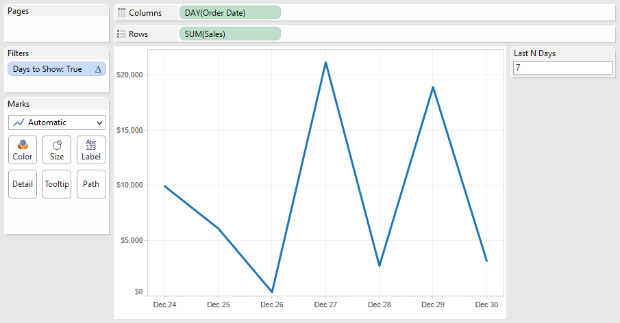
Next, let’s build a bar chart for sales by category and sub-category. This is where it gets a bit trickier. In order for your “Days to Show” filter to work, you must keep your Order Date field in the view. Move it to the level of detail. The result looks like this, with stacked bars for each date. I then sorted sub-category by sales descending.
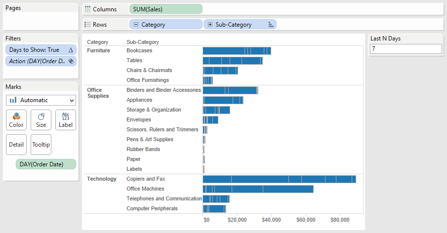
Step 5 – Clean up the bar chart by removing the borders. Click on the Color shelf, then Border and choose None.

Your bar chart now looks like this:

Step 6 – Put it all together on a dashboard and add some interactivity.

Your bar chart now looks like this:

Step 6 – Put it all together on a dashboard and add some interactivity.

One additional cool benefit is that as you use the action filters (e.g., click on Envelopes), you will see the last N days based on that selection.
You can download the workbook used to create this blog post here. My next blog post will take this one step farther…calculating cumulative totals for the last N days.
Subscribe to:
Posts
(
Atom
)


