February 4, 2025
How to Exclude Reference Lines from Grand Totals in Tableau

Ever added a reference line to your Tableau visualization, only to see it appear in the grand total row, even when it doesn’t make sense?
If your grand total uses a different aggregation than your main data (e.g., SUM vs. AVG), the reference line can be misleading.
Unfortunately, Tableau doesn’t offer a simple way to exclude it—but there’s a trick to removing it while keeping your totals visible.
In the video below, I’ll walk you through the step-by-step solution to remove reference lines from grand totals.
Want to become an advanced Tableau user?
Unlock your full potential with Next-Level Tableau, the ultimate training program for Tableau users. Gain access to expert-led tutorials, live sessions, and a supportive community designed to help you master advanced skills, create stunning dashboards, and achieve your career goals.
Learn more and take your Tableau skills to the next level today at nextleveltableau.com.
Unsure? Sign up for my free course at starter.nextleveltableau.com.

March 6, 2024
What does Level of Detail mean in Tableau?

If you’re serious about learning Tableau, you must understand the level of detail of the view. Another way to think about it is the level of granularity.
This is essential for ensuring you know the aggregations that Tableau will perform as this will impact your analysis.
Here's a guide to help you:
September 12, 2023
How to Calculate Weekday-Only Sales in Tableau

Have you ever wondered how to compare sales performance between two sets of weekdays?
In this video, I'll show you how to calculate and compare sales for the last 10 weekdays against the prior 10 weekdays—all while excluding weekends.
What You Will Learn:
- Setting up your data source for comparison
- Creating calculated fields for two sets of weekdays
- Configuring table calculations to get only the days you need
- Filtering out weekends from both data sets
- Implementing advanced date functions for comparison
- Visualizing and comparing sales for both sets of weekdays
Background Context:
Tableau enables you to conduct intricate data analyses, but comparing specific sets of weekdays can be tricky. This tutorial simplifies that process, focusing on comparing the last 10 weekdays' sales with the 10 weekdays preceding them.
Assumptions:
- You have a foundational knowledge of Tableau.
- Your sales data contains date information.
- You've previously worked with calculated fields in Tableau.
Related Videos:
Resources:
- Workbook & data: Link
January 19, 2023
How to Calculate Day Over Day Change
In this tip, I going to show you how to build 3 different KPI cards for measuring day over day change. In just a few steps, I’ll show you how to calculate:
- Sales for the most recent day
- Sales for the previous day
- Difference in sales between those two dates
- Percent difference in sales between those two dates
I'll then show you how to create these 3 different methods for displaying the KPIs so that you can create those that are most useful for your audience.

RESOURCES
- Data - https://data.world/vizwiz/sample-car-sales
- Month over Month Change - https://www.youtube.com/watch?v=ViD3vclgNv8
- Year over Year Change - https://www.youtube.com/watch?v=YuxYr4_l2ww

August 4, 2022
ATTR - The Most Confusing Aggregation in Tableau
- What an attribute is
- Why the attribute aggregation exists
- Examples that show how it works
- The difference between ATTR and other aggregations like MIN & MAX
- How Tableau write the ATTR aggregation as a formula
- How to ensure you're not misleading your audience
- How to work around the pesky *
May 25, 2021
How to Create a Marginal Histogram


June 15, 2018
Tableau Prep Tip: Returning the First and Second Purchase Dates

In this video, I should you how I approached returning the first and second purchase dates for a customer, include some summary measures, then bring them both back together into a single table for visualizing in Tableau.
February 7, 2017
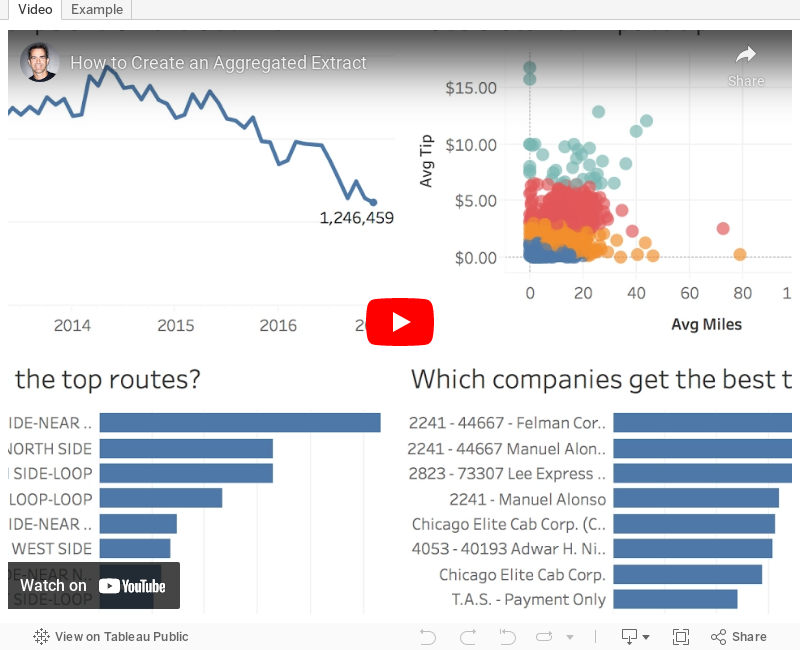
Tableau Tip Tuesday: How to Create an Aggregated Extract

Aggregated extracts are an undervalued and underused feature in Tableau.
Week 6 of #MakeoverMonday allowed us to work with 105M Chicago taxi trips from an Exasol data source. This is fantastic, until you need to publish the viz to Tableau Public which has a 15M record limit. The way to work around the 15M limit is by creating an aggregated extract, for which Tableau has created a great quick start guide here. In the video below, I show you how I created an aggregated extract with the Chicago taxi data.Keep in mind, though, that your data has to be aggregatable. For example, if you do cohort analysis, you likely won't be able to aggregate the data and maintain the cohorts.
Why aggregated extracts?
- Smaller extracts
- Better performance
- Only contains the necessary dimensions
- Makes extract refreshes faster
- Reduces resource burden on your Tableau Server
Steps for Creating an Aggregated Extract
- Hide unused dimensions
- Add extract filters (optional)
- Aggregate the data for the visible dimensions
- Create the extract
December 1, 2015
Tableau Tip Tuesday: How to Create a Single Filter with Multiple Levels of Aggregation

This week's tip covers two scenarios which are based on a great question from Pablo Sáenz de Tejada, who recently finished his training at The Data School and is on his first placement at easyJet with Paul Chapman.
- First, Pablo wanted to know how he could create a single select filter that includes multiple levels of aggregation (e.g., State and Region)
- Can he include a custom level of aggregation in the same filter (e.g., a custom defined Region)?
With that question in mind, here is this week's tip.