May 25, 2021
How to Create a Marginal Histogram
aggregation
,
analysis
,
bar chart
,
color
,
column chart
,
containers
,
context
,
dashboard
,
data visualization
,
distribution
,
format
,
frequency
,
heatmap
,
how to
,
layout
,
marginal histogram
,
tableau
,
tip
,
tutorial
,
worksheet
No comments

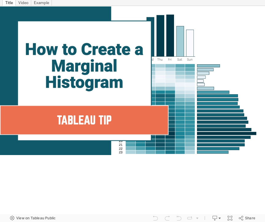
You can think of a marginal histogram as a heatmap with a histogram to the side and the top of the heatmap. Each graph provides a frequency distribution.
In this example, I'm going to show you how to create a marginal histogram that displays a frequency distribution of the number of taxi rides by weekday and hour for January 2020 in NYC.
Subscribe to:
Post Comments
(
Atom
)


No comments
Post a Comment