May 31, 2021
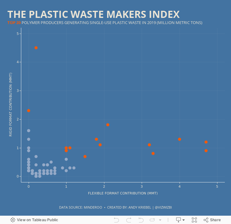
#MakeoverMonday 2021 Week 22: The Plastic Waste Makers Index
bar chart
,
bins
,
box plot
,
calculated field
,
distribution
,
histogram
,
jitter
,
parameter
,
parameter action
,
random
,
rounded
,
scatter plot
,
scatterplot
,
set
,
sort
,
stacked
No comments

Subscribe to:
Post Comments
(
Atom
)


No comments
Post a Comment