April 11, 2023
How to Create a Jittered Bar Chart in Tableau

Are you tired of the same old boring bar charts? Add some flair to your data visualization with a jittered bar chart! See more of your data without losing scope of the overall.
To create one, simply add a random amount of noise to the x-axis and y-axis of your bar chart. This will add more granularity to your data, prevent overlapping and give your chart a unique look. Try it out and impress your colleagues with your data viz skills!
Here’s a video to help you create your own.

February 2, 2022
How to Create a Jitter Plot
In this tip I show you how to create a jitter plot. A jitter plot is very similar to a dot strip plot other than it reduces the overlapping of the data points. The data is plotted like a dot plot and then we use either the RANDOM() or INDEX() functions to spread out the dots.
May 31, 2021
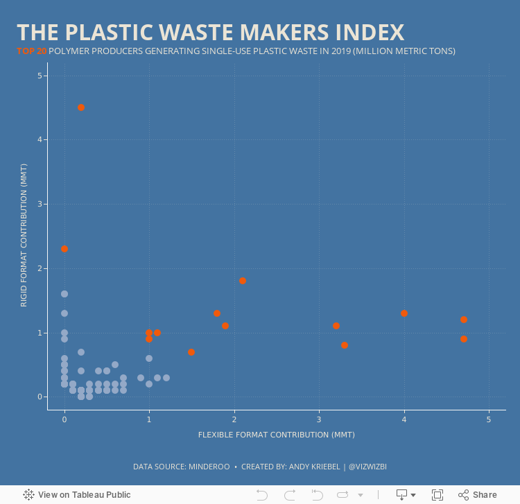
#MakeoverMonday 2021 Week 22: The Plastic Waste Makers Index

May 20, 2021
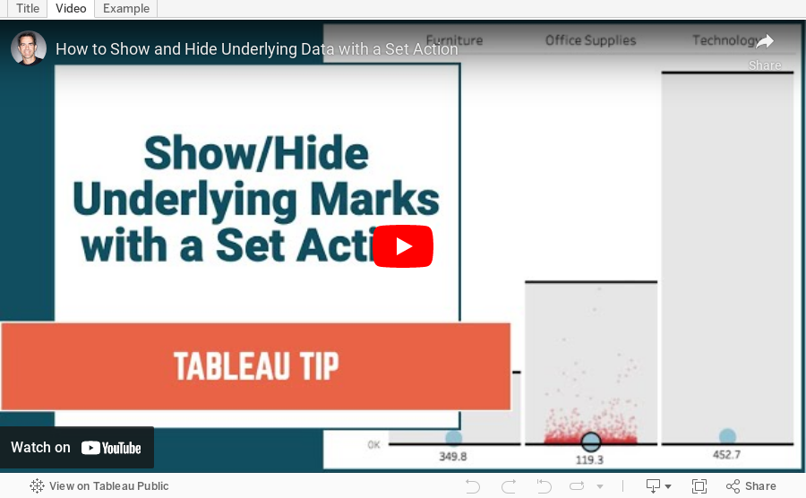
How to Show and Hide Underlying Data with a Set Action

April 5, 2021
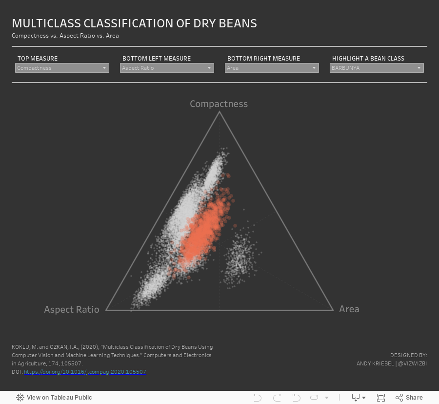
#MakeoverMonday 2021 Week 14 - Multiclass Classification of Dry Beans

September 9, 2020
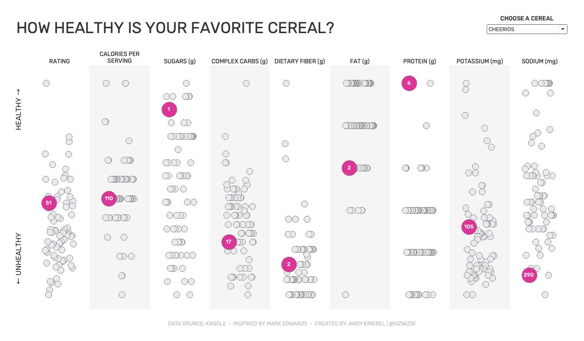
Watch Me Viz - #MakeoverMonday 2020 Week 36 - How Healthy Is Your Favorite Cereal?