May 30, 2023
How to Create a Radial Bubble Chart in Tableau


April 11, 2023
How to Create a Jittered Bar Chart in Tableau

Are you tired of the same old boring bar charts? Add some flair to your data visualization with a jittered bar chart! See more of your data without losing scope of the overall.
To create one, simply add a random amount of noise to the x-axis and y-axis of your bar chart. This will add more granularity to your data, prevent overlapping and give your chart a unique look. Try it out and impress your colleagues with your data viz skills!
Here’s a video to help you create your own.

October 11, 2022
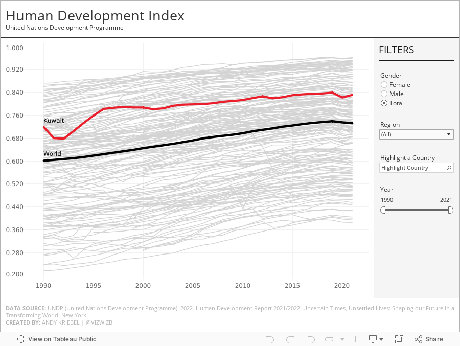
#MakeoverMonday 2022 Week 41 - UNDP Human Development Index

From UNDP:
The Human Development Index (HDI) is a summary measure of average achievement in key dimensions of human development: a long and healthy life, being knowledgeable and have a decent standard of living. The HDI is the geometric mean of normalized indices for each of the three dimensions.
This week, I really liked the original visualization, so during #WatchMeViz, I spend the time recreating the visual. I got most of the way there in an hour and finished it off in the evening. The questions on the live stream are super helpful...thank you!
A couple things I learned:
- Hover action interactivity is very, very slow in Tableau. I ended up changing it to a select action.
- Labeling is overly complicated.
- Tables in a tooltip can look really good. And they are very responsive.
March 22, 2022
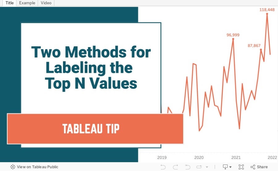
Two Methods for Labeling the Top N Values in a Chart
In this tip I show you how to use the INDEX and RANK functions to label the top N values in a chart. I also explain the difference in how they work, and how the RANK function is simpler to configure.
February 2, 2022
How to Create a Jitter Plot
In this tip I show you how to create a jitter plot. A jitter plot is very similar to a dot strip plot other than it reduces the overlapping of the data points. The data is plotted like a dot plot and then we use either the RANDOM() or INDEX() functions to spread out the dots.
January 19, 2022
Social Connectedness in the United States

NOTE: The insights you see in this post are based on an article by The Upshot from September 2018. Some of the insights and use cases demonstrated are the same and are shown in Tableau for demonstration purposes.
----------------------------
When I first saw the map that The Upshot created in How Connected Is Your Community to Everywhere Else in America? I was blow away by the simplicity of the map and how easy it is to understand the relationships of people in the United States via their Facebook friendships. The first thing you need to understand is the metric "Social Connectedness Index". You can access the data I used via the same link.
Here's the formula Facebook uses to calculate the index:

From Facebook:
Social Connectednessi,j measures the relative probability of a Facebook friendship link between a given Facebook user in location i and a user in location j. Put differently, if this measure is twice as large, a Facebook user in i is about twice as likely to be connected with a given Facebook user in j.
In each dataset, we scale the measure to have a fixed maximum value (by dividing the original measure by the maximum and multiplying by 1,000,000,000) and the lowest possible value of 1. We also round the measure to the nearest integer.
I was not able to match the color scale in The Upshot exactly, so instead I used a table calculation that ranks each County in the U.S. compared to the County selected by the user.

Close enough for me!
The data has columns for the State/County of the user and for State/County of the friend. To ensure that I was only looking at friends for the County selected, I used Parameter Actions to filter the user to the County and State selected. The rank calculation then only uses the SCI for the friends.
Now let's look through some of the use cases as described in The Upshot.
DISTANCE IS MOST IMPORTANT

STATE LINES ARE BOUNDARIES

MIGRATION PATTERNS


PHYSICAL BOUNDARIES


September 9, 2020
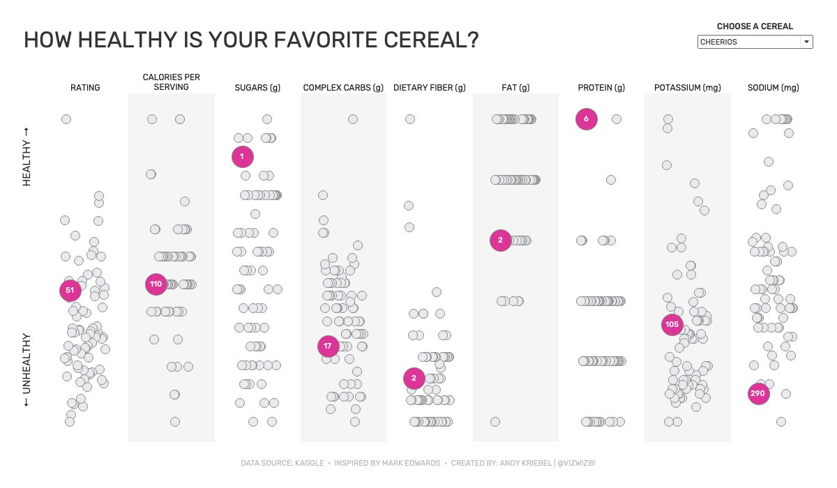
Watch Me Viz - #MakeoverMonday 2020 Week 36 - How Healthy Is Your Favorite Cereal?
June 10, 2018
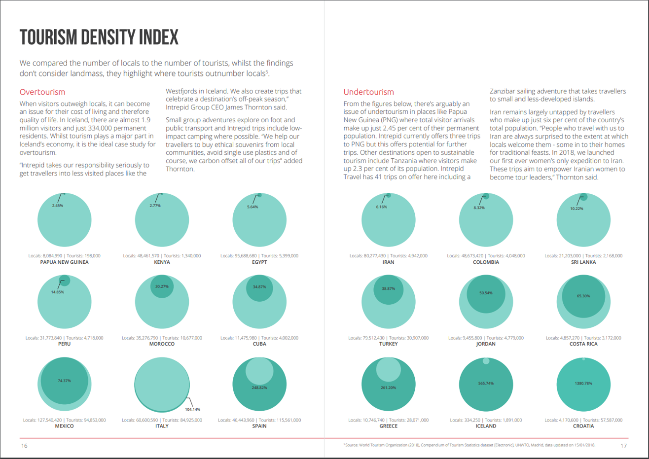
Makeover Monday: Tourism Density Index

What works well?
- Really good explanations for how they define overtourism and undertourism and examples for each
- Providing the exact figures for each country
- Colors are easy enough to distinguish
- Sorting the countries from lowest to highest
- Splitting the view between the highest 9 and the lowest 9
What could be improved?
- Circles are inherently difficult for comparisons. Are they measure by area or diameter? Either way, the circle in a circle in overkill.
- Why does the size of the light green circle change once the dark green circle is a larger value? That makes no sense at all.
- If the exact numbers were not included, it would be impossible to compare countries.
- Why show the top 9? That seems like an unusual way to select the countries.
My Goals
- Focus on either the raw values or the percentages. I'll figure this out once I explore the data.
- Make it easier to compare countries.
November 13, 2017
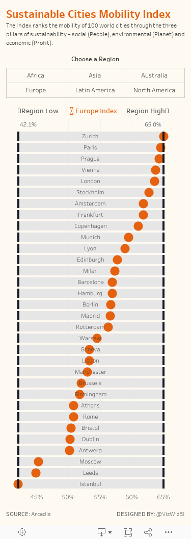
Makeover Monday: Sustainable Cities Mobility Index

What works well?
- Ranking the countries from highest to lowest
- Good title and sub-title that explain the viz
- Including the city names
- Noting how the index was calculated
- Including the data source
- Choosing colors that go well together
What could be improved?
- Make the bar charts bar charts. Making them look like the front of a train is cute, but it's also distracting.
- It's limited to the top 10. What are the other 90 cities? How can I find the ranking of cities in my region?
- The icons off to the right are unnecessary.
My goals
- Keep it simple; I only had around 30 minutes to work on this
- Allow the user to pick a region
- Use the design from last week's Workout Wednesday so I could practice it some more. I was excited to find a dataset that allowed me to use this technique again.
- The vizzes on the Arcadis website are pretty good. Can I build upon those? Can I use their colors?
- Include a description of the index
- Create a mobile version
April 9, 2017
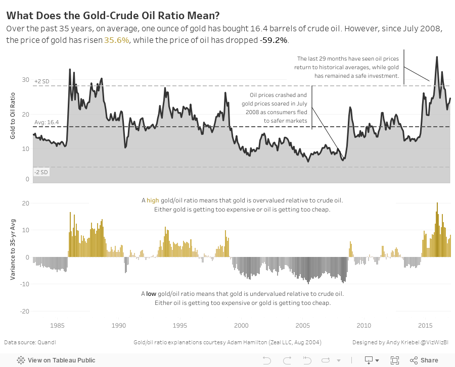
Makeover Monday: What Does the Gold-Crude Oil Ratio Mean?

An interesting sidebar: I went back to the original blog post, downloaded the workbook, then opened it to see how I had shaped the data. Turns out I build this in Tableau 4.1. How cool is that!?! Dashboards had just been added to Tableau. Ahh, the good old days! People starting to use Tableau now have no idea how good they have it.
Anyway, back to the makeover.
What works well?
- Minimal use of color
- Axes are clearly labeled
- Trend line adds context
- Scatterplot portrays the relationship well
- The title doesn't tell me much at all.
- What does each dot mean?
- Is there more to the story?
- What does being above or below the trend line actually mean?

October 19, 2016
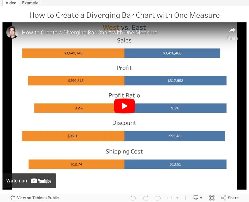
Tableau Tip Tuesday: How to Create a Diverging Bar Chart with One Measure

With a cheeky use of the INDEX table calculation, this was quite straightforward. In the video below, you'll see that the middle of the charts aren't lined up. I fixed this by using the INDEX calc again. You can download the workbook to see how I got it to work.
July 12, 2016
Tableau Tip Tuesday: How to Use Actions To "Reset" a Chart to the Most Recent Date

This week’s tip is based on a tip written by Richie Fanti back in 2013 when he worked for me at Facebook. In essence this tip shows you how to use a dashboard action to “reset” a chart to show the most recent date after you clear the action. It’s a really useful technique when you want the default view to be the most recent date but you want the user to be able to see details for a specific date when they click on it.
If you have any questions, leave a comment below.
December 23, 2013
Tableau Tip: Using actions to “reset” a chart to the most recent date
A great Tableau question came up at Facebook the other day. Often times our users are especially interested in the most recent daily data, but like to have the freedom to view historical details on demand as well. Trend lines are generally good at telling the historical story, but don’t always provide all of the details that users want. Wouldn’t it be cool to use a trend line to filter the specific components of a dashboard to any historical data point, but then be able to immediately revert to the most recent date on demand?
Suppose you have a simple dashboard composed of two sheets:
- A trend line that shows daily sales across product category
- A horizontal bar chart that shows the top selling products.

Now say we want the end user to select a mark on the trend line and have the bar chart update to a list of products within that respective product category and show sales for only that day. Tableau makes this very straightforward through the use of a filter action. However, what if the user unselects that mark on the trend line and we want the bar chart to revert back to only reflecting sales data for the most recent date of data? Without some extra manipulation and a couple table calculations, Tableau’s default behavior would be to clear all actions and show product sales for all dates in the partition, rather than only the most recent one. In other words, there are generally two things we want here:
- The bar chart should only reflect the most recent day of data by default (in this case June 16th).
- When a mark on the trend line is selected, the bar chart should dynamically filter to that respective day of data. However, if that selection is cleared, or if that mark on the trend line is unselected, we want the bar chart to revert back to only reflecting sales data for the most recent date (June 16th).
Using the Superstore Sales Excel data, drag Sales to the Rows Shelf, Product Category to the Color Shelf, and right-click drag and drop Order Date to the Columns Shelf, choosing continuous days.

Also, we’ll need a date filter so that Tableau only shows the most recent two weeks in the view to simplify things. Drag Order Date to the Filters Shelf, choose “Individual dates,” go to the “Top” tab, and choose Top 14 by Minimum Order Date. This filters the partition to the most recent two weeks of data.

Let’s make this a global filter by right-clicking on the date field from the Filters Shelf and choose “Apply to Worksheets,” and “All Using this Data Source.” Now every viz we make using this data source will only reflect the most recent two weeks of data.
Cool, so far so good. Nothing tricky here. Now on to the bar chart. Drag Sales to the Columns Shelf, Product Name to the Rows Shelf, and sort descending by the sum of Sales. I like to add labels on the end of each bar by selecting the “Abc” icon on the toolbar as well. We can also add Product Category to the Color Shelf so that it matches the color scheme in trend line:

Note that view is showing the top products by sales within the last two weeks cumulatively. In order to satisfy #1 of our requirements, our users only want to only see data for the most recent day by default, rather than the most recent two weeks as a whole. This can be done in the dashboard by creating a filter action and selecting a mark on the trend line for the most recent day, but clearing the selection would just show cumulative two week sales again, which is not what we’re looking for. In order to get around this, we can add discrete days to the view, and use the INDEX() function to rank products within each discrete day of data. This will essentially allow Tableau to segment a list of top products within each day.
NOTE: Since this is being done in version 8.0.x, I’m using the INDEX() function to get what we need here. Version 8.1 introduced some enhanced ranking functionality with the RANK() function, but the general framework behind this between v8.0 and v8.1 should be very similar.Right-click drag and drop Order Date to the left of Product Name on the Rows Shelf and choose the discrete MDY option. Right-click on this field and choose Sort, then choose Descending in data source order. This places the most recent day of data on the top of the list in the view. You should have something like this:

Now we need to use a table calculation to sort products within each day, rather than on the aggregate over all days. Create a calculated field, name it Product Rank, and use the index function in the Formula box.

Right click on this newly created calculated field from the measures list in the data window and choose “Convert to Discrete.” Then, drag and drop this between the Order Date and Product Name on the Rows Shelf. Things will look somewhat funky, but we’ll fix this by right-clicking on the Product Rank field on the Rows Shelf and choosing “Edit Table Calculation…” Choose Compute using > Advanced. We want the table calculation to be addressed along Month, Day, Year of Order Date, Product Name, and Product Category in that order, and sorted descending by the sum of Sales. Then select At the level: > Product Name and Restarting Every: > Month, Day, Year of Order Date. Here’s the snapshot of the dialog boxes:

The sheet should now have products correctly sorted in descending order by the sum of sales within each discrete day.

Finally, we need to do this one more time for dates. However, we’ll use the index function differently this time. Since Order Date is already sorted, we don’t necessarily need the INDEX() function strictly to sort stuff. We can instead leverage the more formal ranking to dynamically filter only the top-ranked date. This is different from directly filtering the date field because that would not allow this sheet to interact with other sheets in the dashboard based on Order Date in the dynamic sense that we’re looking for. The INDEX() ranking allows Tableau to make two passes on the partition, therefore telling Tableau to aggregate sales for the past 14 days, but still giving us the ability to only view details for one date at a time dynamically and interactively.
To create the second calculated field, right-click on Product Rank from the measures list and choose “Duplicate.” Rename it “Date Rank.” Drag this to the left of MDY (Order Date) on the Rows Shelf. We want to choose some advanced computation settings for this as well, so go to “Edit Table Calculation,” and edit the “Compute Using” settings so that the table calculation addresses Order Date, Product Name, and Product Category respectively. Then we want the results to be computed along Order Date so we can assign a rank to each discrete day in the view.

This should give us a list of products ranked in descending order by sales within each day, which is also assigned a rank in descending data source order.

Now all we need to do is filter the viz so that it only shows the #1 ranked date, which is also the most recent day of data by default. Double-click on the Date Rank field on the Rows Shelf, and edit the selection so that only #1 is chosen. This is super important because, by filtering the Date Rank, we’ve just completed both #1 and #2 of our requirements for this dashboard. Not only is the most recent date now always going to be displayed by default, but we can also filter to other dates and clear the filter to revert back to the most recent.
All that’s needed now is some clean-up and actually building the dashboard. To hide some of the redundant stuff, right click on the Date Rank field on the Rows Shelf and uncheck Show Header, and do the same for the Product Rank field on the Rows Shelf as well. We’ll leave the date field included to ensure things are working correctly.
To make the dashboard, arrange the sheets to look something like this:

Finally, all we have to do is create the filter action and we’ll be good to go.

We now have a dashboard that only reflects product sales for the most recent day of data in the bar chart, and after interacting with the trend line, the bar chart will always default back to this day as well. This is a pretty cool functionality to have because often our users only care about what is happening today, but like to have the ability to look back at a snapshot in time to view more specific data that otherwise couldn’t be seen in the trend line.
Check it out. Play with it yourself below. Notice how the bar chart defaults to the last date. Click on a dot on the line chart, for example June 10th. Notice how the bar chart updates to reflect Jun 10th. Now deselect that point and the bar chart goes back to the latest date.






