November 13, 2017
Makeover Monday: Sustainable Cities Mobility Index

What works well?
- Ranking the countries from highest to lowest
- Good title and sub-title that explain the viz
- Including the city names
- Noting how the index was calculated
- Including the data source
- Choosing colors that go well together
What could be improved?
- Make the bar charts bar charts. Making them look like the front of a train is cute, but it's also distracting.
- It's limited to the top 10. What are the other 90 cities? How can I find the ranking of cities in my region?
- The icons off to the right are unnecessary.
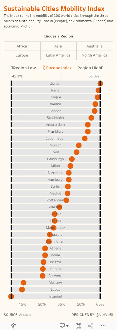
My goals
- Keep it simple; I only had around 30 minutes to work on this
- Allow the user to pick a region
- Use the design from last week's Workout Wednesday so I could practice it some more. I was excited to find a dataset that allowed me to use this technique again.
- The vizzes on the Arcadis website are pretty good. Can I build upon those? Can I use their colors?
- Include a description of the index
- Create a mobile version
With those goals in mind, here is my makeover for week 46.
Subscribe to:
Post Comments
(
Atom
)


No comments
Post a Comment