January 19, 2022
Social Connectedness in the United States

NOTE: The insights you see in this post are based on an article by The Upshot from September 2018. Some of the insights and use cases demonstrated are the same and are shown in Tableau for demonstration purposes.
----------------------------
When I first saw the map that The Upshot created in How Connected Is Your Community to Everywhere Else in America? I was blow away by the simplicity of the map and how easy it is to understand the relationships of people in the United States via their Facebook friendships. The first thing you need to understand is the metric "Social Connectedness Index". You can access the data I used via the same link.
Here's the formula Facebook uses to calculate the index:

From Facebook:
Social Connectednessi,j measures the relative probability of a Facebook friendship link between a given Facebook user in location i and a user in location j. Put differently, if this measure is twice as large, a Facebook user in i is about twice as likely to be connected with a given Facebook user in j.
In each dataset, we scale the measure to have a fixed maximum value (by dividing the original measure by the maximum and multiplying by 1,000,000,000) and the lowest possible value of 1. We also round the measure to the nearest integer.
I was not able to match the color scale in The Upshot exactly, so instead I used a table calculation that ranks each County in the U.S. compared to the County selected by the user.

Close enough for me!
The data has columns for the State/County of the user and for State/County of the friend. To ensure that I was only looking at friends for the County selected, I used Parameter Actions to filter the user to the County and State selected. The rank calculation then only uses the SCI for the friends.
Now let's look through some of the use cases as described in The Upshot.
DISTANCE IS MOST IMPORTANT

STATE LINES ARE BOUNDARIES

MIGRATION PATTERNS


PHYSICAL BOUNDARIES


December 4, 2016
Makeover Monday: The Global Flow of People

The chord diagram that is the subject of Makeover Monday week 49 was selected due to a conversation I had on Twitter with a few people last week. Andy Kirk then suggested we use it for Makeover Monday, so here we are. As I mentioned on Twitter, I have yet to see a chord diagram that I think is easy to read. Perhaps it’s me, but in general, I find them overly complex and confusing. The chart in question is about the global flow of people.

What works well?
- Design captures your attention and encourages you to interact
- Design clearly portrays a flow
- Nice drill in to the country level when you click on a region
- Good use of size to indicate the number of people moving between regions and countries
- Really fast interactivity
What doesn’t work well?
- For me, it’s way too busy; I don’t like how there are lines going all over the place
- You can’t see any trends, but maybe that was an intentional choice
- Some of the colors are too similar like East Asia, Southeast Asia and Oceania
- There’s no order to the regions, not even alphabetical, so why are they in the order they are?
- It’s extremely difficult to compare different arcs, e.g., which region to region movement is 2nd most?
For my version, I wanted to keep it very simple. The question I’m trying to answer is which regions have the highest movement or between or within regions? I chose to present it as a simple heat map and to only focus on the region to region flow. I felt including the countries overcomplicated the visual.
May 30, 2016
Makeover Monday: The History of Famous Wrestlers

Confession: I worked on this on Wednesday, several days before the data went live to all of you. Sorry! But I’m on a family holiday to Paris. Yes, Paris. Lucky us!
Anyway, the visualisation and data this week comes from Horizontal History. Andy C did the data prep this week, so if there are problems, blame him, though he won’t respond because he’s camping somewhere in France. I’ve been dreading this data set for a while. I didn’t find it particularly interesting, but Andy insisted since I’ve been blowing this one off for 2 months.
Let’s start by looking at the original visualisation. You should definitely take the time to read through the original article because the author went through painstaking efforts to gather the data and gives an amazing overview. I’m going to focus on the last chart because it’s the most complete.
 |
| Click the image for the full size version |
What works well?
- This is a TON of information to display in one view. Given that constraint, the author organizes it probably as well as possible.
- The tall, thin layout works well and gives you a good sense for the length of the timeline.
- I like the dashed lines that signify a new century. It breaks up the viz and makes it easier to follow along.
What doesn’t work well?
- There are too many colors that are too bold. It’d be tough to come up with a color palette that works well for this many categories. Softer tones would work better.
- I don’t like turning my head sideways to read something. Rotate the whole viz and make it horizontal (which the author later did here).
- While I get that this is supposed to be an extensive list, it’s overwhelming. I’d love to see some interactivity like filtering and highlighting so that I can find my own story.
- If it were interactive, it would be good to include more information about each person as you click on them.
- Simply the visualization. It’s just too busy, but granted, that was kind of the point the author was making. Again, read the article and you’ll understand his approach.
I played with this data set, begrudgingly, for about 30 minutes and was getting a bit irritated. For me, it was overwhelming. I’m hoping others don’t feel the same way. I think my unconscious bias came into play this week against this data set. Finally I stumbled upon the Domain field and saw there was a sports category. Great! I love sports. This is the point where I decided to focus on a simpler subset of the data.
Within sports I first looked at footballers before finding the Holy Grail…professional wrestlers! I was a MASSIVE wrestling fan as a kid. The Hulk Hogan / Andre The Giant match from Wrestlemania III was totally changed wrestling. I’m watching it as I type this. Hulkamania shot through the roof! And in early 2015, I even got to meet the Hulkster in person!

So the heck with a makeover of the entire original viz, I wanted to create something about WRESTLING and the superstars I watched through the years. Enjoy!
February 11, 2016
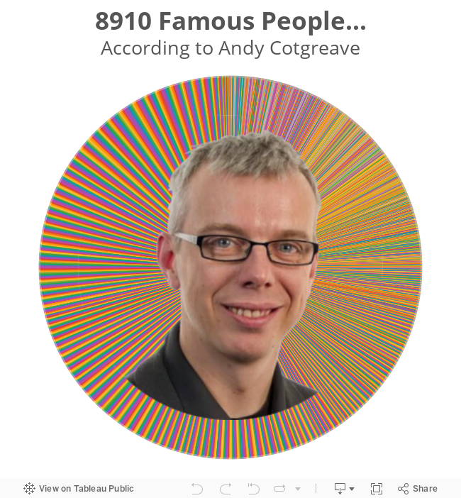
London Viz Club: The History of Famous People

We had been discussing using the data from the Open Beer Database to try to build something that would let people identify the beers they might like best. Graeme had warned us that the data wasn't particularly exciting, but we marched on anyway, blind to his advice.
Emily did a fabulous job of joining all of the various datasets using Alteryx and quickly got us a clean data set we could visualise. And boy was Graeme right; there was absolutely nothing interesting about the data. All it had was a list of beers, their ABV and IBU and their location. That's it. So we built a map, then another map, then a bar chart and we all were quickly bored.
On to Plan B. Andy C mentioned that he had been wanting for a long time to have a crack at making over this chart called Horizontal History (click on the image to view a larger version):

Sweet! This looked like a fabulous idea, yet like most projects, finding the data quickly became a problem. We ended up finding a great data set by MIT as part of their Pantheon project. So exciting! Until we looked at the data and realized it only included birth years.
To build a timeline-like viz, we would need death dates for those no longer living. Ugh!!! Back to Google we went and this time we found this data set that included many more people and also their death dates. We download this file (which was in JSON format) and Emily began combing them in Alteryx. This took way, way longer than we expected because we couldn't figure out how to get the JSON Parse tool in Alteryx to behave like we expected. We wasted a good hour here.
While Emily was working on that, I decided to see if anyone had already built a tool to convert a JSON to CSV and low and behold I found this great little tool. A few minutes later I had a CSV and we were able to join this CSV with the TSV from Pantheon within Tableau. Phew! That took was too long.
By this time, it was about 9:30pm (we started at 6:15) and the team needed to get going. So we started playing with the data, built a simple timeline. Then we started playing with some of the dimension that we get from the Pantheon dataset.
For example, only about 14% of the famous people in the list are women. What??? That's sad.
 |
| Note: Not all women are shown (this is merely a screenshot) |
Ok, what occupations are associated with these women?
 |
| Note: Top 15 occupations only |

Then someone proposed sorting the names by birth year and then changing the fonts to Comic Sans and Papyrus, really only in an effort to troll Andy for leaving. Yes, this was it! Have a look at the tooltips (hover outside of Andy's pretty face)...fabulous!
Don't worry, you'll have a chance to improve this in a future Makeover Monday.
December 30, 2015
Dear Data Two | Week 37: Swearing

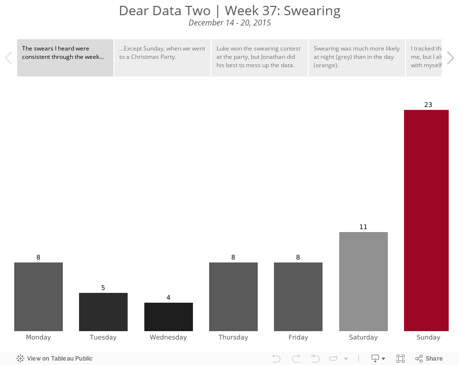
It was interesting paying attention to the swearing I heard around me. I know I definitely changed my behaviour this week knowing that I was tracking myself. That's been one of the outcomes I didn't expect from this project; changing my behaviour knowing I have to report on myself. Yet this week, I still swore the most. I'm chalking this up to me being with myself all of the time.
The most fun part of this week was a Christmas party we went to on Sunday. I was covertly recording all of the swear words I heard. Naturally, as people drank more, the swearing increased. Then they caught me tracking them. And the game changed. They starting blurting out swear word after swear word, knowing I couldn't possibly keep up with the tracking. So, I ignored that noise and only recorded "natural" swears.
As for the postcard, if it didn't take so long to create, I would have re-created it. I wish I had spaced out the words better for a less cluttered effect.
I'm incredibly curious to see how Jeffrey reacts to this. He was a great sport about my drinking card, given that he doesn't drink. And I've never heard him swear. Is this project changing his opinion of me? He certainly knows way more about me than he ever did before.
Check out my analysis below to see how I interpreted what the data was telling me.
August 7, 2015
Dear Data Two | Week 12: The Kriebel Family

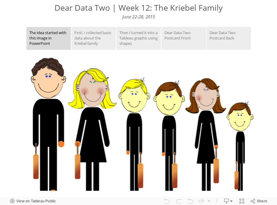
- Collection basic data about the characteristics of my family
- Use shapes in Tableau to create an infographic
- Translate the graphic to the postcard