February 11, 2016
London Viz Club: The History of Famous People
andy cotgreave
,
donut chart
,
famous
,
history
,
London
,
people
,
pie chart
,
shape
,
VizClub
2 comments

We had been discussing using the data from the Open Beer Database to try to build something that would let people identify the beers they might like best. Graeme had warned us that the data wasn't particularly exciting, but we marched on anyway, blind to his advice.
Emily did a fabulous job of joining all of the various datasets using Alteryx and quickly got us a clean data set we could visualise. And boy was Graeme right; there was absolutely nothing interesting about the data. All it had was a list of beers, their ABV and IBU and their location. That's it. So we built a map, then another map, then a bar chart and we all were quickly bored.
On to Plan B. Andy C mentioned that he had been wanting for a long time to have a crack at making over this chart called Horizontal History (click on the image to view a larger version):

Sweet! This looked like a fabulous idea, yet like most projects, finding the data quickly became a problem. We ended up finding a great data set by MIT as part of their Pantheon project. So exciting! Until we looked at the data and realized it only included birth years.
To build a timeline-like viz, we would need death dates for those no longer living. Ugh!!! Back to Google we went and this time we found this data set that included many more people and also their death dates. We download this file (which was in JSON format) and Emily began combing them in Alteryx. This took way, way longer than we expected because we couldn't figure out how to get the JSON Parse tool in Alteryx to behave like we expected. We wasted a good hour here.
While Emily was working on that, I decided to see if anyone had already built a tool to convert a JSON to CSV and low and behold I found this great little tool. A few minutes later I had a CSV and we were able to join this CSV with the TSV from Pantheon within Tableau. Phew! That took was too long.
By this time, it was about 9:30pm (we started at 6:15) and the team needed to get going. So we started playing with the data, built a simple timeline. Then we started playing with some of the dimension that we get from the Pantheon dataset.
For example, only about 14% of the famous people in the list are women. What??? That's sad.
 |
| Note: Not all women are shown (this is merely a screenshot) |
Ok, what occupations are associated with these women?
 |
| Note: Top 15 occupations only |

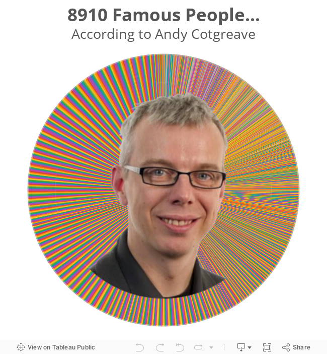
Then someone proposed sorting the names by birth year and then changing the fonts to Comic Sans and Papyrus, really only in an effort to troll Andy for leaving. Yes, this was it! Have a look at the tooltips (hover outside of Andy's pretty face)...fabulous!
Don't worry, you'll have a chance to improve this in a future Makeover Monday.
Subscribe to:
Post Comments
(
Atom
)


I think the data cleaning process missed some things. I checked to see where religious figures ranked and saw that Jesus wasn't in there. It's likely other things got missed, too. I went back to GiHub and found that he's in the raw file as well as the Pantheon project: http://pantheon.media.mit.edu/people/Jesus%20Christ
ReplyDeleteDespite the conversion issues, this is a great find. I can see myself using it over and over.
Thanks for identifying the mistake Robert! Feel free to use the other data source from Github if you'd prefer.
Delete