August 11, 2015
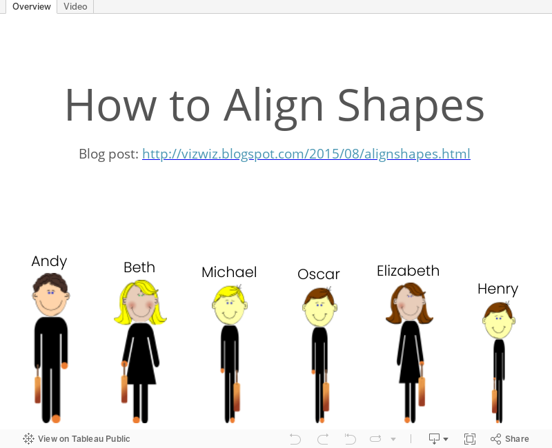
Tableau Tip Tuesday: How to Align Shapes

August 7, 2015
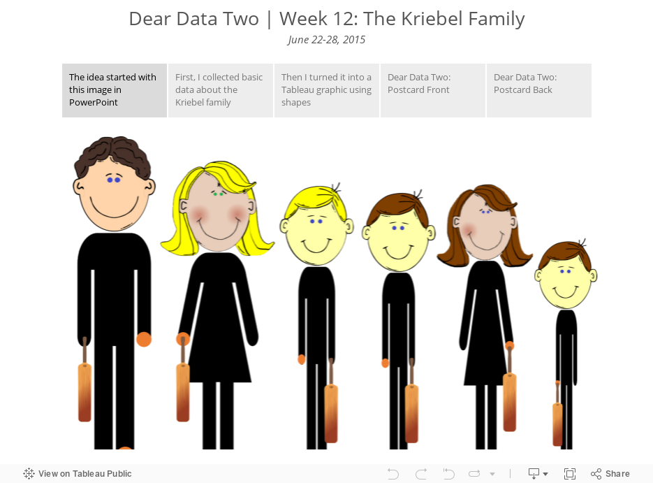
Dear Data Two | Week 12: The Kriebel Family

- Collection basic data about the characteristics of my family
- Use shapes in Tableau to create an infographic
- Translate the graphic to the postcard
February 21, 2015
Tableau Tip: Labeling the Right-inside of a Bar Chart
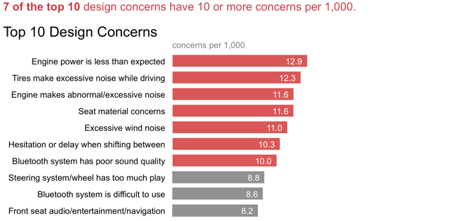
This got me thinking. Out of the box, you cannot put the data label for bar charts in Tableau on the right-inside of the bar. Here are the options you get from the Labels shelf:


None of these options let me label the bars like Cole does. To do so, you need to follow a few simple steps:


You can download the workbook used to build this example here (requires Tableau 9).
UPDATE: Joe Mako suggested in the comments to use a cell-level reference line. This method saves the secondary axis for something else, should you need it. Both methods solve the same problem though. I've included this method in the workbook link above. Here's what it looks like:

And if you want the dimension labels inside the bar as well, simply drag the dimension to the Label shelf and left align.

August 23, 2013
When left-aligned labels go right and right-aligned labels go left...a logarithmic love story
While working on a project in datacamp this week, I was using a log scale on a bar chart because it was the most effective way to communicate. (NOTE: See this article from Naomi Robbins for more info about appropriate use of log scales.) I ran into an interesting phenomenon in Tableau, which I believe is a bug, but I kind of like.
Let’s start with a simple bar chart with three different label alignment options.

Some quick notes:
- The length of the bars in all of these examples is represented by the field “Value”
- The label is represented by the field “% of Value”.
- These charts all use the default scale.
These charts look as I expect. Auto, left and right align are placing the labels in the expected location.
However, look what happens when I change the scale to logarithmic.

What happened?
- Auto alignment has suddenly become left align.
- Left alignment is now right aligned, but inside the end of the bar.
- Right alignment is now left aligned.
When I filter down to just the top 10, the behavior changes again.

Final thoughts:
- I definitely think this is a bug, and I’ve reported this because Tableau is providing an inconsistent and unexpected user experience.
- I really like the look of the bar label inside the end of the bar. I would like more flexibility with label alignment to be able to get this look intentionally.
- If you want to hear about lots of the cool stuff we’re doing with Tableau at Facebook, come here our talk at TCC13 at 11am on Wednesday – “Interworks: Data Discovery at Facebook: Why Culture & Flexibility Matter for Modern Analytics”.
If you want to play with it yourself, you can download the workbook here.






