Showing posts with label diverging. Show all posts
April 9, 2024
How to Create a Floating Bar Chart in Tableau
bar chart
,
calculated field
,
color
,
difference
,
diverging
,
floating bar chart
,
gantt
,
lookup
,
size
,
table calc
,
table calculation
,
tableau
No comments
A floating bar chart is similar to a Gantt chart, except it shows the range of two data points instead of two dates.
July 11, 2023
#MakeoverMonday 2023 Week 28 - Global Passport Rankings
bar chart
,
bar in bar
,
barbell
,
butterfly chart
,
diverging
,
gantt
,
grouped
,
histogram
,
how to
,
jittered bar chart
,
Makeover Monday
,
scatterplot
,
slope graph
,
tableau
,
trellis chart
No comments

I created:
- Grouped bar chart
- Bar in bar chart
- Grouped bar chart with a gantt bar for the difference
- Diverging bar chart
- Histogram
- Butterfly chart
- Barbell chart
- Scatter plot
- Slope graph
- Trellis chart
- Jittered bar chart
Wow. I didn't realize I had tried so many chart types. No wonder the hour went by so quickly.
I didn't love any of the charts, so I went with the one that I thought was the best of the bunch. Check it out below the video.
If you find the video useful, please give it a like on YouTube and subscribe to my channel. That helps other people find the content too.
Lastly, remember to sign up for my newsletter at andykriebel.com. You get sneak peaks of new videos, advice to help you be better at your job, plus exclusive discounts to products I create.
November 10, 2022
How to Add Hundreds of Custom Color Palettes
analysis
,
categorical
,
color
,
color palette
,
colour
,
custom color palette
,
data visualization
,
diverging
,
formatting
,
hex code
,
html
,
sequential
,
tableau
,
tip
No comments
Tableau comes with some great color palettes that have been designed to work well together. And you can add your own custom color palettes by making a couple of simple changes to the preferences.tps file that comes with Tableau Desktop. For example, you may have a color palette that matches your company’s brand.
In this video I show you how to add 3 different types of color palettes to Tableau:
- Categorical
- Sequential
- Diverging
You can add as many color palettes as you’d like. While you can have as many colors as you want in each palette, the Color shelf only displays 20. Here's a link to my color palettes.
Once you’ve updated the preferences file, restart Tableau and they’ll all be there for you. Below the video is the code you need to create each of the color palette types. Make sure when you copy in the double quotes that they are straight double quotes and not angled.
Categorical Palette
color-palette name="Palette Name" type="regular">
<color>#</color>
<color>#</color>
<color>#</color>
<color>#</color>
</color-palette>
Sequential Palette
color-palette name="Palette Name" type="ordered-sequential">
<color>#</color>
<color>#</color>
<color>#</color>
<color>#</color>
</color-palette>
Diverging Palette
color-palette name="Palette Name" type="ordered-diverging">
<color>#</color>
<color>#</color>
<color>#</color>
<color>#</color>
</color-palette>
October 19, 2016
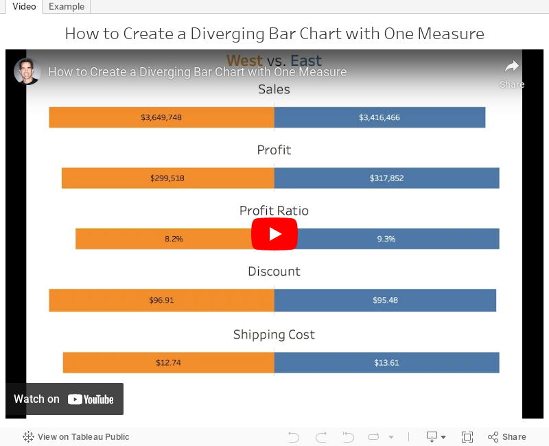
Tableau Tip Tuesday: How to Create a Diverging Bar Chart with One Measure
bar chart
,
bikini chart
,
diverging
,
diverging bar chart
,
index
,
table calculation
,
Tableau Tip Tuesday
4 comments

With a cheeky use of the INDEX table calculation, this was quite straightforward. In the video below, you'll see that the middle of the charts aren't lined up. I fixed this by using the INDEX calc again. You can download the workbook to see how I got it to work.
January 26, 2016
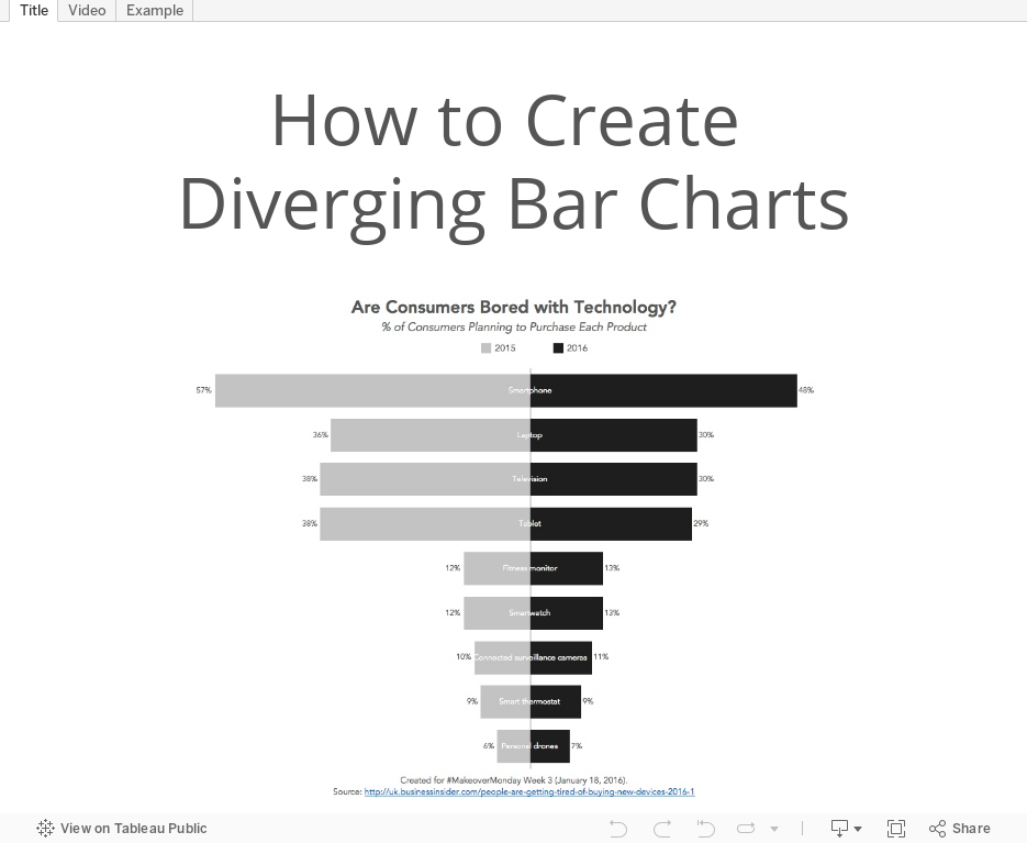
Tableau Tip Tuesday: How to Create Diverging Bar Charts

UPDATE: Some followers have let me know that they've heard these charts called tornado charts or butterfly charts. Basically, the consensus is that this type of chart doesn't have a name. That's ok though!
For this week's tip, I show you how to make diverging bar chart or bikini charts or whatever they are called.
Subscribe to:
Posts
(
Atom
)






