October 1, 2020
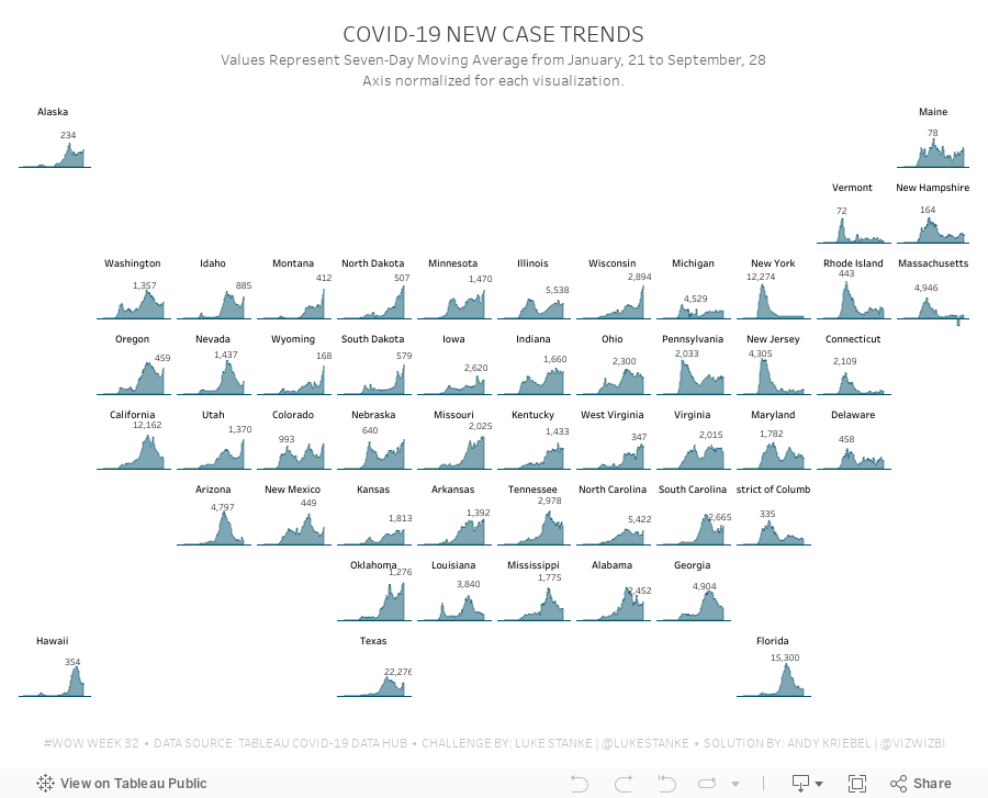
#WorkoutWednesday 2020 Week 32: COVID-19 New Case Trends

As I continue to catch up on Workout Wednesday challenges I've missed, I'm picking and choosing those that looking interesting at first glance (and that I think are doable in a short amount of time). Week 32 was one I knew I could get done quickly since it was very similar to 2017 week 7. Actually, since the columns and rows were provided to use already via a CASE statement, the trellis part of the exercise required no calculations and no work.
The toughest part was normalizing the calculation within each State. The key here is to think about each State individually, find the highest value, and then compare all of the other dates to that value. I did this by putting each State and date into a row, creating a calculation to get the largest value, then computing the necessary ratio. Once I had that, it was simple to turn it into a chart.
To get the State names in the middle of each chart, think about how you can count half of the day in each chart. Then take that value and add it to the first date and you'll get a single date that's halfway across the date range. This solution will be flexible for any new data that would be included.
Some difference between mine and Luke's
- I didn't filter the dates; I decided to use the entire data set, but keep in mind that I did this several weeks after Luke posted the challenge.
- I created a mobile version as well.
And with that, here's my completed #WorkoutWednesday for week 32 2020.
April 9, 2017
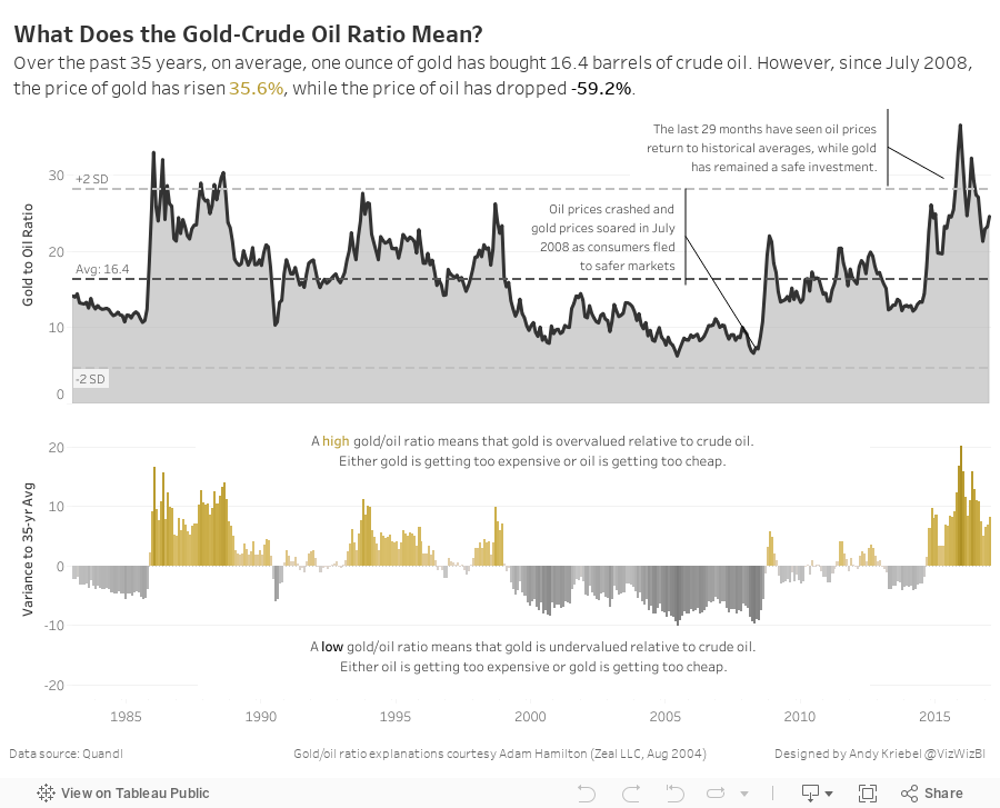
Makeover Monday: What Does the Gold-Crude Oil Ratio Mean?

An interesting sidebar: I went back to the original blog post, downloaded the workbook, then opened it to see how I had shaped the data. Turns out I build this in Tableau 4.1. How cool is that!?! Dashboards had just been added to Tableau. Ahh, the good old days! People starting to use Tableau now have no idea how good they have it.
Anyway, back to the makeover.
What works well?
- Minimal use of color
- Axes are clearly labeled
- Trend line adds context
- Scatterplot portrays the relationship well
- The title doesn't tell me much at all.
- What does each dot mean?
- Is there more to the story?
- What does being above or below the trend line actually mean?