March 16, 2023
How to Dynamically Resize Marks in Tableau

In this video, I show you how to resize marks (in this case circles) dependent on how many marks are in the view. For example, if all possible marks are in the view (100%), the circles should be small. If only 10% of possible marks are in the view, the circles should be large.
I show how to do this on a map, but it can be extended to scatter plots, box plots, dot plots, jittered bar chart, and more.
July 5, 2022
How to Create a Hexbin Map in Tableau
In this tip, I show you how to create a hexbin map in Tableau. But first, let me explain the purpose, benefits and drawback of a hexbin map.
There are countless times when I have been asked to display way too much data on a map. Sometimes I’ve been asked to display thousands of points on a map..but why? I know no one will understand it.
A hexbin map uses hexagons to divide an area into multiple parts and assign a color gradient to each hexagon. This chart type is used to visualize density, where the hexagons dividing the whole space into discrete units of equal size.
This video is going to help you communicate the concentration of data on maps more effectively and give you another option for visualizing geospatial data. I’ll show you how to create a hexbin map based on both the value and the rank, giving you two options depending on your use case.
If you want to follow along, these are the data sources I used:
1. Austin Bike Accidents - https://bit.ly/AustinBikeAccidents
2. Austin Zip Codes Shapefile - https://bit.ly/AustinZipCodes
3. Price Summary - https://bit.ly/PriceSummary
February 22, 2021
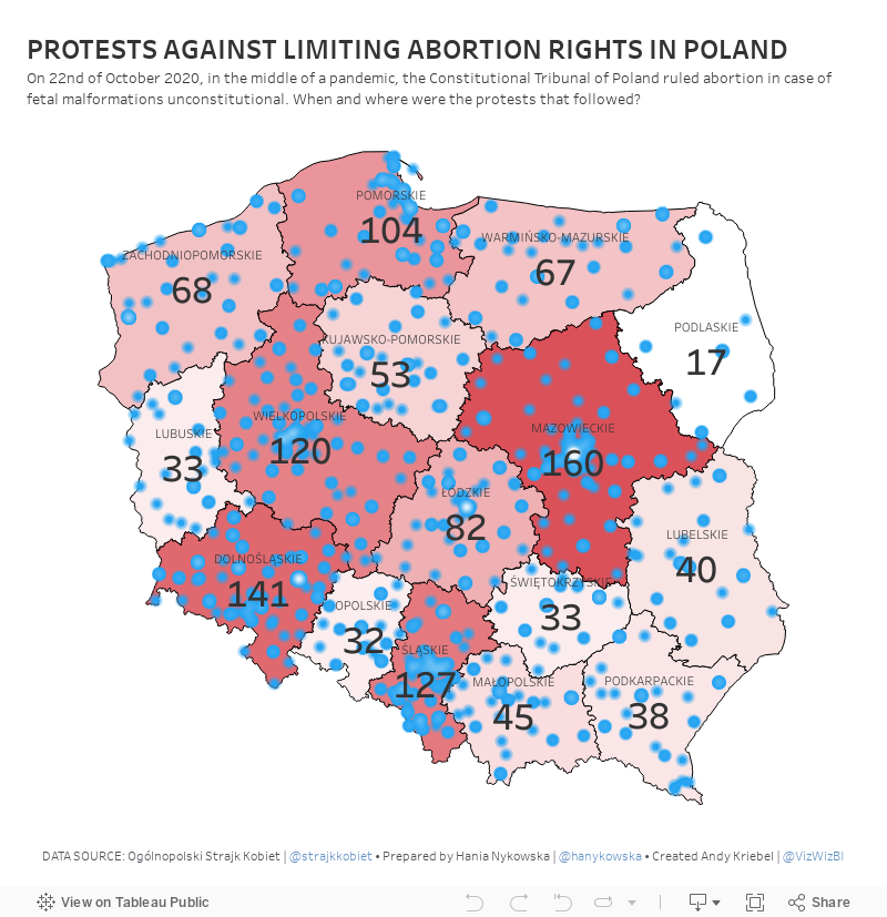
#MakeoverMonday Week 8 - Protests Against Limiting Abortion Rights in Poland

October 20, 2020
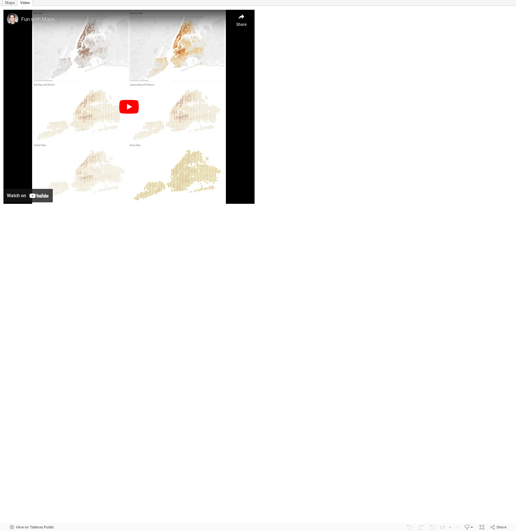
#TableauTipTuesday: Four Methods for Creating Dots on a Map

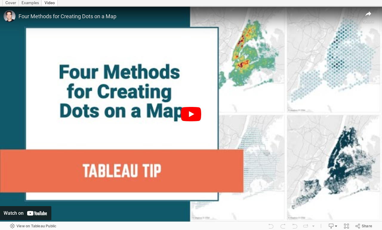
People love maps. Putting dots on a map gives a sense of precision. There are lots of methods for displaying maps. In this video, I show you four:
- The exact locations
- Density map
- Using the ROUND function to generalize the points
- Using the HEXBIN functions to generalize the points, but at a level controllable by the user
June 19, 2020
How to Get Your Data from Strava to Tableau
- Download the data from Strava
- Prep it with Alteryx
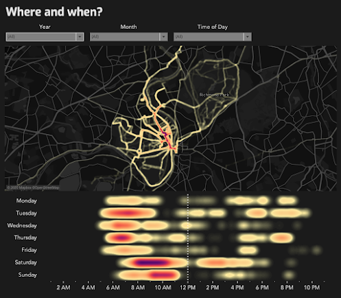
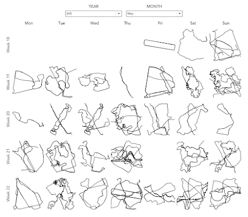
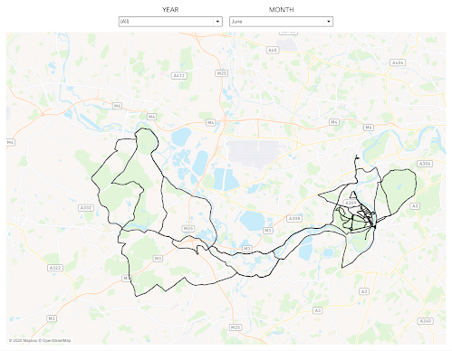
- Visualize it in Tableau

- My Alteryx workflow was a mess (I tinkered with it every month).
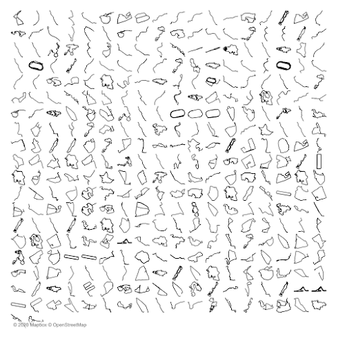
- Each of the routes would be adjusted to fit perfectly in a square.
TOOLS REQUIRED
- A Strava account - NOTE: Make sure you are logged in to Strava throughout these steps.
- Alteryx Designer
- Tableau Desktop
- Simple Mass Downloader Chrome extension
GET THE DATA FROM STRAVA


DOWNLOAD EACH ACTIVITY


ALTERYX PROCESS

- Import the data, strip out the parts we need, then create points and lines.
- Normalize the data based on the calcs from Ken Flerlage, turn them into lines (one mark for each route rather than hundreds of point for each route) and export as a Tableau extract.
- For each point, calculate the distance, climb, etc. and extract all of the points.
- Take each of the points and turn them into lines.


TABLEAU PROCESS



July 2, 2019
#TableauTipTuesday: Fun with Maps

February 22, 2019
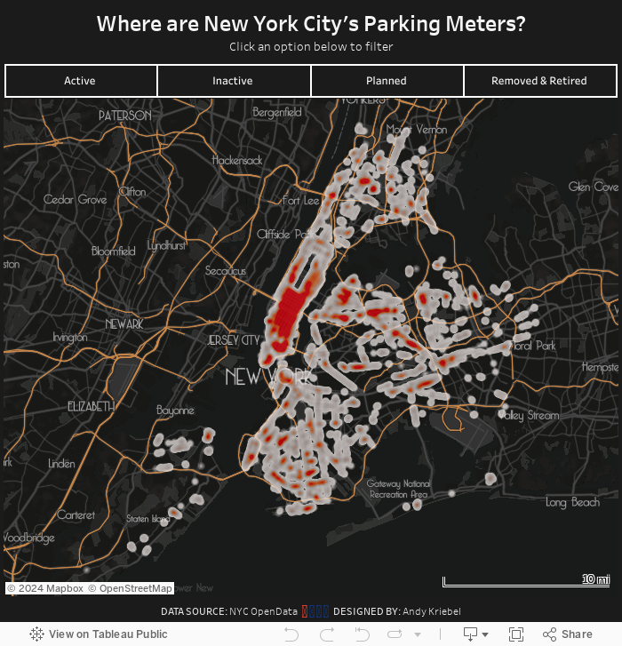
Where are New York's Parking Meters?

Their map is impossible to read with some many big dots overlapping each other. This also makes it hard to see the concentration of parking meters. My assumption going in was that you'd see way more in Manhattan.
All I really did was create a map, plot each point, and change the mark type to Density. From there it was formatting:
- Using a custom mapbox map, which I customized based on the mapbox template Metropolis.
- Play around with lots of colors, then intensity and opacity of each of those colors, before settling on a choice.
October 31, 2018
Analyzing Pitcher Performance With Density Heatmaps
To give it a test, I downloaded every pitch for Clayton Kershaw and Justin Verlander (two of the best pitchers in Major League Baseball) from 2008-2018 from the great stats website Baseball Savant. Every time I look at baseball data, I'm amazed at the detail of the stats covered; the data far exceeds anything that is covered in other sports.
After downloading the data, I built the small multiples view below for each pitcher so that I could see their progression through the years. Click on the images for the interactive versions. I love how the data shows me how each pitcher has gotten better with their "misses" through their careers. For example, when they throw sliders for balls, they now tend to miss below the strike zone. This is a great sign that they have command of their pitches and are less likely to miss in an area where the batter can take advantage.
The density heatmap feature will most likely be used by most people on maps, which makes sense, but consider looking at it as an alternative whenever you need to plot x/y coordinates and have lots of points to display.


September 13, 2018
Clayton Kershaw & My Learning Process
What is Learning?
- is active - process of engaging and manipulating objects, experiences, and conversations in order to build mental models of the world (Dewey, 1938; Piaget, 1964; Vygotsky, 1986). Learners build knowledge as they explore the world around them, observe and interact with phenomena, converse and engage with others, and make connections between new ideas and prior understandings.
- builds on prior knowledge - and involves enriching, building on, and changing existing understanding, where “one’s knowledge base is a scaffold that supports the construction of all future learning” (Alexander, 1996, p. 89).
- is situated in an authentic context - provides learners with the opportunity to engage with specific ideas and concepts on a need-to-know or want-to-know basis (Greeno, 2006; Kolodner, 2006).
- requires learners’ motivation and cognitive engagement to be sustained when learning complex ideas, because considerable mental effort and persistence are necessary.
- is active in that I am building my knowledge as I explore the data set and learn the new features.
- builds on my prior knowledge of how the feature works and my knowledge of the game of baseball. However, I had never done a scatterplot of pitching before, so I had to learn new terminology in the data. This knowledge will help me be more productive and learn faster in the future.
- is situated in the authentic context of engaging with the ideas and visual concepts that I saw online and drew on paper.
- required my motivation and engagement to see the project through to fruition and the persistent to make the display visually accurate.






