April 30, 2024
How I Create a Unit Histogram in Tableau

A unit histogram is a chart that shows the distribution of data points across a series of bins of a measure.
Unlike a traditional histogram that uses bars, a unit histogram consists of a set of marks, each representing a member of a dimension.
In this example, our final result is a unit histogram showing the distribution of states by their average sales.
If you like this, you'll love Next-Level Tableau. You get over 175 hours of live training with me, 130+ on-demand videos, workshops, office hours, workbooks, data sets, lots of new videos each year, any new courses I create, and a great Community.
Get more info and sign up today at nextleveltableau.com.
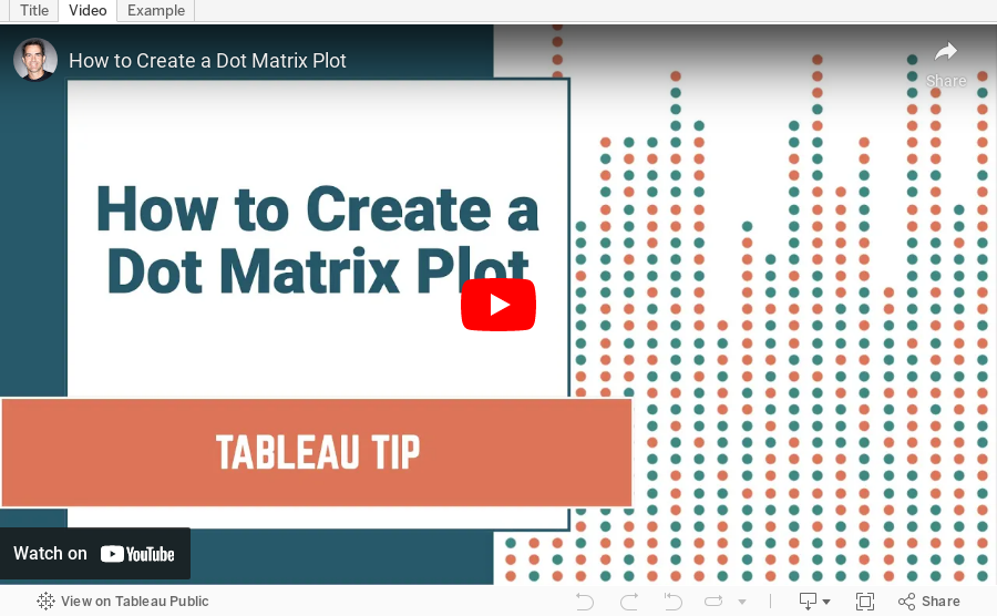
December 17, 2020
How to Create a Dot Matrix Plot

Dot matrix charts are useful for visualizing the distribution and frequency of discrete data. They help you understand the scale and proportion. The purchase is to understand how many, not how much.
In this example, I'm using two colors to distinguish new vs. used cars. However, if you have only one variable or category, then stick to one color.
Resources:
- Workbook - https://bit.ly/DotMatrixPlot
- Data set - https://data.world/vizwiz/car-sales-mock-data
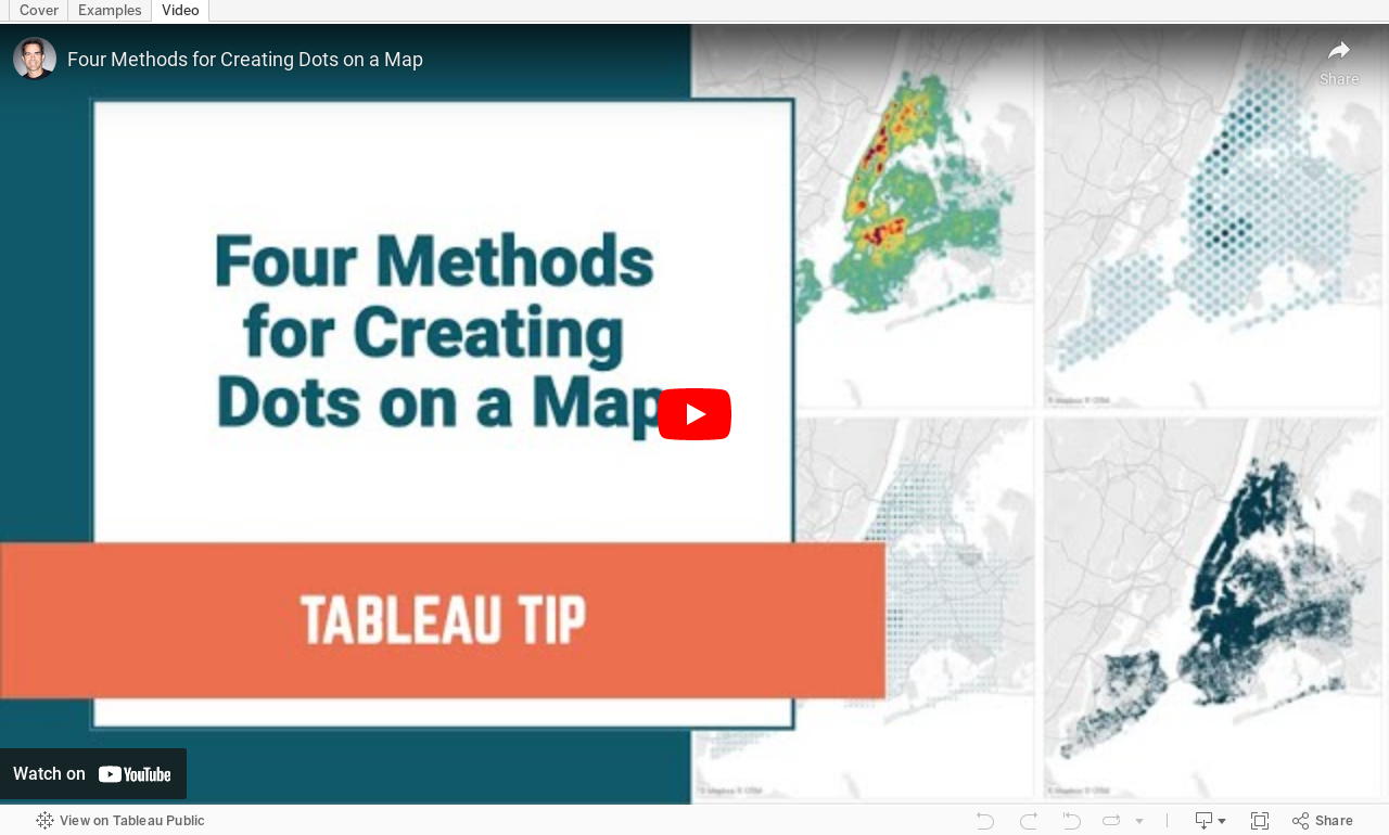
October 20, 2020
#TableauTipTuesday: Four Methods for Creating Dots on a Map

People love maps. Putting dots on a map gives a sense of precision. There are lots of methods for displaying maps. In this video, I show you four:
- The exact locations
- Density map
- Using the ROUND function to generalize the points
- Using the HEXBIN functions to generalize the points, but at a level controllable by the user
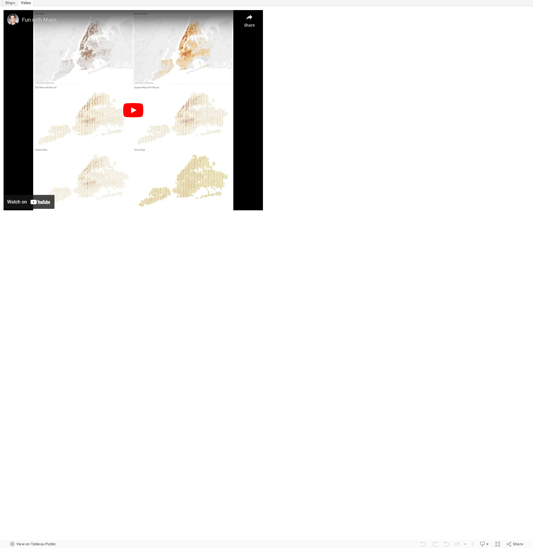
July 2, 2019
#TableauTipTuesday: Fun with Maps

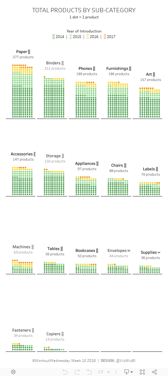
April 12, 2018
Workout Wednesday Part 2: Total Products by Sub-Category
Some thoughts:
- Getting the subcategories to layout correctly in a trellis plot was easy.
- Getting the labels above each grid was easy.
- Getting 10 dots across each pane was easy.
- Getting the stacking of the dots in rows was a pain!
- Luke has an evil side.
March 27, 2017
Makeover Monday: The Secret of Success

Andy Cotgreave messaged Eva and me about this particular viz and found a great article that does an excellent in-depth review of this particular piece. Reading the article helped reassure the thoughts that I've had about this chart over the years.
What works well?
- Engaging design
- Clear labels on the values
- Legend matches the shape of each amoeba
- Everything is scaled in proportion
- Good color choices
- Nice big title
- The subtitle is very offensive. It sure seems this survey was conducted by some extreme right-wing group.
- The overlapping colors make it hard to follow the pattern.
- Radar charts are very hard for making comparisons across categories.
- The radars are curved to make the segments appear to take up more space.
- Unnecessary icons
February 22, 2017
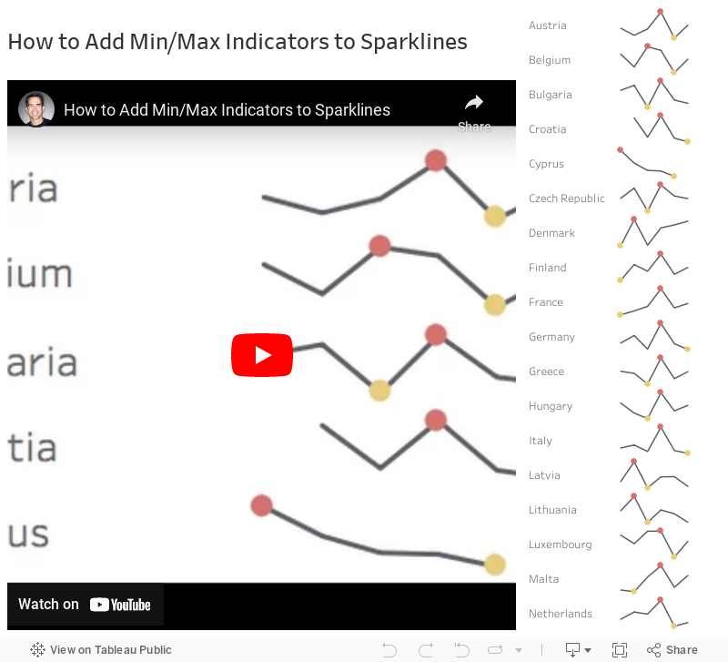
Tableau Tip Tuesday: How to Add Min/Max Indicators to Sparklines
First, let's have a quick look at Ann's viz:

Notice the sparklines with the indicators on the right. In this week's tip, I'll walk you through how I would go about creating those. The video is under five minutes and easily replicable. Enjoy!
March 21, 2016
Makeover Monday: Women's Rights Around the World - An Interactive Graphic

Wow! This week’s Makeover Monday was a really tough data set. I struggled to come up with something that I thought communicated effectively. I had an idea in my head, yet when I tried to execute that idea, it simply didn’t work.
But first, let’s take a look at the original graphic from the Guardian Datablog.

What works well?
- The interaction is fantastic.
- It’s colourful, which captured my attention immediately.
- I really like the pop up list of rights you see when you click on a specific bar.
What doesn’t work well?
- There are way too many colours.
- Arranging the countries in an arc makes it difficult to compare countries. For example, the United States is on the outside, which automatically makes it look larger than any country farther inside the circle even though they may take up the same percentage of the arc.
- The equal scaling makes no sense at all. Why would you want to scale them equally?
- Does the population scaling scale by total population or female population?
- Comparing countries across women’s rights is basically impossible.
I started with the idea of a long infographic and quickly realised that this would hinder the interactivity I was after. If I want you to compare countries, then I should have them all in a single screen. I then thought about creating a bump chart. Here’s the result of that…not so good!

Back to the drawing board I went. I knew I wanted to include a few things in particular:
- A way to filter by region
- A way to show and compare all countries within a category of women’s rights
- A map to display possible geographic concentrations
- Emphasis on the countries that are performing worst
- Interactivity, like the original, that displays each question and if the criteria is met
- Action filters where it makes sense
- Simple instructions
For my viz, I also made the assumption, for the sake of time, that Yes responses were the only positive responses. Given all of those criteria, here is my submission for this week’s Makeover Monday. Enjoy!
February 23, 2016
Dear Data Two | Week 43: Trying New Things

I’ve fallen behind…again! I was in quite a good groove, then suddenly burnout hit me. Fortunately I’ve been able to keep up with the data collection. The ebbs and flows of this project can become quite overwhelming and I’d rather hold off on creating a postcard until my head is in it than create something for the sake of staying on track. I’m fairly sure Jeffrey feels the same way.
I feel like I’m in the home stretch now. Currently I’m collecting data for week 47, which means only five more weeks!!!
For week 43, the topic was “trying new things.” Immediately I thought about when I was a kid and never wanted to try new food or go new places. As an adult, I’ve become quite more adventurous, including two massive moves for my family, so I think I’m adapting well to trying new things. You can read through my analysis of the week in the story points below. The simple outcome is this: I liked 81% of the new things I tried, so that should encourage me to try even more new things and to not be afraid.
March 3, 2015
Tableau Tip Tuesday: Creating Connected Scatter Plots in Tableau
I previously wrote detailed instructions for creating connected scatter plots here.
You can download the workbook used to create this video here.


