VizWiz

Launch, grow, and unlock your career in data
Showing posts with label line. Show all posts

May 15, 2024

#MakeoverMonday 2024 Week 20 - Exporting Freedom, One Bullet at a Time

No comments

I struggled mightily with this week's #MakeoverMonday. My goals was to replicate the original visualization by Bloomberg.

I knew I need to create path to connect the US at the center to each country.

I wanted to make the US the center of the of the map.

Sounds simple, right? I made it way harder than it needed to be.
  • I overthought the data prep.
  • I forgot how to create the paths.
  • I couldn't get the math right to offset the longitude.

The coloring and labeling was straightforward for me.

Adding the US as a circle in the middle was pretty simple.

To overcome the problems I faced
  • I looked at a previous visualization I created using paths.

  • I opened the workbook and the data to see the configuration.
  • I replicated that set up by adding a second set of records to the data set.
  • Viewers on the livestream helped me figure out the math to offset the longitude.

The simplest way to explain the location of each country is to think of the lat/lon for the US as 0,0. Then you compare that to the lat/lon for every other country to create the offset.

I got there in the end. What do you think? Was the juice worth the squeeze?

Click the image below to access the viz. 


April 2, 2024

60 Ways to Visualize Time Series Data in Tableau

No comments

I don't believe in creating fancy visualization to get attention. I prefer easy to understand. Here's my complete list of 60 unique ways to visualize time series data.

Learn to build them here. View the workbook here. Download it on Gumroad here (for a small fee).

March 8, 2024

Visualizing Time Series Data in Tableau

No comments

Last night I was invited to speak at the Chicago Tableau User Group about visualizing time series data. Other than spatial data, time series data is my favorite to visualize. 

There seem to be endless methods for making time series data useful for analysis. Check out this video for 60ish ways to visualize time.

I had a 20 minute slot to present and, of course, I ran over time. I seem to do this with every session I run lately. Be it training for Next-Level Tableau, presenting at events, or running a livestream, I get into a groove and don't want to stop.

I was able to create 14 vizzes in 20+ minutes. I added an extra in this workbook to make the dashboard format nicely.

Click on the image below to download the workbook and dissect it. Get the data here to follow along. 

Have fun! 

February 15, 2022

How to Create a Barbell Chart

No comments
In this tip, I show you two methods for creating a barbell chart. The first method uses two measures and the second method uses one measure split up by a dimension.

February 8, 2022

How to Create an Enclosed Dot Plot

No comments
In this tip, I show you how to create an enclosed dot plot, which is essentially a dot plot that is enclosed by a line. It's very similar to a barbell chart except the line connecting the dots surrounds to dots.

July 19, 2021

#MakeoverMonday 2021 Week 29 - Non-Whites Are At Higher Risk of Dying From COVID-19

No comments

Another COVID-19 data set this week and a great visualization that shows how much more likely ethnic minorities in the UK are to die from COVID.

In the video, I worked through rebuilding the original viz since I liked it so much. Interact with the viz below the video.


February 23, 2021

Four Methods for Creating a Seismogram

No comments
A Seismogram is an alternative to a circle timeline. They are a great way of showing change over time, and are particularly effective when there are big variations in the dataset.

In this video, I show you how to build several version of a Seismogram:

1. Discrete Dates with horizontal lines
2. Continuous Dates with horizontal lines
3. Continuous Dates with vertical lines
4. Gantt chart Seismogram

June 19, 2020

How to Get Your Data from Strava to Tableau

No comments
UPDATE: If you prefer video tutorials, there is now one on my YouTube channel here. The steps to get the links into the Simple Mass Downloader are done more efficiently in the video. There are several steps removed from the Excel and link uploads that are listed in the blog.


For a while now, I've been using this process for getting my data from Strava into Tableau like this:
  1. Download the data from Strava
  2. Prep it with Alteryx
  3. Visualize it in Tableau

In this post, I will outline the steps for getting your data from Strava into Tableau. I have also created a template with some sample vizzes for you to use. Download it from Tableau Public here.

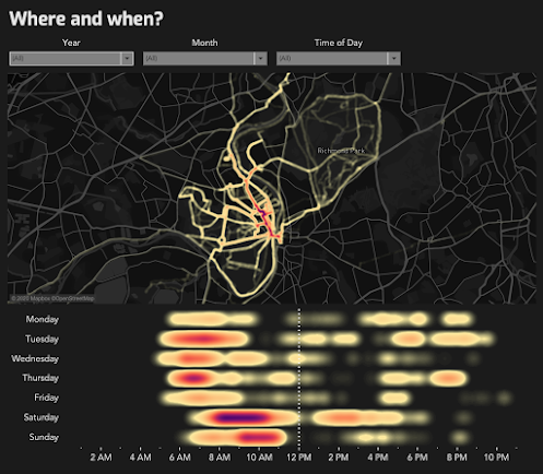
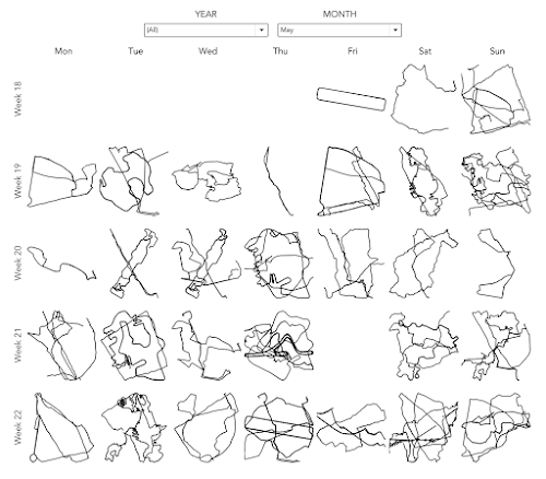
I started revamping the process after wanting to create a small multiple view of all of my activities like this:


When I first started creating these, I took a process based on R and converted it into a workflow in Alteryx. This worked great, but there were two main drawbacks:

  1. My Alteryx workflow was a mess (I tinkered with it every month).
  2. Each of the routes would be adjusted to fit perfectly in a square.

This second problem meant that the routes were not scaled correct according to the curvature of the Earth. I then saw that Andy Cotgreave reached out to Ken Flerlage for help. They've written about their process here. Great! However, the calculations on this process make rendering the maps in Tableau very, very slow. Like REALLY slow.

That's where Alteryx comes in. I pushed all of the data processing into Alteryx, export each route as a single spatial object and every renders super fast. So if you're interested in getting all of your data out of Strava and visualizing it in Tableau, this process is for you. It does require Alteryx, but you could replicate the process in R.


TOOLS REQUIRED

  • A Strava account - NOTE: Make sure you are logged in to Strava throughout these steps.
  • Alteryx Designer
  • Tableau Desktop
  • Simple Mass Downloader Chrome extension

GET THE DATA FROM STRAVA

Step 1 - Login to Strava, click on your profile icon on the upper right, choose Settings.


Step 2 - On the My Profile page, click on My Account.


Step 3 - Scroll to the bottom and click on the Get Started button in the Download or Delete Your Account section.


Step 4 - In step 2, choose Request Your Archive. Don't do anything else on this page.


Step 5 - Check your email in a few minutes. When it arrives, click on the Download Archive button in the email.


Step 6 - Unzip the file that downloads. Open the folder that's created and you should see something like this.

The activities folder contains all of the raw files, but these won't all be in the same format, which means they're useless. The ONLY file we need is activities.csv. Open the CSV in Excel.

Step 7 - The only column we need in the file is the Activity ID column.


Delete all columns except Activity ID.


Step 8 - Insert a column to the left of Activity ID. I name it URL, but call it whatever you prefer. Then in cell A2 enter this formula: 

=CONCAT("https://www.strava.com/activities/",B2,"/export_gpx")

Then copy it down for all rows. This create a link to each activity in GPX format. If some of the activities don't have location data, don't worry about it. Those will simply not download in the process.

Choose the URL column header (the "A" above URL), choose Copy, then Paste Special => Values. Then delete column B (the column with the activity ids).


DOWNLOAD EACH ACTIVITY

Step 1 - Add the Simple Mass Downloader Chrome extension.


A new tab will open with a tutorial if you're interested to learn how it works.

Step 2 - Click on the extension button and you should see this screen.


Step 3 - Click on the hamburger on the right and choose Import URLs from local file.


Step 4 - Import the activities.csv file and the URLs will upload. This loads all of the files into the queue on the Download List tab. Choose the Select All box and they should all be highlighted.


Step 5 - Click on Start Selected and you'll see a bunch of files start downloading very quickly. Again, some of them will error out if the activity doesn't have location data. The files that download will have a green check next to them.


Phew! That might seem like a lot, but once you do it a couple times, the process is really quick.

Fantastic...all of the files are now downloaded. Onto Alteryx we go. 

ALTERYX PROCESS

Step 1 - Download the Strava Route Maps workflow from the Alteryx Gallery and open it in Alteryx Designer. If you can't download it from the Gallery, I have it on Google Drive here.


The Strava icon is a simple macro that will import all of the GPX files in the Directory you specify when you run the app. 

The workflow is split into four parts:

  1. Import the data, strip out the parts we need, then create points and lines.
  2. Normalize the data based on the calcs from Ken Flerlage, turn them into lines (one mark for each route rather than hundreds of point for each route) and export as a Tableau extract.
  3. For each point, calculate the distance, climb, etc. and extract all of the points.
  4. Take each of the points and turn them into lines.

Neither part 3 nor part 4 above normalize the data into squares. These are simply all of the data for each route.

Step 2 - Run the workflow as an App by clicking on the magic wand next to the Run button.


Step 3 - Choose the folder that contains all of the GPX files from the Simple Mass Downloader output. And click Finish.


This will generate three Tableau extracts that will load into the same directory as the GPX files. The workflow extracts them as TDE because Hyper files don't support polygons. Even though these aren't polygons, it makes me more comfortable that Tableau will read the files correctly.

Success!


Click the Clear button and then the OK button. Otherwise all three files will open in Tableau, which we don't want.

We're all done with Alteryx. Onto Tableau.


TABLEAU PROCESS

I've created a template for you to get started with. Download it from my Tableau Public profile here. Once you have done that, follow these steps.

Step 1- Open Tableau and right-click on each data source and pick Edit Data Source.


Step 2 - Click on the carrot next to the data source name and choose Edit Connection.


Step 3 - Navigate to the data source that downloaded from the Alteryx workflow. It will have the same name.


Step 4 - Go back to your worksheets and everything should update automatically. If not, right-click on the data source name and choose Refresh.

Step 5 - Customize the views as you see fit. That's it!

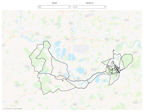
Here are the vizzes that I have included in the template.


March 3, 2015

Tableau Tip Tuesday: Creating Connected Scatter Plots in Tableau

4 comments
I love connected scatter plots, especially when they are animated. Hans Rosling made the scatter plot more famous with his incredible video showing fertility rates vs. life expectancy, and this is the data set that I used in this tip.  Also worth checking out is this great blog post by Alberto Cairo.

I previously wrote detailed instructions for creating connected scatter plots here.

You can download the workbook used to create this video here.

September 1, 2014

Makeover Monday: Where We Donate vs. Diseases that Kill Us

11 comments
One of the ways that I can tell I've made an impact on people I've interacted with is when they send me links to terrible visualizations that they want me to makeover, long after we have worked together. My friend Karyn, who I used to work with at Facebook, send me a link last week to this infographic:

Source: IFLScience

Of course the point of this infographic is to show how much money the ALS Ice Bucket Challenge has raised compared to how few die from the disease relative to other diseases. The data is from 2011, so it doesn't account for the fact that the Ice Bucket Challenge has now raised over $100M. For the purpose of this makeover, let's focus on the chart itself. I see several issues immediately:
  1. The bubble sizes were originally based on the diameter of the circles, not the area.  This is a big mistake! The author has since fixed this so the graphic above is now correct.
  2. There are too many colors. I find myself going back and forth to the legend. It shouldn't be so hard for the readers.
  3. The colors in the legend are in no particular order; not alphabetical, not by deaths, nor not by money raised. This is way too confusing.
  4. It's difficult to trace the relationship between the deaths and the money raised. 
Taking these difficulties into account, I have created this slope graph.


Some of the benefits of presenting the data with a slope graph include:
  • We can see the ranking relationship between the cause and the disease much easier. 
  • I've highlighted the Ice Bucket Challenge since it is the focus on the article.
  • I colored the remaining line by red or blue to indicate a decline or increase in rank respectively.
  • I labeled the ends of the lines directly to eliminate the need for a legend.
One additional element that would add value to the slope graph would be to include the bubble size. If you'd like to build your own infographic, you can download the data here and/or the Tableau workbook here.

August 12, 2014

Tableau Tip: Creating a Connected Scatterplot

No comments
Today I had the incredible honor of helping Alberto Cairo create his very first Tableau visualization. Alberto chose to create a connected scatterplot.  Shortly thereafter on Twitter, Lynn Cherny asked:
So this post is dedicated to her question.  Here you go Lynn:

Step 1: Create the scatterplot


Step 2: Change the Mark type to Line


Step 3: Add a continuous date dimension to the Path shelf


Step 4: Add Markers to the lines via the Color shelf


Step 5: On each axis, uncheck the "Include Zero" option


Step 6: Add a dimension to the Color shelf to create additional lines


That's all there is to it!  Super simple!  Download the sample workbook here.

June 2, 2014

Makeover Monday: The Face Pie - Taking an Analogy Too Far

4 comments

Edward Tufte likes to say "the only worse design than a pie chart is several of them." Today's makeover takes this even one step farther. Someone at Pew Research decided that since the topic of their chart was "The Changing Face of America" that they should uses faces instead of pies.

Humans are poor at judging angles in a pie. I can't even imagine how bad we are at judging angles in obscure shapes. Also, the purpose of this graphic is to show change. It’s very difficult to understand trends in a series of face pies. I would present the data as a line chart like this:

image

Now it’s much, much easier to see the changing demographics of the United States. Keep it simple people!