Showing posts with label discrete. Show all posts
May 25, 2024
How to Create a Dot Strip Plot in Tableau
comparison
,
discrete
,
distribution
,
dot plot
,
dot strip plot
,
frequency
,
how to
,
order
,
reference line
,
strip plot
,
tableau
No comments
Dot strip plots help visualize the frequency and distribution of small, discrete data sets. Dots placed in order on a strip are a space-efficient method of laying out ranks across multiple categories.
April 21, 2024
How to Create Custom Date Hierarchies in Tableau
continuous
,
custom
,
custom dates
,
data analysis
,
date drill down
,
dates
,
discrete
,
drill down
,
hierarchy
,
tableau
No comments
Custom date hierarchies are one of the most underutilized features in Tableau. They allow you to define specific drill-downs not automatically available.
For example, you may want to allow your users to only drill-down from Year to Month.
April 20, 2024
The What, Why, and How of Custom Dates in Tableau
continuous
,
custom dates
,
date part
,
date value
,
discrete
,
how to
,
tableau
No comments
Custom dates allow users to define the level of granularity and format of the date field according to their specific needs based on existing date fields in the data.
They are useful when you want to restrict drill-down options or create sets for specific date ranges.
Here's how to create them.
June 27, 2023
Blue vs. Green - What does it mean?
aggregate
,
blue
,
continuous
,
continuous dimension
,
continuous measure
,
count
,
dimension
,
disaggregate
,
discrete
,
discrete dimension
,
discrete measure
,
fill
,
green
,
group
,
headers
,
how to
,
measure
,
split
,
tableau
No comments

When I first started using #Tableau, I assumed that blue meant dimensions and green meant measures. They don’t.
Blue means Discrete
Green means Continuous
It took me a couple of years to get my head around this most foundational concept in Tableau.
Dimensions and measures are merely a way that Tableau organizes the data.
And if you only take away one thing from this video, this is it:
- Blue things GROUP your data
- Green things COUNT your data
- Dimensions SPLIT up the view
- Measures FILL the view
June 28, 2022
How to Use the Highlighter to Set a Default Color Palette
chart
,
color
,
color palette
,
comparison
,
context
,
dimension
,
discrete
,
formatting
,
graph
,
highlight
,
highlighter
,
how to assign colors
,
how to highlight.
,
tableau
,
tip
,
tutorial
,
worksheet
No comments
Let's say you have a view with lots of marks and you want highlight a specific mark and assign a color palette so that mark is always highlighted whenever that dimension is used, irrespective of the chart.
To do this you can Highlight one or more discrete fields from the color palette and assign those marks to be highlighted. This does not impact the level of detail in the view.
Here's how you do it:
June 22, 2022
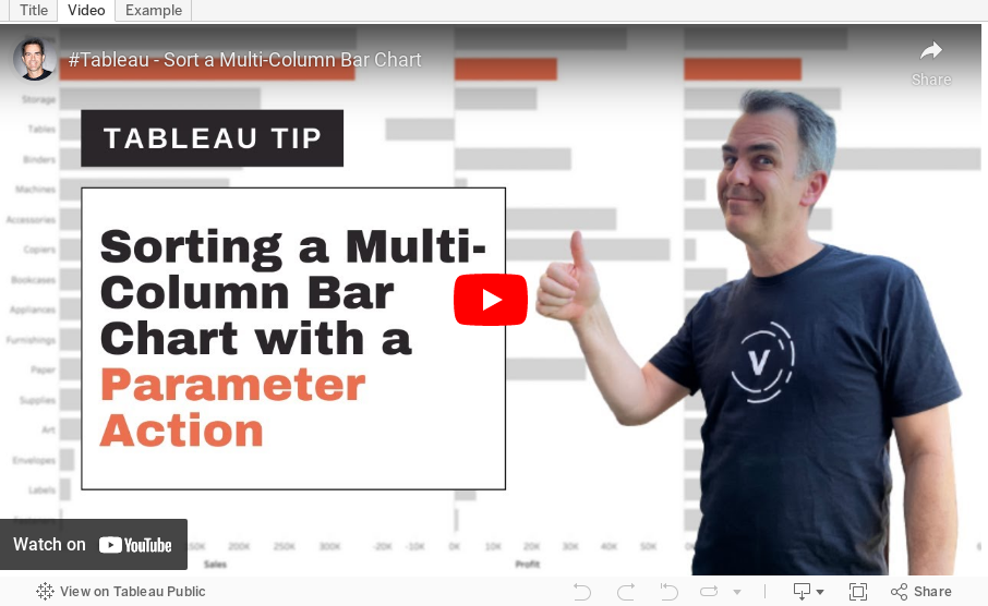
How to Sort a Multi-Column Bar Chart with a Parameter Action
bar chart
,
calculated field
,
case statement
,
chart
,
condition
,
continuous
,
dimension
,
discrete
,
graph
,
highlight action
,
how to
,
measure
,
parameter action
,
set action
,
sort
,
tableau
,
tip
,
tutorial
,
worksheet action
No comments
February 23, 2021
Four Methods for Creating a Seismogram
chart
,
circle timeline
,
color
,
continuous
,
date
,
discrete
,
gantt
,
graph
,
highlight
,
how to
,
line
,
measure names
,
measure values
,
path
,
seismogram
,
tableau tip
,
tutorial
No comments

A Seismogram is an alternative to a circle timeline. They are a great way of showing change over time, and are particularly effective when there are big variations in the dataset.
In this video, I show you how to build several version of a Seismogram:
1. Discrete Dates with horizontal lines
2. Continuous Dates with horizontal lines
3. Continuous Dates with vertical lines
4. Gantt chart Seismogram

December 18, 2018
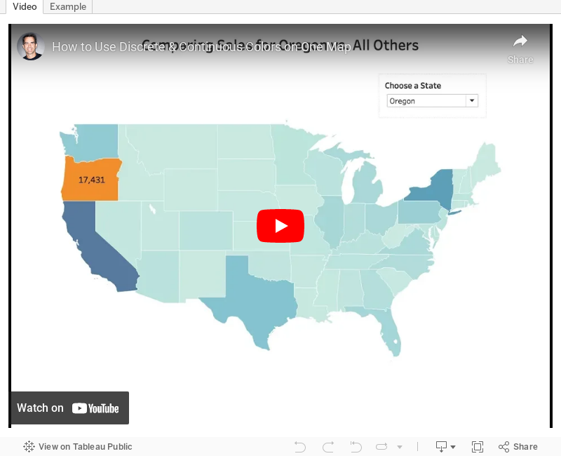
Tableau Tip Tuesday: Using Discrete & Continuous Colors on One Map
color
,
continuous
,
discrete
,
dual axis
,
layer
,
layering
,
map
,
Tableau Tip Tuesday
No comments

A couple weeks ago,
This is quite simple if you know how to layer maps and take advantage of multiple marks cards. I show you how to do just that in this week's tip.
Enjoy!
February 9, 2016
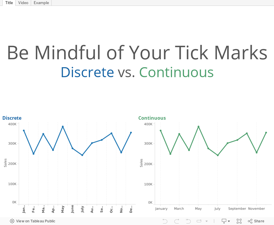
Tableau Tip Tuesday: How Discrete & Continuous Dimensions Affect Your Tick Marks & Gridlines

August 29, 2014
Two-way Sorting in Tableau - Sorting Some of the Viz by a Measure and the Rest Alphabetically
airport
,
calculated field
,
continuous
,
crosstab
,
date
,
delay
,
discrete
,
formatting
,
sparklines
,
table calculation
,
tableau
,
tips
,
travel
,
tricks
10 comments
I had an interesting requirement posed to me yesterday that I hadn't ever run into before. I'm using this Airline Delays data to demonstrate the technique. The requirements were along these lines:
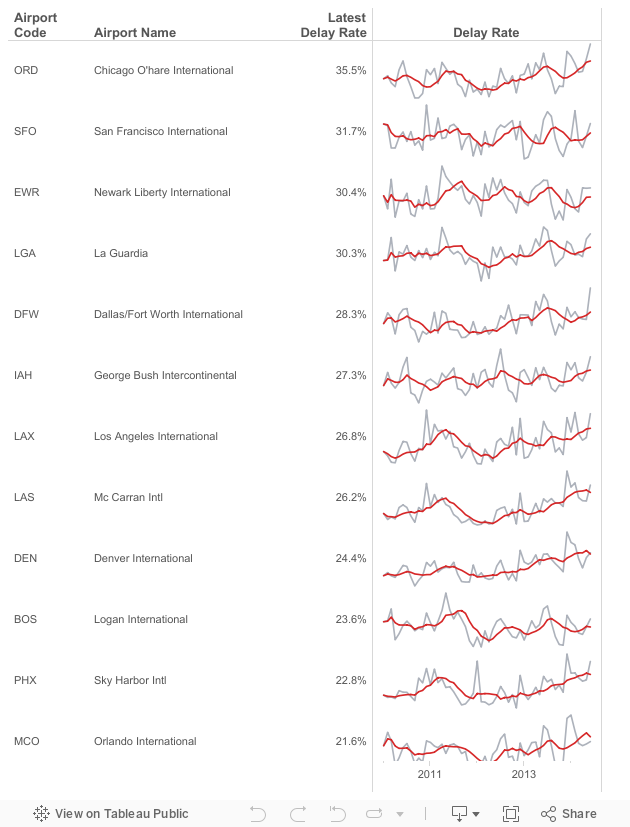
- Given a list of airports, there are a subset that are "targets". Let's assume they are the top 15 with the most flights in 2014: ATL, DFW, ORD, LAX, DEN, IAH, SFO, PHX, LAS, MCO, CLT, EWR, BOS, SLC, LGA
- The airports need to be sorted by the latest delay rate. However, only those in my top 15 list should be sorted by delay rate, the rest should be sorted alphabetically to make them easier to lookup.
- Include sparklines for each airport for 2010 to present.
This is the final product and here's how I went about solving this problem. There could very well be a more efficient method, but this worked for me.
Subscribe to:
Posts
(
Atom
)






