Showing posts with label measure. Show all posts
May 26, 2024
How to Create a Barcode Chart in Tableau
barcode
,
barcode chart
,
detail
,
dimension
,
distribution
,
how to
,
measure
,
tableau
No comments
Like dot strip plots, barcode charts are good for displaying all the data in a table, they work best when highlighting individual values.
July 18, 2023
UNLIMITED Charts, Metrics, and Number Formats in Tableau with Dynamic Zone Visibility
chart
,
dimension
,
dynamic
,
dynamic zone visibility
,
how to
,
measure
,
parameter
,
swap
,
tableau
No comments

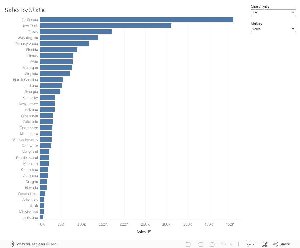
Dynamic zone visibility opens up so many use cases. Previously, I had to do some number formatting tricks to show two different formats on one chart.
But with DZV, I can create an unlimited number of combinations of charts, metrics, and number formats.
In this video, I show you four examples to get you started.
Download the workbook here. Interact with it below the video.
June 27, 2023
Blue vs. Green - What does it mean?
aggregate
,
blue
,
continuous
,
continuous dimension
,
continuous measure
,
count
,
dimension
,
disaggregate
,
discrete
,
discrete dimension
,
discrete measure
,
fill
,
green
,
group
,
headers
,
how to
,
measure
,
split
,
tableau
No comments

When I first started using #Tableau, I assumed that blue meant dimensions and green meant measures. They don’t.
Blue means Discrete
Green means Continuous
It took me a couple of years to get my head around this most foundational concept in Tableau.
Dimensions and measures are merely a way that Tableau organizes the data.
And if you only take away one thing from this video, this is it:
- Blue things GROUP your data
- Green things COUNT your data
- Dimensions SPLIT up the view
- Measures FILL the view
June 22, 2022
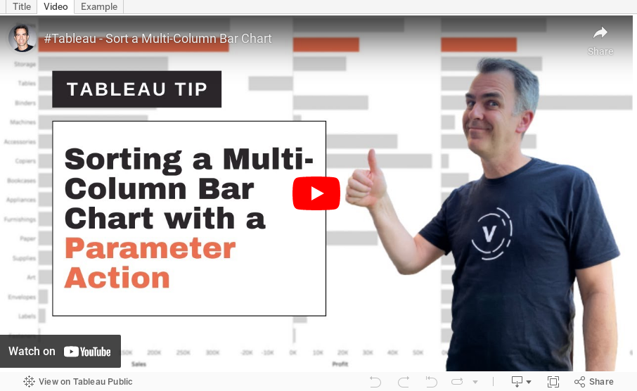
How to Sort a Multi-Column Bar Chart with a Parameter Action
bar chart
,
calculated field
,
case statement
,
chart
,
condition
,
continuous
,
dimension
,
discrete
,
graph
,
highlight action
,
how to
,
measure
,
parameter action
,
set action
,
sort
,
tableau
,
tip
,
tutorial
,
worksheet action
No comments
March 1, 2022
How to Create a Dual Axis Chart with One Dimension and One Measure
bar chart
,
calculated field
,
comparison
,
context
,
data visualization
,
dimension
,
dual axis
,
level of detail
,
line chart
,
LOD
,
measure
,
single dimension
,
single measure
,
synchronize axis
,
tableau
,
tip
,
tutorial
No comments
This tip comes from a comment from a viewer. They wanted to know how they could build a dual-axis chart based on a single dimension (e.g., Order Date) and a single measure (e.g., Sales). In this tip I show you how to compare the monthly sales for the current year (as a line) to the prior year (as a bar).
Subscribe to:
Posts
(
Atom
)






