VizWiz

Launch, grow, and unlock your career in data
Showing posts with label highlight action. Show all posts

October 17, 2022

#MakeoverMonday 2022 Week 42 - Food & Drug Administration Inspections in America

No comments

Having looked at the original visualization this week (here), it was pretty clear to me that the creators desired to create a KPI style dashboard. In a way it's good that I picked up on it that way. However, it wasn't designed particularly uclarly well to communicate most efficiently.

I decided during Watch Me Viz that I would stick with their idea of a KPI dashboard, but design it in a way that I thought would be easier to understand.

As per normal, it took way too long to faff about with the formatting. I made a couple of small changes after I finished the live stream. Click on the image below the video to check it out. Leave a comment on the video on YouTube if you have any questions. (Comments aren't appearing on the blog for some reason).

Have a wonderful week!


June 22, 2022

How to Sort a Multi-Column Bar Chart with a Parameter Action

No comments
Let's say you have a chart with 1 dimension and 3 measures. You want to make sorting the bar chart by any of the measures as easy as possible. In this tip, I show you how to use parameter actions to sort the bar charts based on the measure you select.

June 7, 2022

How to Compare to a Selected Value with a Parameter Action

No comments
In this tip, I show you how to use a parameter action to compare values within a chart. This example uses a bar chart; it works with other chart types as well.

May 31, 2022

Proportional Brushing with a Set Action

No comments
Proportional brushing allows you to view an item you choose from one chart as a proportion of another chart. For example, you can view the sales for Corporate (from the Segment dimension) as a proportion of the sales of each Region.

July 26, 2021

#MakeoverMonday 2021 Week 30 - America's Racial Breakdown by State

No comments

Makeover Monday week 30 looked at this viz from Visual Capitalist showing the percentage of each race in each State in America.

In the video below, you'll see my recreate the tiled treemap before creating a tiled bar chart. Thanks for watching!

Click here to view the interactive version on Tableau Public.


April 27, 2021

How to Create a Dynamic Quadrant Chart Using a Set Action

No comments
A quadrant chart, by definition, is a scatter plot with a background split into four equal sections. Typically, though, the sections are divided up as to how they compare to the average of both axes. 

In this video, I show you how to make the axes you want to compare to dynamic. I show you how to use a set action to change the reference point to which each quadrant is compared.

March 22, 2021

#WorkoutWednesday 2021 Week 11 - Gapminder: Income vs. Life Expectancy

No comments

As Lorna mentions in the week 11 challenge, the key is in the data prep. Once you have that, the visualization is really simple.

I did not use the new relationships model; I stuck with the traditional method of unions and a join as that's the most straightforward way to ensure you get the data in the correct shape.

First, you want to union together the three CSV files: life expectancy, population, and income. When you do that, you'll get this strange looking view that is super wide and doesn't have headers that mean anything. 


What you should see, though, is that the headers are in the first row. To fix that, click on the drop down triangle next to the unioned data sources and choose Field names are in first row.


The years are nicely in the headers now. The next step is to select all of the columns with the years and pivot the data. Be sure to ONLY select the years.

I then renamed Pivot Field Names to "Year" and changed the data type to Number (whole) and also renamed Pivot Field Values to "Values".

Next, add the data source with the list of countries and drag it into the data prep area to create a join. You want to join "country" to "name". And now everything should look good. That's it for the data prep.


Now that the data is pivoted, in order to build the view, you need to create a calculated field for each measure: life expectancy, population, and income


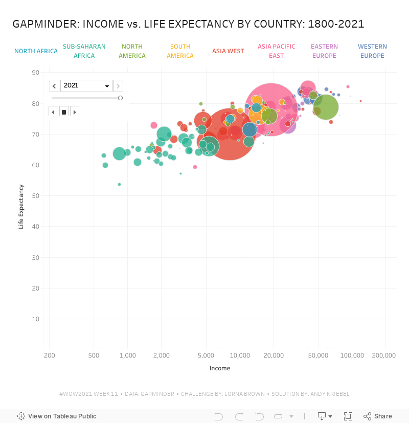
All three calculations are the same. All you need to do is swap out the name of the csv. Lastly, build the view.


Note that the x-axis is a logarithmic scale and both axes have the option to start at 0 turned off.  That's it! I hope you found this helpful.

March 15, 2021

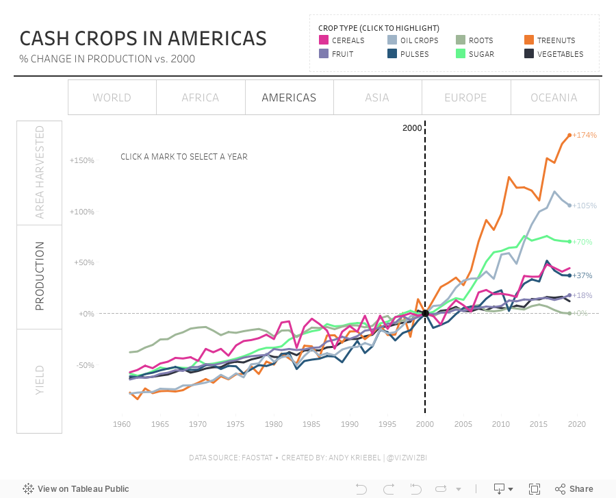
#MakeoverMonday Week 11: The World's Largest Cash Crops
No comments
What a fun dataset! Thank you for your ideas during #WatchMeViz. Here are the video and final visualization.