March 22, 2021
#WorkoutWednesday 2021 Week 11 - Gapminder: Income vs. Life Expectancy
animation
,
country
,
gapminder
,
hans rosling
,
highlight action
,
income
,
life expectancy
,
pages
,
population
,
region
,
scatter plot
,
scatterplot
,
Workout Wednesday
No comments

I did not use the new relationships model; I stuck with the traditional method of unions and a join as that's the most straightforward way to ensure you get the data in the correct shape.
First, you want to union together the three CSV files: life expectancy, population, and income. When you do that, you'll get this strange looking view that is super wide and doesn't have headers that mean anything.

What you should see, though, is that the headers are in the first row. To fix that, click on the drop down triangle next to the unioned data sources and choose Field names are in first row.

The years are nicely in the headers now. The next step is to select all of the columns with the years and pivot the data. Be sure to ONLY select the years.

Next, add the data source with the list of countries and drag it into the data prep area to create a join. You want to join "country" to "name". And now everything should look good. That's it for the data prep.

Now that the data is pivoted, in order to build the view, you need to create a calculated field for each measure: life expectancy, population, and income

All three calculations are the same. All you need to do is swap out the name of the csv. Lastly, build the view.

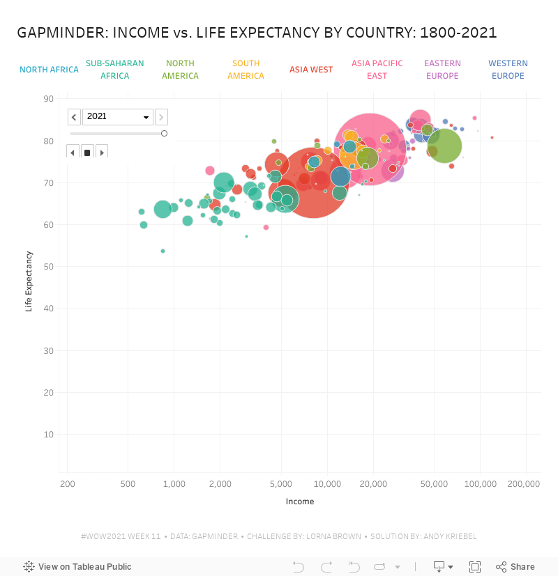
Note that the x-axis is a logarithmic scale and both axes have the option to start at 0 turned off. That's it! I hope you found this helpful.
Subscribe to:
Post Comments
(
Atom
)


No comments
Post a Comment