Showing posts with label region. Show all posts
August 30, 2021
#MakeoverMonday 2021 Week 35 - Male Circumcision Around the World
action
,
BAN
,
bar chart
,
circumcision
,
dashboard
,
dashboard action
,
filter action
,
gender
,
health
,
how to
,
Makeover Monday
,
male
,
region
,
set action
,
tableau
No comments

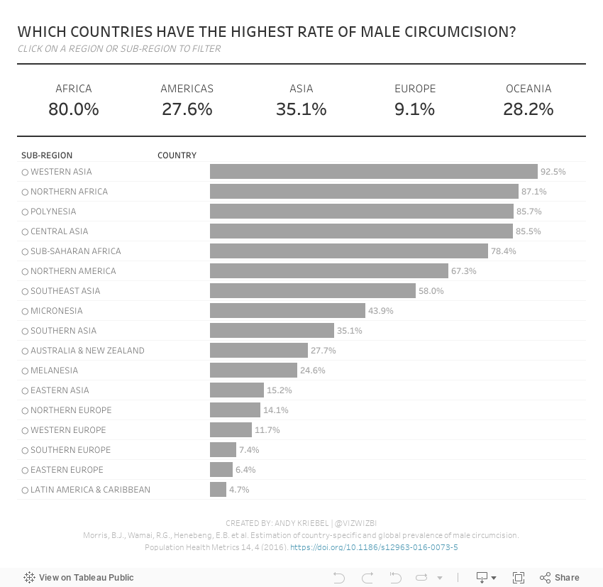
In this week's Watch Me Viz, I started by showing the original visualization, demonstrated how to make a non-geographical field geographical, and then I spent lots of time working through set action drill down.
I showed how to do drill down to two and three levels of dimensions in a hierarchy. Lastly, while building the dashboard, I also showed how to move fields you select in an action to the top of the view with a sorting calculation.
Enjoy!
March 22, 2021
#WorkoutWednesday 2021 Week 11 - Gapminder: Income vs. Life Expectancy
animation
,
country
,
gapminder
,
hans rosling
,
highlight action
,
income
,
life expectancy
,
pages
,
population
,
region
,
scatter plot
,
scatterplot
,
Workout Wednesday
No comments

I did not use the new relationships model; I stuck with the traditional method of unions and a join as that's the most straightforward way to ensure you get the data in the correct shape.
First, you want to union together the three CSV files: life expectancy, population, and income. When you do that, you'll get this strange looking view that is super wide and doesn't have headers that mean anything.

What you should see, though, is that the headers are in the first row. To fix that, click on the drop down triangle next to the unioned data sources and choose Field names are in first row.

The years are nicely in the headers now. The next step is to select all of the columns with the years and pivot the data. Be sure to ONLY select the years.

Next, add the data source with the list of countries and drag it into the data prep area to create a join. You want to join "country" to "name". And now everything should look good. That's it for the data prep.

Now that the data is pivoted, in order to build the view, you need to create a calculated field for each measure: life expectancy, population, and income

All three calculations are the same. All you need to do is swap out the name of the csv. Lastly, build the view.

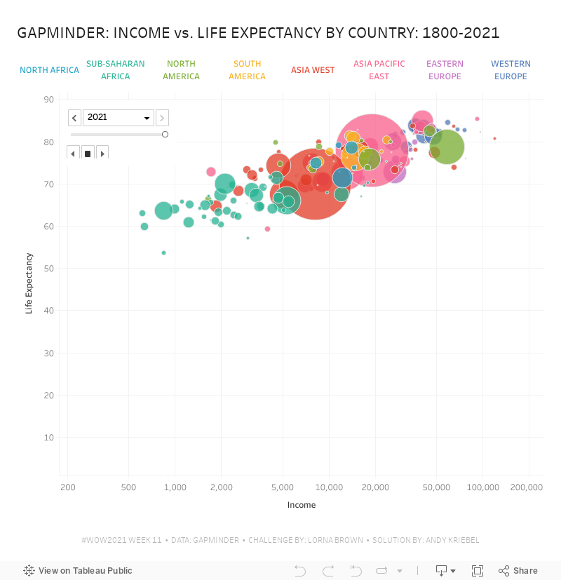
Note that the x-axis is a logarithmic scale and both axes have the option to start at 0 turned off. That's it! I hope you found this helpful.
March 15, 2021
#MakeoverMonday Week 11: The World's Largest Cash Crops
cash crops
,
containers
,
filter action
,
food
,
formatting
,
highlight action
,
Makeover Monday
,
parameter action
,
products
,
region
,
time series
No comments
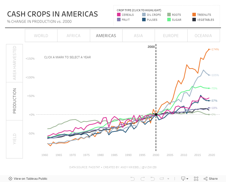
What a fun dataset! Thank you for your ideas during #WatchMeViz. Here are the video and final visualization.

February 26, 2020
Visualizing the Geography of TV Stations
contour
,
Erin Davis
,
FCC
,
frequency
,
geography
,
map
,
parameter
,
region
,
signal
,
TV
,
United States
,
USA
No comments

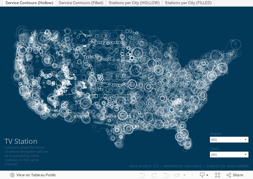
The piece I wanted to replicate in Tableau is based on her beautiful work Visualizing the Geography of FM Radio. Since she had already done this for radio, I thought I'd try to replicate her work, but with TV stations, that is, the strength and coverage that the broadcast signals from TV stations transmit.
First, I had to prep the data. Fortunately the raw data was easily accessible on the FCC website as are explanations of the fields and how to use them. The FCC also have information about which States fall into which FCC regions. I manually grouped the States into their regions in Tableau (it would have needed to be manually created data anyway).
From there, it was some data prep to get the signal boundaries for each state, ensure they are in the correct State (e.g., some stations that were listed in California actually plotted in other States), then export as a TDE (Hyper files don't work well with polygons).
Here's the Alteryx workflow:

For Tableau, I created a custom color palette based on the color legend on Erin's vizzes, replicated her maps as close as possible, and that's it!
Enjoy!
March 26, 2019
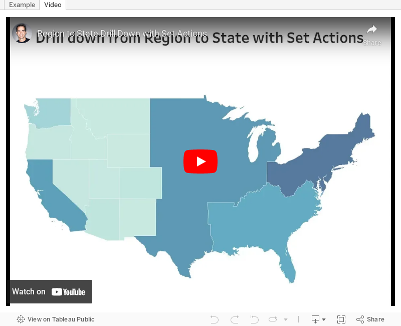
#TableauTipTuesday: Create a Region to State Drill Down Map with Set Actions

Subscribe to:
Posts
(
Atom
)






