October 3, 2022
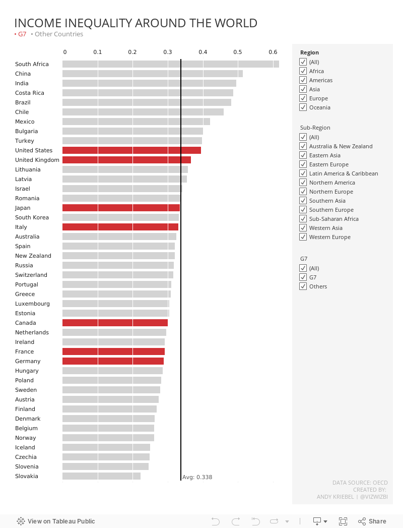
#MakeoverMonday 2022 Week 40 - Income Inequality Around the World

March 22, 2021
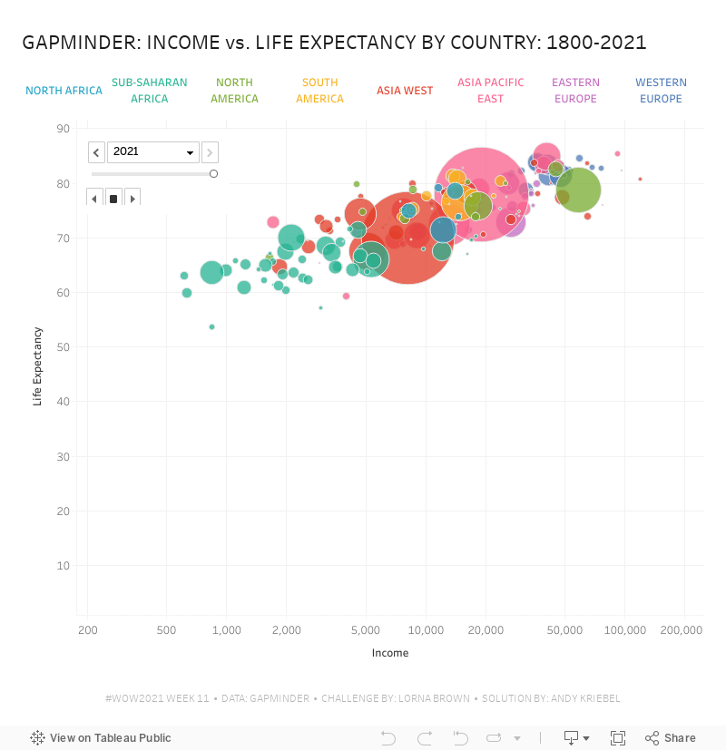
#WorkoutWednesday 2021 Week 11 - Gapminder: Income vs. Life Expectancy


What you should see, though, is that the headers are in the first row. To fix that, click on the drop down triangle next to the unioned data sources and choose Field names are in first row.


Now that the data is pivoted, in order to build the view, you need to create a calculated field for each measure: life expectancy, population, and income


January 15, 2018
Makeover Monday: U.S. Household Income Distribution by State

What works well?
- The ordering of the states by the highest income level from smallest to largest is easy to see.
- The colors are all pretty distinct from each other (as I'm not color blind).
- The colors seem like an intentional choice to go from red (low) to green (high) with steps of color in between.
- The labels help add context to the stacked bars and they aren't distracting.
- Including the data source
What could be improved?
- There's no indication as to which year this represents.
- As it's not interactive, you can't sort by a different income level, therefore it's not easy to compare different states without reading the labels, which is slow.
- Are there region differences? I can't tell from this view.
What I did:
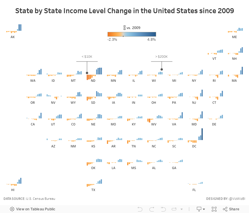
- To be able to see regional trends, I included a tile map.
- I used bars that represent the change since 2009 so that we could see which income groups grew and shrank the most.
- I included context in the tooltips that show each income level for 2016 and the change since 2009 for the selected income level.
- I added some annotations to aid understanding (thanks Eva for the idea).
November 28, 2016
Makeover Monday: Patterns of Change in Wealth Inequality

Different take on this week's #makeovermonday - used path analysis technique I learned from @eagereyes at #data16https://t.co/jFV8zyA8uQ pic.twitter.com/AMRTmPMQxo
— Matt Hoover (@Matt_Hoov) November 28, 2016
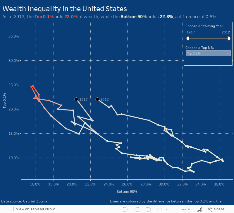
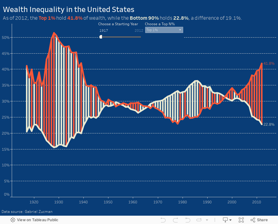
A connected scatterplot is great for visualising paired time series data. In this case, the pair is the bottom 90% vs. the top N% as picked by the user. The line is colored by the difference between the bottom 90% and the top N%. I added dots on the ends of the lines to make the start and end easier to find.
Makeover Monday: Wealth Inequality in the United States


What works well?
- Line chart is an appropriate chart choice as we're comparing two values over time
- Title is clear and simple
- Good sourcing and footnotes
- Tells a simple story effectively
- Only one axis is needed
- Title is a bit misleading as the values aren't actually equivalent
- Color choices imply democrat vs. republican
- Feels like there's a bit of extra visual clutter
- Difference could be accentuated more
This week, I again recorded all of my work along the way. In 45 minutes, I created 175 images. But this doesn't include parameters, filters and all the work done inside the dashboard, otherwise it would probably be twice as many.

You'll see in my final version that I put a lot of focus on the difference between the lines. I also used a parameter so the user can pick their own comparison. I also have a dynamic subtitle that updates based on the values picked in the parameter.
December 6, 2011
When income grows, who gains? Find out for yourself.
Anyone who follow this blog know how much I despise pie charts, but there are times when I tip my cap to someone that does them well. As much as it pains me to say it, pie charts are not ALWAYS evil.
The viz below is a great example of how to use a pie chart well (from the State of Working America blog):
- There are a maximum of four slices to this pie chart
- You can very quickly see how dominant one slice is versus the others
- The colors contrast well enough to not have to constantly refer to the legend
Click on the image to interact (you will be taken to the source site).
I guess what caught me most off-guard about this chart is the summary text when you choose 2002-2008. All income growth went to the top 10%. I had no idea! A great chart can indeed tell a great story, or better yet, let the reader discover the story for themselves.

November 7, 2011
Makeover of a Makeover – Waterfall vs. Side-by-side Bar Chart
One of the great things about the data viz world is that people are always willing to listen, learn and share. Cole Nussbaumer over at storytelling with data (a great blog you should follow) recently conducted a visual makeover on some horrible charts submitted during a class she was teaching. and she was willing to share her data with me so that I could make my own viz. Where else do you experience such camaraderie?
The improvements she recommends are fantastic, but I recommended one improvement to this chart she created:

Typically when I see side-by-side bar charts I’m looking to compare the bars that are next to each other. However, in this case, the bars are not necessarily related; they are simply a list of expenses and income next to each other. I recommended she create a waterfall chart like this one done with Tableau:

To me, a waterfall chart communicates the expenses vs. income story of this data more effectively
- The bar sizes make comparisons easy. It’s clear that Programs are the largest expense and Grants are the largest income.
- You can easily see the total variance without having to do the math in your head.
- Other Expenses are much larger than Other Income. I wonder what’s included in those expenses. Looks like an area for investigation.
- This group should probably focus a bit more on Sponsorships so that they’re not so dependent on Grants.
I could have included labels for all of the bars, but I wanted to show the patterns and relative sizes without the numbers being a distraction.
You can download the original Excel data here and/or the Tableau workbook here.
P.S. I chose red/green bars for two reasons: (1) most people understand red as negative and green as positive when reading financial figures and (2) to annoy my friend Steve Wexler of the Data Revelations blog (another you should follow), who hates this color scheme more than anyone I know.






