Showing posts with label G7. Show all posts
October 3, 2022
#MakeoverMonday 2022 Week 40 - Income Inequality Around the World
color
,
comparison
,
context
,
economy
,
G7
,
income
,
inequality
,
level of detail
,
liz truss
,
LOD
,
tableau
,
united kingdom
,
viz in tooltip
,
WatchMeViz
No comments

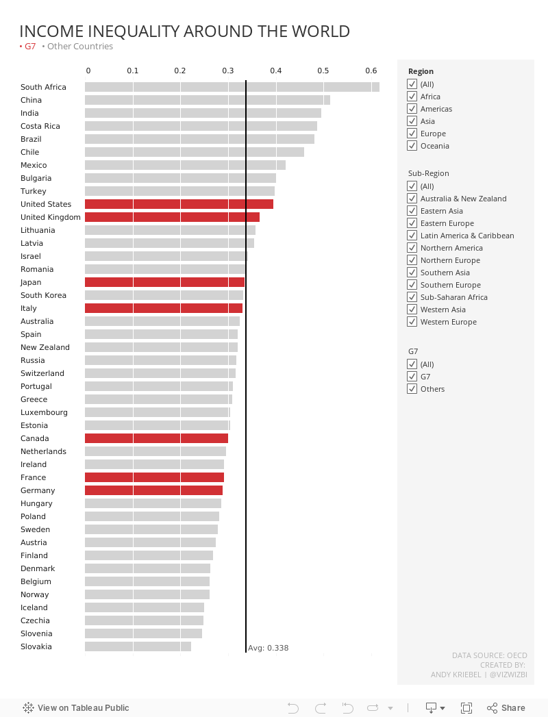
Still, though, I was curious to see how the UK compared to the rest of the World. During Watch Me Viz (below), I started by rebuilding the original chart, which I quite liked. I then looked at the data over time, but it was quite sparse and difficult to do any meaningful analysis of.
So I decided to stick with a single chart that looked like the original, but it includes all countries and some filtering options.
To learn how I approached the analysis and built the charts, watch the video below. My final dashboard is below the video.
Enjoy!
March 19, 2019
#MakeoverMonday Power BI Edition: Reykjavik Index for Leadership in G7 Countries

DATA PREP REQUIRED
- Add values for the remainder (100 - index)
- Add a sort column
- Pivot the data so that the index and the remainder were in the same column
WHAT WORKED WELL
- Creating a stacked bar chart in Power BI was quite simple.
- Customizing the split of the colors for the index and the remainder was easy.
- The viz layout is super intuitive and automatically adjust to the size of the screen while maintaining the original chart ratio.
- The fonts look super crisp.
- Simple to add a constant reference line for the G7 average.
WHAT I COULDN'T OVERCOME
- I couldn't find a way to show only the mark labels for the purple bars.
- I had to change the mark labels so that the values of the grey bars wouldn't be visible by making the text the same color as the grey bars.
- I couldn't copy/paste into a text box.
- I couldn't customize the font size for the reference line.
- I'm sure there's a way, but I couldn't figure out how to color code the bars based on whether they were above or below the G7 average. For example, I wanted to make those countries below the G7 average a lighter shade of purple.
With that, here's my second Makeover Monday for week 12 2019.
March 17, 2019
#MakeoverMonday: To what extent are women and men viewed equally in leadership positions?
equality
,
female
,
G7
,
Makeover Monday
,
Reykjavik Index
,
women
No comments

Let's have a look at the chart:
 |
| Source: World Economic Forum |
WHAT WORKS WELL?
- Ordering the countries from highest to lowest in terms of people that view women and men equally in leadership positions
- Including the G7 average for context
- Assigning a different color to the G7 average
- Labeling the end of the lines
WHAT COULD BE IMPROVED?
- Circular bar charts are horrible for comparisons.
- The title is meaningless.
- The lines start thin, get thicker, then get thin again. Why?
- The title and the center of the chart are the same. That's certainly unnecessary redundancy.
WHAT I DID
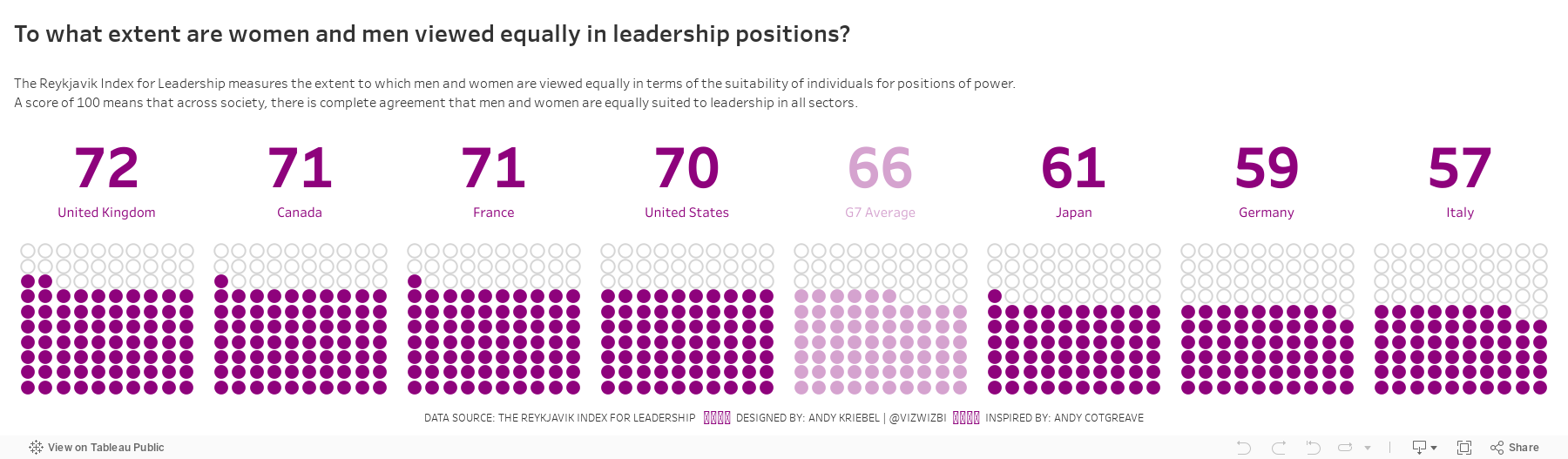
I started by creating a simple bar chart and that was fine. I also added a grey bar to have it as a stacked bar for each country that goes up to 100%. I then thought about doing a waffle chart (with circles) and then I remembered this viz from Andy Cotgreave back in Makeover Monday week 4 2016. I decided to replicate Andy's work since it looks great and gives lots of context. I created a mobile version like Andy did too.
With that in mind, here's my makeover for week 12.
October 2, 2017
Makeover Monday: Which Quarter Performs Best in the UK Economy?

What works well?
- The title tells me what the viz is comparing.
- Highlighting the UK since that's the focus on the article
- Using a line chart to display data over time
- Including a reference to the data source
- Sticking with the FT themed colors
What could be improved?
- The article that was part of references Brexit, but this timeline doesn't show pre- AND post-Brexit vote. Including a longer time range would be more useful to understand the long-term trends.
- There are extra tick marks on the time axis, making it look sloppy.
- Include a % since and an axis title. I had to go back to the subtitle to get that.
- Use a more impactful title and subtitle. The source article has plenty of sentences they could have used instead.
My goals
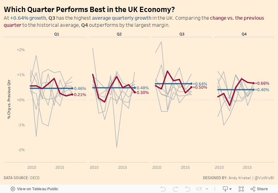
- I wanted to understand how each quarter performed by year, not year by quarter. This will allow me to see historically which quarter performs the best.
- Use a better title and subtitle
- Include a mobile design (for my own practice)
- Keep the other G7 countries in the background for reference, but don't actually refer to them.
- Stick with the FT theme
With those goals in mind, here is my Makeover Monday week 40.
Subscribe to:
Posts
(
Atom
)






