Showing posts with label Reykjavik Index. Show all posts
March 20, 2019
#MakeoverMonday Data Studio Edition: Reykjavik Index for Leadership in G7 Countries

DATA PREP REQUIRED
- Add values for the remainder (100 - index)
- Add a sort column
- Pivot the data so that the index and the remainder were in the same column
WHAT WORKED WELL
- To create the stacked bar chart, all you need to do is select the chart type and drop the fields on the appropriate shelves.
- Customizing the split of the colors for the index and the remainder was easy.
- I was able to customize the size of the viz.
- You can choose any font that Google supports!!
- The tooltips are super responsive.
- Everything looks very crisp.
- Hiding the gridlines leaves a nice thin black line on the y-axis without me needing to fiddle around with a few different settings.
- The overall UX is quite intuitive. I see they have a data explorer now too.
WHAT I COULDN'T OVERCOME
- I couldn't find a way to show only the mark labels for the purple bars.
- I couldn't add a reference line for the G7 average so I had to leave it in the view.
- I couldn't hide the x-axis only. When you do, the y-axis gets hidden as well.
With that, here's my third Makeover Monday for week 12 2019.
March 19, 2019
#MakeoverMonday Power BI Edition: Reykjavik Index for Leadership in G7 Countries

DATA PREP REQUIRED
- Add values for the remainder (100 - index)
- Add a sort column
- Pivot the data so that the index and the remainder were in the same column
WHAT WORKED WELL
- Creating a stacked bar chart in Power BI was quite simple.
- Customizing the split of the colors for the index and the remainder was easy.
- The viz layout is super intuitive and automatically adjust to the size of the screen while maintaining the original chart ratio.
- The fonts look super crisp.
- Simple to add a constant reference line for the G7 average.
WHAT I COULDN'T OVERCOME
- I couldn't find a way to show only the mark labels for the purple bars.
- I had to change the mark labels so that the values of the grey bars wouldn't be visible by making the text the same color as the grey bars.
- I couldn't copy/paste into a text box.
- I couldn't customize the font size for the reference line.
- I'm sure there's a way, but I couldn't figure out how to color code the bars based on whether they were above or below the G7 average. For example, I wanted to make those countries below the G7 average a lighter shade of purple.
With that, here's my second Makeover Monday for week 12 2019.
March 17, 2019
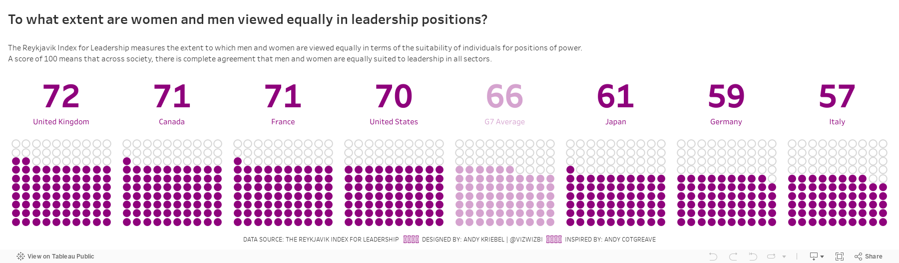
#MakeoverMonday: To what extent are women and men viewed equally in leadership positions?
equality
,
female
,
G7
,
Makeover Monday
,
Reykjavik Index
,
women
No comments

Let's have a look at the chart:
 |
| Source: World Economic Forum |
WHAT WORKS WELL?
- Ordering the countries from highest to lowest in terms of people that view women and men equally in leadership positions
- Including the G7 average for context
- Assigning a different color to the G7 average
- Labeling the end of the lines
WHAT COULD BE IMPROVED?
- Circular bar charts are horrible for comparisons.
- The title is meaningless.
- The lines start thin, get thicker, then get thin again. Why?
- The title and the center of the chart are the same. That's certainly unnecessary redundancy.
WHAT I DID
I started by creating a simple bar chart and that was fine. I also added a grey bar to have it as a stacked bar for each country that goes up to 100%. I then thought about doing a waffle chart (with circles) and then I remembered this viz from Andy Cotgreave back in Makeover Monday week 4 2016. I decided to replicate Andy's work since it looks great and gives lots of context. I created a mobile version like Andy did too.
With that in mind, here's my makeover for week 12.
Subscribe to:
Posts
(
Atom
)






