October 2, 2017
Makeover Monday: Which Quarter Performs Best in the UK Economy?

What works well?
- The title tells me what the viz is comparing.
- Highlighting the UK since that's the focus on the article
- Using a line chart to display data over time
- Including a reference to the data source
- Sticking with the FT themed colors
What could be improved?
- The article that was part of references Brexit, but this timeline doesn't show pre- AND post-Brexit vote. Including a longer time range would be more useful to understand the long-term trends.
- There are extra tick marks on the time axis, making it look sloppy.
- Include a % since and an axis title. I had to go back to the subtitle to get that.
- Use a more impactful title and subtitle. The source article has plenty of sentences they could have used instead.
My goals
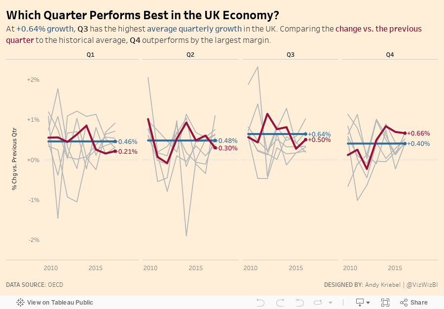
- I wanted to understand how each quarter performed by year, not year by quarter. This will allow me to see historically which quarter performs the best.
- Use a better title and subtitle
- Include a mobile design (for my own practice)
- Keep the other G7 countries in the background for reference, but don't actually refer to them.
- Stick with the FT theme
With those goals in mind, here is my Makeover Monday week 40.
Subscribe to:
Post Comments
(
Atom
)


No comments
Post a Comment