October 4, 2017
Workout Wednesday: All the Sorts | Part 2
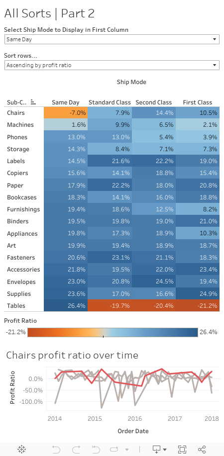
- Add a line chart showing profit ratio over time (continuous months) by each ship mode.
- The ship mode selected by the end user should be highlighted in red in the line chart, the rest in grey.
- The line chart should show by default the profit ratio for the product sub-category which is in the top row of the highlight table. Remember this can be changed by selecting a different ship mode or row sort.
- When a user selects a product sub-category in the highlight table the line chart should change to show the selected sub-category
Seemed innocent enough at first. I had a pretty good idea that I needed a table calc to make this work, but it took me a while to get the settings just right. Anyway, another challenge done!
Subscribe to:
Post Comments
(
Atom
)


No comments
Post a Comment