Showing posts with label sorting. Show all posts
April 5, 2022
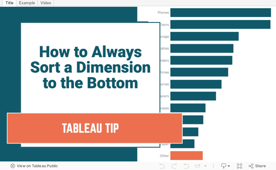
How to Always Sort a Dimension to the Bottom of a Chart
ascending
,
bar chart
,
calculated field
,
chart
,
comparison
,
context
,
descending
,
dimension
,
graph
,
group
,
highlight
,
how to
,
negative
,
sort
,
sorting
,
tableau
,
tip
,
tutorial
No comments
July 6, 2021
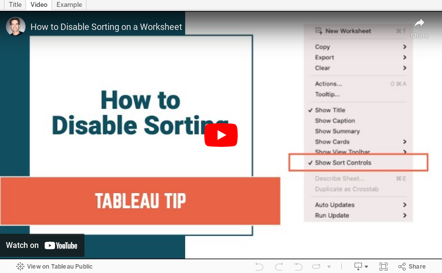
How to Disable Sorting on a Worksheet
axis
,
disable
,
header
,
menu
,
show sort controls
,
sort
,
sorting
,
tableau
,
tip
,
worksheet
No comments
It's quite simple! All you have to do is turn off the sort controls. In this short Tableau Tip, I show you how to do it. Enjoy!
August 11, 2020
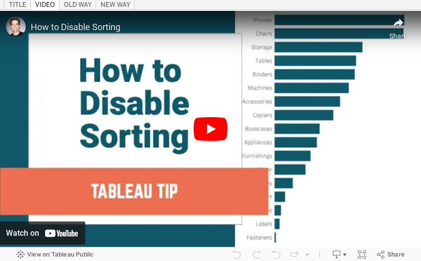
#TableauTipTuesday - How to Disable Sorting

There are times when you want to prevent your users from sorting a chart. This video has the solution for you.
Enjoy!
July 30, 2019
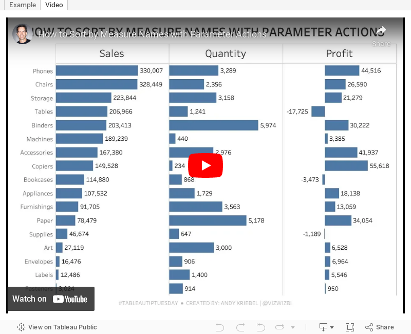
#TableauTipTuesday: How to Sort by Measure Names with Parameter Actions

February 8, 2018
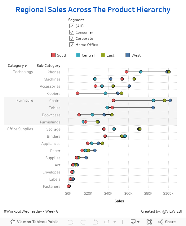
Workout Wednesday: Regional Sales Across the Product Hierarchy
For week 6, Luke challenged us to build a connected dot plot. Get the requirements here. For me, it was all pretty straightforward except for the row banding. That was a pain in the ass and took some trial and error to get it just right. I also learned a nice little hack to emulate row borders.

January 17, 2018
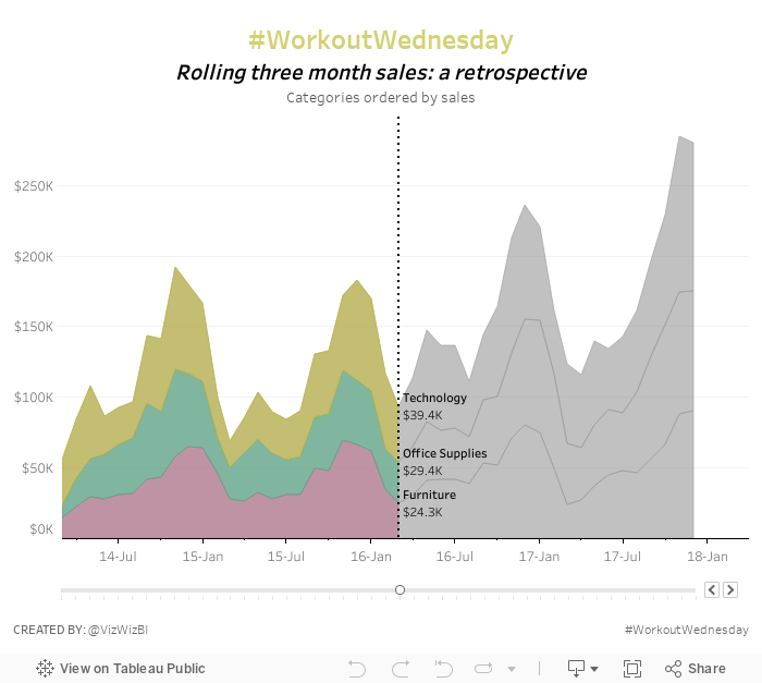
Workout Wednesday: Rolling Three Month Sales
level of detail
,
LOD
,
moving sum
,
parameter
,
sorting
,
stacked area chart
,
table calc
,
Workout Wednesday
2 comments
Nice challenge from the boys this week. Essentially you have to create a stacked area chart with the stacks adjusting top to bottom depending on which one is the largest. The title also needs to be the same color as stack that's on top. Finally you need a parameter to determine where to split the colors of the view and where to display the values.
There are some other tricks too. I won't give away my solution, but I'm 99% sure it different than theirs. Get the requirements here.

There are some other tricks too. I won't give away my solution, but I'm 99% sure it different than theirs. Get the requirements here.
October 4, 2017
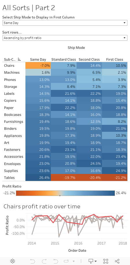
Workout Wednesday: All the Sorts | Part 2
- Add a line chart showing profit ratio over time (continuous months) by each ship mode.
- The ship mode selected by the end user should be highlighted in red in the line chart, the rest in grey.
- The line chart should show by default the profit ratio for the product sub-category which is in the top row of the highlight table. Remember this can be changed by selecting a different ship mode or row sort.
- When a user selects a product sub-category in the highlight table the line chart should change to show the selected sub-category
Seemed innocent enough at first. I had a pretty good idea that I needed a table calc to make this work, but it took me a while to get the settings just right. Anyway, another challenge done!
September 20, 2017
Workout Wednesday: (It Takes) All Sorts
calculated field
,
heat map
,
highlight table
,
parameter
,
profit ratio
,
sort
,
sorting
,
Workout Wednesday
1 comment
Oh Emma thought she was being sneaky today in the week 38 challenge. We had a similar challenge last year for the Data School Gym. For this week, given the EU Superstore data set, you have to meet these requirements (read the full details on Emma's blog):
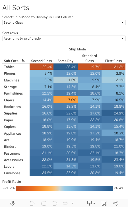

- Create the highlight table showing profit ratio by ship mode and sub-category.
- The columns should be sorted by the ship mode selected in the drop down first, followed by the remaining ship modes sorted descending by their overall profit ratio.
- The Product Subcategories should be sorted ascending or descending (depending on end user selection) of the profit ratios for the selected ship mode.
For me, the last requirement was the trickiest part. In the end, I had to create two parameters and three calculations.
Good luck!
July 19, 2017
Workout Wednesday: Who sits where at the Data School?
calculations
,
Data School
,
donut chart
,
level of detail
,
seating
,
sorting
,
Workout Wednesday
6 comments
This might seem a bit stalkerish, yet I promise this was done as a learning exercise. Since DS2 started, I've been tracking where each person sits around the table every day (well, almost every day). We sit around a table, so the seats are numbered 1-8. I started doing this because I noticed some people in DS1 (ahem Pablo and Damiana) sitting in the same spots EVERY SINGLE DAY, so when DS2 started, I wanted to see if it would continue.
BTW, we also literally tracked how many times Bethany said "literally" just to get to her to stop saying it ALL THE TIME! This is a great way to change behaviours.
Your task for Workout Wednesday Week 29 is to visualise the favorite seats of each person in each cohort. Here are the rules:

BTW, we also literally tracked how many times Bethany said "literally" just to get to her to stop saying it ALL THE TIME! This is a great way to change behaviours.
Your task for Workout Wednesday Week 29 is to visualise the favorite seats of each person in each cohort. Here are the rules:
- The cohorts must be listed in ascending ordered top-to-bottom from DS2-DS6.
- Within each cohort, the DSers should be ordered by the percentage of time they sit in their favorite seat.
- Create a donut chart for each DSer.
- The blue slice (Hex #2C5573) represents the time they spent in their favorite seat.
- The grey slice (Hex #D3D3D3) represents the time spent in any other seat.
- In the middle of the donut chart, you need to include 3 bits of information:
- The time they spent in their favorite seat as a BAN.
- Their name.
- The seat number of their favorite seat.
- Match the title and subtitle.
- Match the formatting.
- Match the tooltips.
- The viz should be 1000x700.
Download the data here.
That's it! Good luck! When you finish, remember to post an image to twitter with the hashtag #WorkoutWednesday and tag @EmmaWhyte and @VizWizBI.
Click on the image for the interactive version.
Subscribe to:
Posts
(
Atom
)


