Showing posts with label profit ratio. Show all posts
December 3, 2018
Workout Wednesday | Week 48: Profitability Bridge
I'm a bit behind again on Workout Wednesday, you know, this whole life thing. Today I had a few minutes to look at week 48. As it was a waterfall chart with a couple of other tricks thrown in, I thought it would be pretty straightforward, and it was...thank goodness.
The basic requirements:
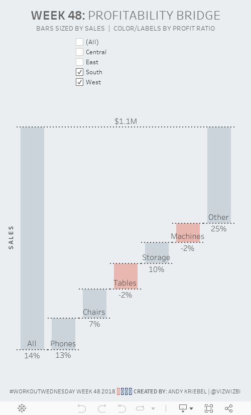

The basic requirements:
- Create a waterfall chart showing the top 5 sub-categories by sales. Include an other category for all other categories.
- Show a bar on the far-left of the waterfall that shows all sub-categories. Label it all.
- Add dashed lines that “connect” each bar.
- Add a dashed line that connects the All bar with the Other bar.
- Make sure each line looks as a single continuous dashed line.
- Label each sub-category above the bottom line of each bar.
- Label each bar with the profit ratio below the bottom line of each bar.
- Add a filter by region. Make sure the filter is centered on the dashboard above the chart.
- Color the bar gray if it above zero or pink if it is below zero.
December 20, 2017
Workout Wednesday: State by State Profit Ratio
For today's challenge, you'll need two data sets: Superstore Sales (the one we always use for WW) and the hex map template.
Requirements
- You are NOT allowed to use blending.
- Create a small multiple hex map showing profit ratio by state.
- Color the hexagons using the Sunrise-Sunset Diverging color palette
- Match the tooltips on all of the charts
- Include a summary heatmap by year and month at the bottom of the map
- Everything in the dashboard needs to be tiled
- Ensure there is no gap between the hex map and the heatmap. The column divider lines must match up.
- Include a sparkline of profit ratio by quarter with labels on the ends of the lines.
- Ensure there is enough space for the labels on the sparkline, but you CANNOT manually fix the axis. Make it dynamic via calculations.
- Clicking on a state should update the sparkline, update the heatmap, and highlight the state in the hex map. Mississippi and West Virginia are good test cases to ensure it's working.
- The dashboard should be 700x700.
That's it! This is one of the easiest challenges this year from me. It's a good way to bring together a lot of what we've learned this year.
Good luck!

September 20, 2017
Workout Wednesday: (It Takes) All Sorts
calculated field
,
heat map
,
highlight table
,
parameter
,
profit ratio
,
sort
,
sorting
,
Workout Wednesday
1 comment
Oh Emma thought she was being sneaky today in the week 38 challenge. We had a similar challenge last year for the Data School Gym. For this week, given the EU Superstore data set, you have to meet these requirements (read the full details on Emma's blog):
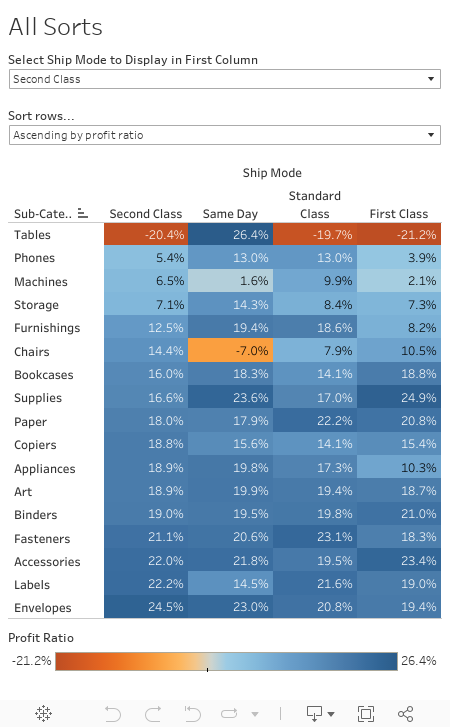

- Create the highlight table showing profit ratio by ship mode and sub-category.
- The columns should be sorted by the ship mode selected in the drop down first, followed by the remaining ship modes sorted descending by their overall profit ratio.
- The Product Subcategories should be sorted ascending or descending (depending on end user selection) of the profit ratios for the selected ship mode.
For me, the last requirement was the trickiest part. In the end, I had to create two parameters and three calculations.
Good luck!
May 24, 2012
Creating an interactive monthly calendar in Tableau is easier than you might think
calculated fields
,
calendar
,
color
,
data blending
,
dates
,
Dustin Wyers
,
heat map
,
highlight table
,
interactive
,
InterWorks
,
Joe Mako
,
profit ratio
,
Steve Wexler
,
tableau
,
tips
,
tricks
26 comments
If you’re not following the InterWorks blog, you should be. They routinely crank out fantastic tips and tricks for Tableau. Dustin Wyers, a BI Analyst for InterWorks, recently wrote about “Creating Calendar Views in Tableau”.
Dustin’s post does an excellent job of taking you through creating a calendar viz step-by-step. But I felt it fell a bit short in the end since you didn’t actually see a calendar. Dustin’s end product looks like this:


Ok, let’s get to it.
Step 1 – Create a list of dates in Excel and open the data in Tableau.


Step 4 - Right-click drag the Date field onto the Row shelf and choose the WEEK(Date) discrete format

Your view should look like this:

Step 5 – Clean up the view a bit by right-clicking on the Date label and choosing Hide Field Labels for Columns

Step 6 – Right-click on the WEEK(Date) pill on the Rows shelf and uncheck Show Header

Your view should look like this:

We’re getting close!
Step 7 – Right-click drag the Date field onto the Text shelf and choose DAY(Date)

Step 8 – Align the Text to the top right, center the header for the WEEKDAY(Date (copy) field, re-size the view a bit and we now have a beautiful calendar.

Ok, sweet, we have something that looks exactly like a calendar, but so what? This doesn’t tell us anything.
Consider that you want to see the profit ratio for your sales (or any other metric) displayed on each day as a color. This is where data blending comes in handy.
Step 9 – Connect to the Superstore Sales data source (or any other data you want to use, as long as it has a date field)
Step 10 – Create the data blending relationships. Go to the Data menu and choose Edit Relationships. You will need to create these Custom relationships:

Step 11 – Create a calculation for Profit Ratio by right-clicking on any field and choosing Create Calculated Field

Step 12 – Drag the Profit Ratio measure onto the Color shelf

That’s it! You must admit this is pretty cool.
Note that Tableau defaults positive and negative colors to the Red-Green palette; you might want to change it for those color blind folks out there (and to keep Steve Wexler off your back).
If you want to take it a couple steps farther, you could show the quick filter for the MY(Date) field, create a parameter to allow for any of several metrics to be chosen, and on an on to make it a truly interactive analysis.
In the version embedded below, I changed the color palette to Red-White-Green so that those days without any sales would be white instead of gray.
Try this with your own data. I bet your users will find this incredibly useful, especially as a performance monitoring tool.

Dustin’s post does an excellent job of taking you through creating a calendar viz step-by-step. But I felt it fell a bit short in the end since you didn’t actually see a calendar. Dustin’s end product looks like this:

I wanted something that looked more like a true calendar. I did so utilizing some of the techniques I outlined recently for creating a heat map, but also adding in some of the suggestions by Joe Mako. The end result, if you follow the tutorial below, will look like this:

Ok, let’s get to it.
Step 1 – Create a list of dates in Excel and open the data in Tableau.

Step 2 – Right-click drag the Date field onto the Column shelf and choose the MY(Date) discrete format

Your view should look like this:

Step 3 - Right-click drag the Date field onto the Column shelf and choose the WEEKDAY(Date) discrete format

Your view should look like this:

Step 4 - Right-click drag the Date field onto the Row shelf and choose the WEEK(Date) discrete format

Your view should look like this:

Step 5 – Clean up the view a bit by right-clicking on the Date label and choosing Hide Field Labels for Columns

Step 6 – Right-click on the WEEK(Date) pill on the Rows shelf and uncheck Show Header

Your view should look like this:

We’re getting close!
Step 7 – Right-click drag the Date field onto the Text shelf and choose DAY(Date)

Step 8 – Align the Text to the top right, center the header for the WEEKDAY(Date (copy) field, re-size the view a bit and we now have a beautiful calendar.

Ok, sweet, we have something that looks exactly like a calendar, but so what? This doesn’t tell us anything.
Consider that you want to see the profit ratio for your sales (or any other metric) displayed on each day as a color. This is where data blending comes in handy.
Step 9 – Connect to the Superstore Sales data source (or any other data you want to use, as long as it has a date field)
You might ask at this point why I used a separate data source for the calendar dates when a Date field exists in the Superstore Sales data. The reason is quite simple. The Superstore Sales data does not have sales for every day. Therefore I will not see the Day labels on each of the boxes. For example, if there are no sales on January 13, 2009, then the 13 label on that day will be blank.
Step 10 – Create the data blending relationships. Go to the Data menu and choose Edit Relationships. You will need to create these Custom relationships:

Step 11 – Create a calculation for Profit Ratio by right-clicking on any field and choosing Create Calculated Field

Step 12 – Drag the Profit Ratio measure onto the Color shelf
Step 13 – Change the Mark Type to Square
Step 14 – Set the size to its maximum

That’s it! You must admit this is pretty cool.
Note that Tableau defaults positive and negative colors to the Red-Green palette; you might want to change it for those color blind folks out there (and to keep Steve Wexler off your back).
If you want to take it a couple steps farther, you could show the quick filter for the MY(Date) field, create a parameter to allow for any of several metrics to be chosen, and on an on to make it a truly interactive analysis.
In the version embedded below, I changed the color palette to Red-White-Green so that those days without any sales would be white instead of gray.
Try this with your own data. I bet your users will find this incredibly useful, especially as a performance monitoring tool.
Subscribe to:
Posts
(
Atom
)






